
Package Exports
- @arshiash80/strapi-plugin-iconhub/package.json
- @arshiash80/strapi-plugin-iconhub/strapi-admin
- @arshiash80/strapi-plugin-iconhub/strapi-server
Readme
Strapi IconHub
A powerful and lightweight icon management plugin for Strapi CMS that supports both raw SVG and the Iconify icon library.
Features
- 🔍 Access 200K+ icons via Iconify integration
- 🎨 Visual icon picker in Strapi admin UI
- 🧩 Dual storage: icon name and raw SVG code
- 🧱 Compatible with all Strapi content types
- ⚙️ Optimized for dynamic frontend rendering
- 🚀 Lightweight and performant
Installation
# npm
npm i @arshiash80/strapi-plugin-iconhub

# yarn
yarn add @arshiash80/strapi-plugin-iconhub
Rebuild the admin panel:
# npm
npm run build && npm run develop

# yarn
yarn build && yarn develop
Verification
Navigate to Settings > Plugins to confirm IconHub installation.
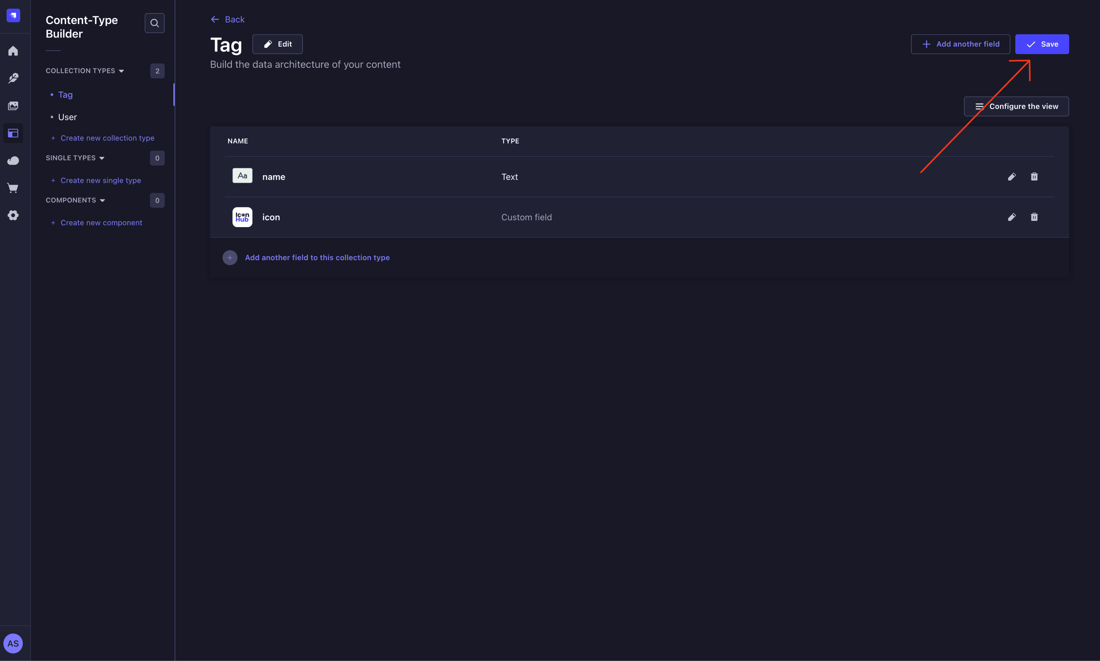
Usage
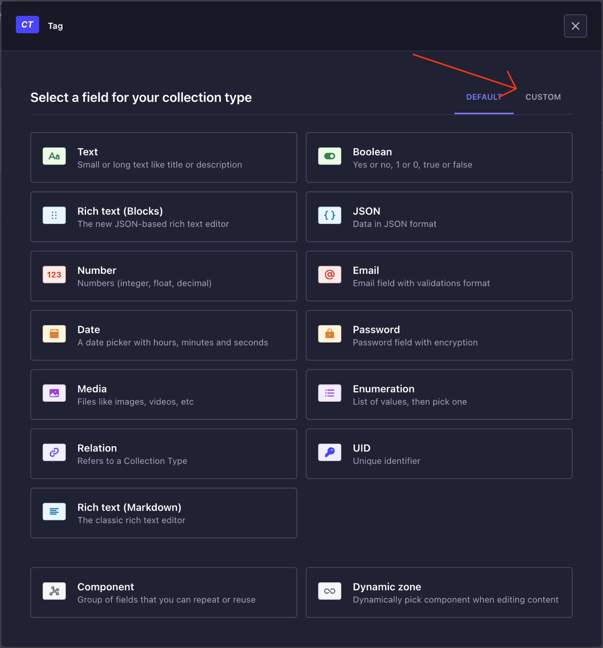
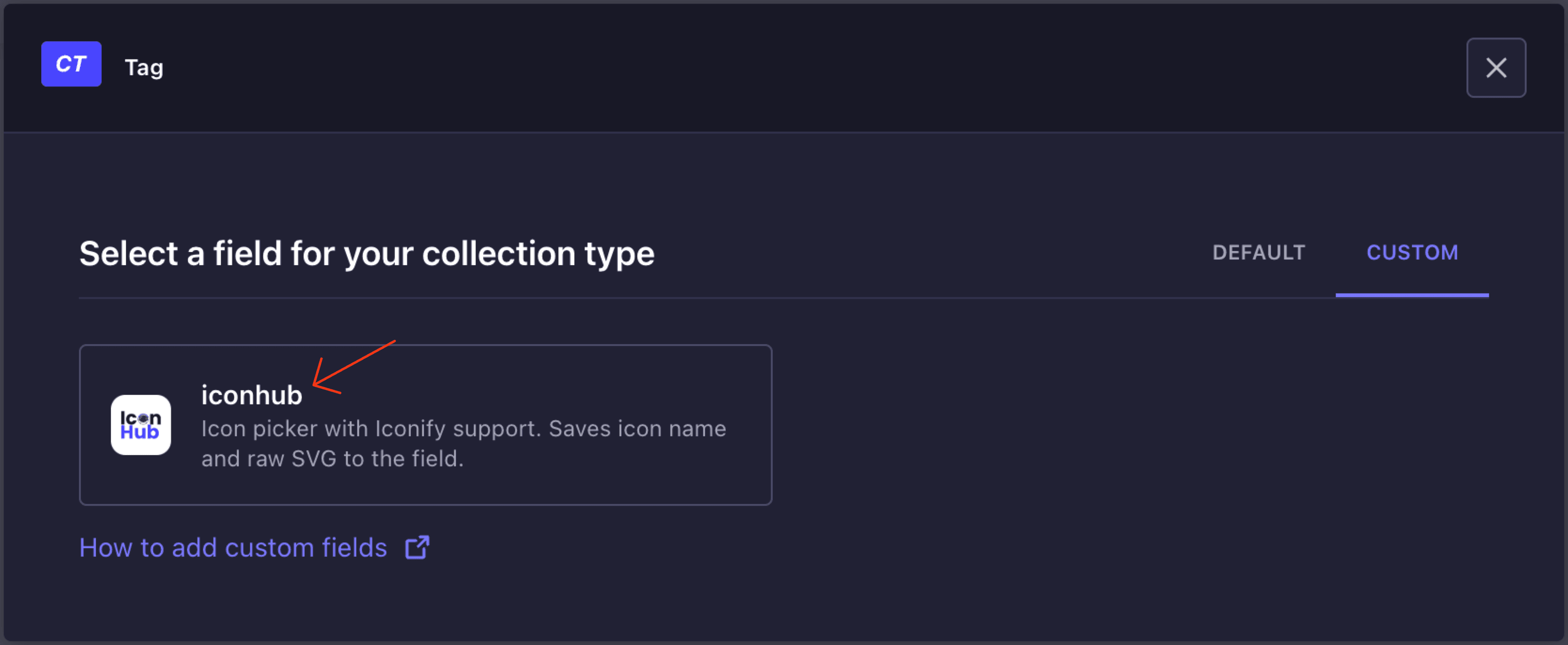
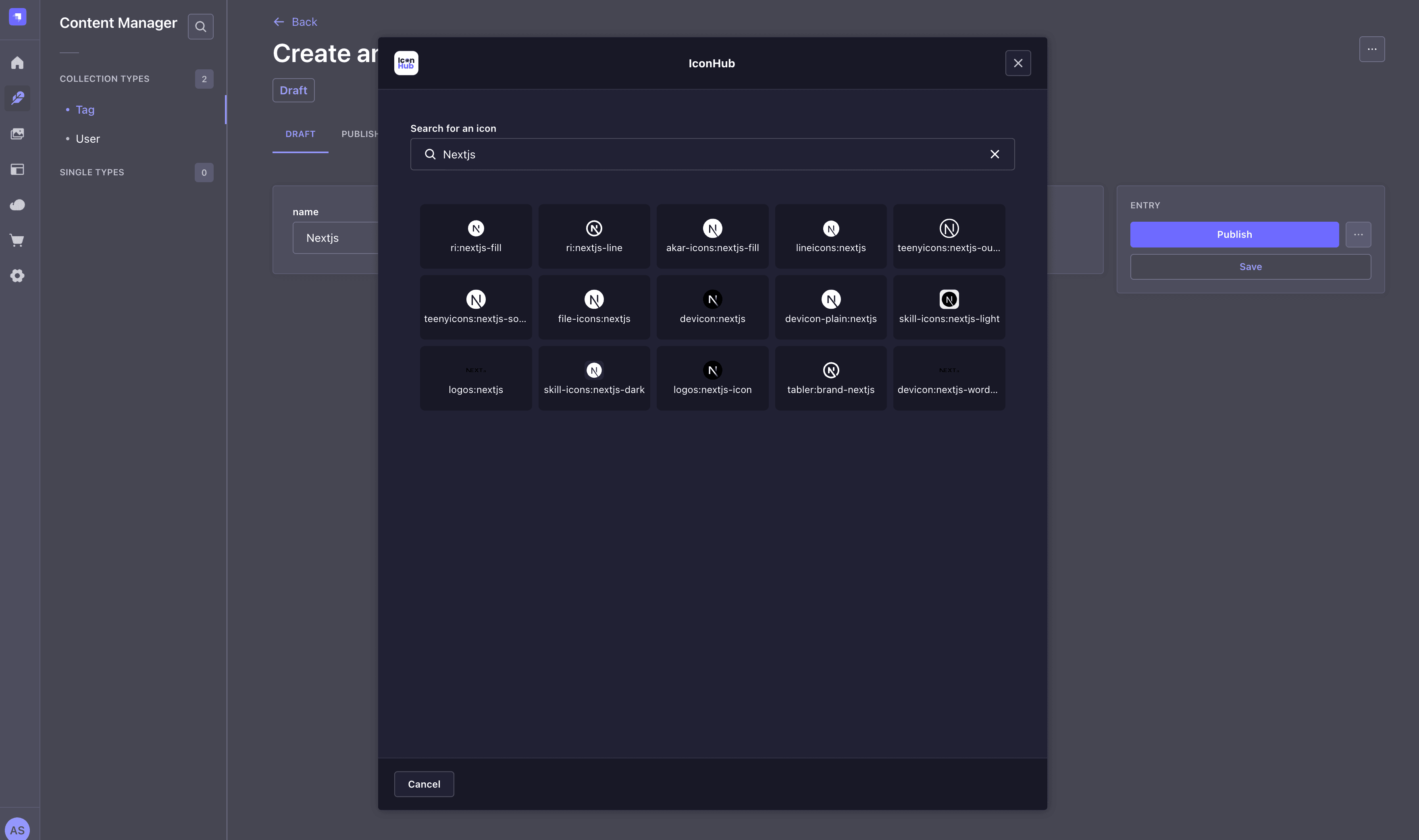
- Open Content-Type Builder
- Add a new custom field
- Select Custom tab and choose IconHub
- Save schema changes
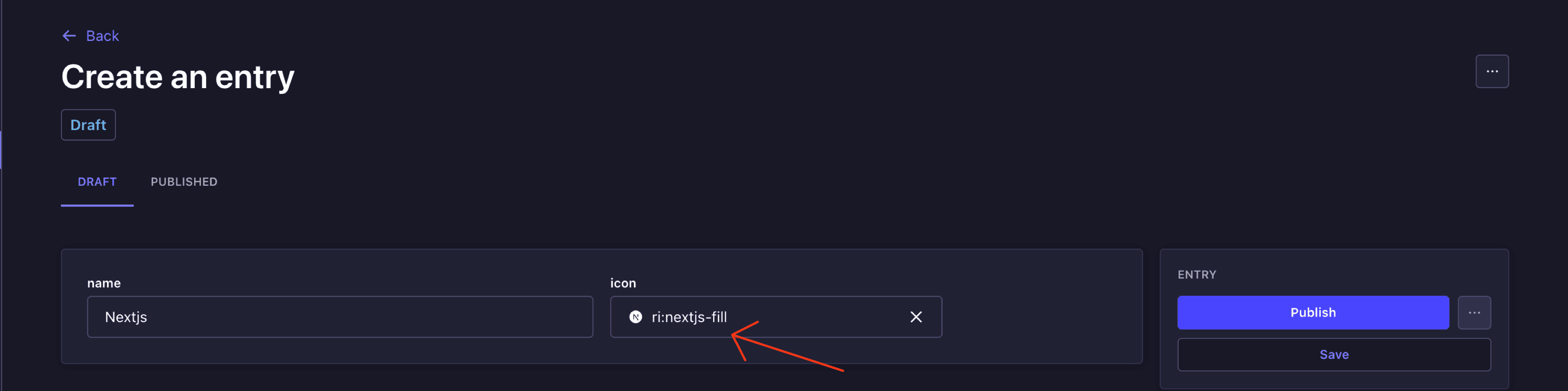
The icon picker will be available in your content entries:
Data Structure
type IconField = {
iconName: string; // e.g. "mdi:home"
iconData: string; // Raw SVG string
width?: number; // Optional width
height?: number; // Optional height
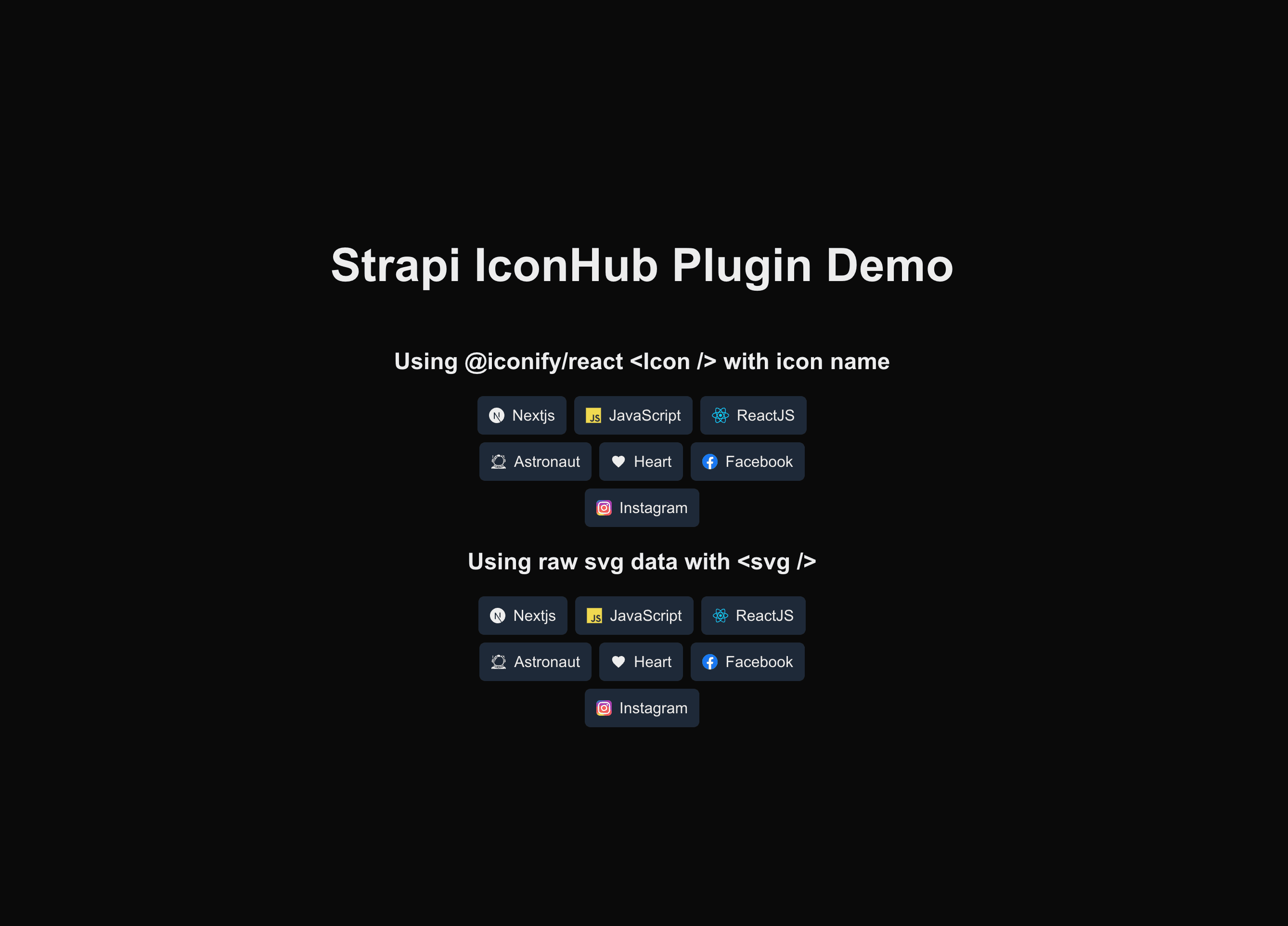
};Frontend Implementation
Next.js Example
import { Icon } from "@iconify/react";

type Tag = {
  name: string;
  icon: {
    iconName: string;
    iconData: string;
    width?: number;
    height?: number;
  };
};

export default async function Home() {
  const res = await fetch("http://localhost:1337/api/tags");
  const json = await res.json();
  const tags: Tag[] = json.data;

  return (
    <div className="w-full h-screen flex flex-col justify-center items-center gap-5">
      <h1 className="text-5xl font-semibold mb-10">Strapi IconHub Demo</h1>

      {/* Iconify Implementation */}
      <section className="text-center">
        <h2 className="text-2xl font-semibold mb-4">Iconify Component</h2>
        <div className="flex flex-wrap gap-2 justify-center">
          {tags.map((tag, i) => (
            <div key={i} className="bg-gray-800 px-3 py-2 rounded flex items-center gap-2">
              <Icon icon={tag.icon.iconName} />
              <span>{tag.name}</span>
            </div>
          ))}
        </div>
      </section>

      {/* Raw SVG Implementation */}
      <section className="text-center mt-10">
        <h2 className="text-2xl font-semibold mb-4">Raw SVG</h2>
        <div className="flex flex-wrap gap-2 justify-center">
          {tags.map((tag, i) => (
            <div key={i} className="bg-gray-800 px-3 py-2 rounded flex items-center gap-2">
              <svg
                width={tag.icon.width || 16}
                height={tag.icon.height || 16}
                viewBox={`0 0 ${tag.icon.width} ${tag.icon.height}`}
                dangerouslySetInnerHTML={{ __html: tag.icon.iconData }}
              />
              <span>{tag.name}</span>
            </div>
          ))}
        </div>
      </section>
    </div>
  );
}
Styling
Customize icons using CSS classes or inline attributes:
// Iconify
<Icon icon={icon.iconName} className="text-green-500 text-5xl" />

// Raw SVG
<svg
  width={48}
  height={48}
  className="text-green-500"
  viewBox={`0 0 ${icon.width} ${icon.height}`}
  dangerouslySetInnerHTML={{ __html: icon.iconData }}
/>
Note: SVGs from Iconify are safe to render with
dangerouslySetInnerHTML. Only use with trusted content sources.
Compatibility
- Strapi v4 & v5
- TypeScript
- Modern frontend frameworks (Next.js, Vue, etc.)