
Package Exports
- @code4bones/react-tree-menu-property-grid
- @code4bones/react-tree-menu-property-grid/build/index.esm.js
- @code4bones/react-tree-menu-property-grid/build/index.js
This package does not declare an exports field, so the exports above have been automatically detected and optimized by JSPM instead. If any package subpath is missing, it is recommended to post an issue to the original package (@code4bones/react-tree-menu-property-grid) to support the "exports" field. If that is not possible, create a JSPM override to customize the exports field for this package.
Readme
TreeMenu / PropertyGrid


System default / Custom theme

| feature | sample |
|---|---|
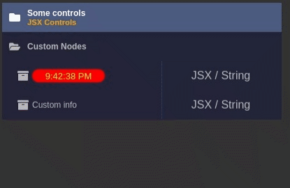 |
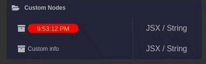 |
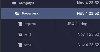 |
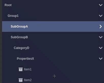 |
clone, samples available via yarn storybook
Brief
yarn add @code4bones/react-tree-menu-property-grid
import  {TreeMenu, TreeMenuActions,TreeMenuItem }  from "@code4bones/react-tree-menu-property-grid";
import "@code4bones/react-tree-menu-property-grid/build/styles.css";

const ITEMS : TreeMenuItem[] = [{
  id:"item1",
  title:"Item 1",
  // other TreeMenuItem's props
    childs:[{
     id:"sub",
     title:"Subitem 1",
   }]
}];

// if your need to use exponsed actions
const ref = createRef<TreeMenuActions>();

<TreeMenu
  ref={ref}
  items={ITEMS}
  onClick={onClick}
/>
Properties
type RenderFn = (item:MenuItem) => React.ReactElement | undefined | null;
type RenderType = RenderFn | React.ReactElement;
| Propery name | Description | Signature |
|---|---|---|
treeID |
tree id | string |
propertyGrid |
property grid mode | boolean |
items[] |
tree menu items array | TreeMenuItem[] |
ref |
handle to TreeMenu methods | TreeMenuActions |
initialCollapsed |
initial tree state | boolean |
initialSelected |
initial selected item | item's id : string |
theme |
theme override class name | dark, light, custom name |
classPrefix |
container global prefix | string |
enableRotate |
Rotate collapse / expand icon | boolean |
infoStyle |
global custom style | boolean |
titleStyle |
global custom style | boolean |
infoReveal |
global info display modes | "always" |
badgeVisible |
display badge | boolean |
groupIconLeft |
group icon position | boolean |
onClick |
item click handler | onClick?:(item:TreeMenuItem) => void |
onToggle |
collapse / expand | onToggle?:(id?:string,collapsed?:boolean) => void; |
renderBadge |
item click handler | RenderType |
renderIcon |
Left side element of item | RenderType |
renderGroupState |
Group indicator | RenderType |
TreeMenuItem
    id:string;
    title:string | React.ReactElement;
    info?:string | React.ReactElement;
    badge?:string | React.ReactElement;
    control?:string | JSX.Element;
    infoReveal?:InfoReveal;
    icon?:React.ReactElement;
    badge?:string | React.ReactElement;
    disabled?:boolean;
    unselectable?:boolean;
    titleClass?:string;
    infoClass?:string;
    style?:React.CSSProperties;
    titleStyle?:React.CSSProperties;
    infoStyle?:React.CSSProperties;
TreeMenuActions ( use ref )
    enable:(id:string,disable?:boolean) => void;
    getItem:(id:string) => TreeMenuItem | null;
    collapse:(id:string,collapsed?:boolean) => void;
    select:(id:string) => void;
      invalidate:() => void;
      rebuild:(items:TreeMenuItem[]) => void;
Sample
Sample available via storybook yarn storybook