
Package Exports
- @davzon/react-country-state-city
- @davzon/react-country-state-city/dist/cjs/index.js
- @davzon/react-country-state-city/dist/esm/index.js
- @davzon/react-country-state-city/dist/umd/index.js
This package does not declare an exports field, so the exports above have been automatically detected and optimized by JSPM instead. If any package subpath is missing, it is recommended to post an issue to the original package (@davzon/react-country-state-city) to support the "exports" field. If that is not possible, create a JSPM override to customize the exports field for this package.
Readme
React-country-state-city
React-country-state-city allows you to create a responsive country, state, city dropdown with search options.
Installation
$ npm install --save react-country-state-city
$ yarn add react-country-state-city
Features
- Easy to set up for real, you can make it work in less than 1minute!
- Super easy to customize
- Autosuggest: a list of matching countries is displayed when the input text changes.
- Country data is provided, State data is provided based on given country id, City data is provided based on given country id and state id.
- Country flag icons.
- onChange and onTextChange callbacks.
- And much more !
The gist
import {
CitySelect,
CountrySelect,
StateSelect,
} from "react-country-state-city";
import "react-country-state-city/dist/react-country-state-city.css";
function App() {
const [countryid, setCountryid] = useState(0);
const [stateid, setstateid] = useState(0);
return (
<div>
<h6>Country</h6>
<CountrySelect
onChange={(e) => {
setCountryid(e.id);
}}
placeHolder="Select Country"
/>
<h6>State</h6>
<StateSelect
countryid={countryid}
onChange={(e) => {
setstateid(e.id);
}}
placeHolder="Select State"
/>
<h6>City</h6>
<CitySelect
countryid={countryid}
stateid={stateid}
onChange={(e) => {
console.log(e);
}}
placeHolder="Select City"
/>
</div>
);
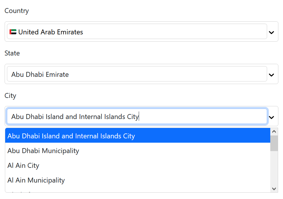
}City Example
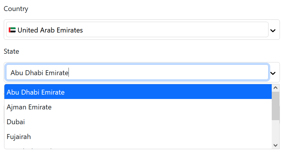
State Example
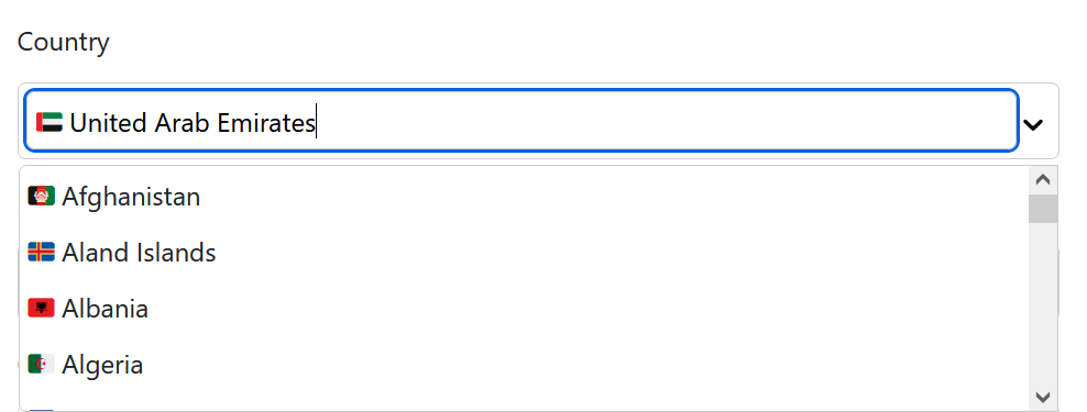
Country Example
The Country Select Properties
Properties used to customise the rendering:
| Name | Type | Description |
|---|---|---|
| defaultValue | Country | optional The current value: a country object |
| containerClassName | string | optional styles for a container |
| inputClassName | string | optional styles for input box |
| onChange | function | optional The current value: a country object.The argument is the country object |
| onTextChange | function | optional A callback fired when the input text changes. |
| placeHolder | string | optional Placeholder text displayed in empty input |
| showFlag | boolean | optional Flags are displayed when true and not displayed when false. default is true. |
State Select Properties
The same country select properties and additionally
| Name | Type | Description |
|---|---|---|
| countryid | number | required The id of the selected country object |
City Select Properties
The same country select properties and additionally
| Name | Type | Description |
|---|---|---|
| countryid | number | required The id of the selected country object |
| stateid | number | required The id of the selected state object |
Demo
A demo is worth a thousand words
Contribute
Show your ❤️ and support by giving a ⭐. Any suggestions are welcome! venkatmcajj@gmail.com
Financial Contributors
Become a financial contributor and help us sustain our community. Contribute
License
Licensed under MIT