
Package Exports
- @diatonic/piano
- @diatonic/piano/styles.css
Readme
Diatonic Piano

Interactive SVG piano as a React component.
Reference
Installation
npm install @diatonic/pianoThen import the component and default styles:
import { Piano } from "@diatonic/piano";
import "@diatonic/piano/styles.css";

function App() {
  return <Piano />;
}
Static Piano
By default, the piano will expand to fill its container. If you place the <Piano> tag inside a div with fixed width, you'll get a simple, static piano:
<Piano />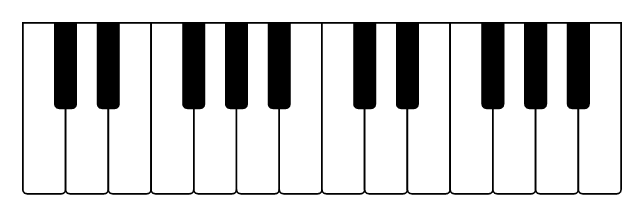
The following props can be set to modify the static piano:
| Prop | Description | Default |
|---|---|---|
| octaves | Number of octaves | 2 |
| width | Width of the <svg> element | '100%' |
| height | Height of the <svg> element | '100%' |
| preserveAspectRatio | Attribute for <svg> element (details) | 'xMinYMin meet' |
Pressed and Highlighted keys
Two props can be used to set a key as pressed or highlighted. There are no real differences between the two, but it can be used to separate permanently pressed keys from the key currently being hovered, or to mark a chord and a scale at the same time. The two props are:
| Prop | Description | Default |
|---|---|---|
| pressed | Keys will be pressed | [] |
| highlighted | Keys will be highlighted | [] |
As an example, you can press F4, A4, and C#5 to highlight an F augmented chord:
<Piano pressed={["F4", "A4", "C#5"]} />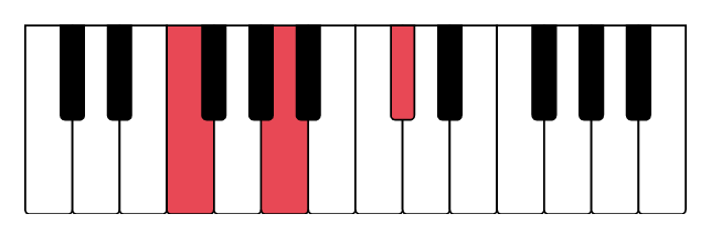
Internally, the component uses kamasi to figure out which notes to highlight. The component also accepts kamasi objects as input. So if your cool friends want to improvise over a D minor blues scale, you're just a single line from knowing which keys to use:
import { scale } from "kamasi";

<Piano highlighted={scale("D blues minor")} />;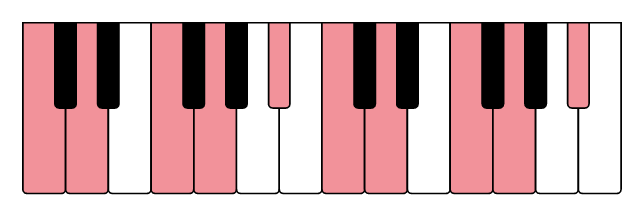
Styling
The piano is styled using a CSS-first approach. You have three ways to customize the appearance:
Basic CSS Styling
Import the default styles to get a classic black and white piano:
import "@diatonic/piano/styles.css";CSS Variables
The easiest way to customize colors is with CSS variables:
:root {
  /* White keys */
  --piano-key-diatonic-fill: #f0f0f0;
  --piano-key-diatonic-pressed-fill: #4caf50;
  --piano-key-diatonic-highlighted-fill: #81c784;
  --piano-key-diatonic-stroke: #333;

  /* Black keys */
  --piano-key-chromatic-fill: #333;
  --piano-key-chromatic-pressed-fill: #4caf50;
  --piano-key-chromatic-highlighted-fill: #81c784;
  --piano-key-chromatic-stroke: #000;

  /* Global */
  --piano-key-stroke-width: 4;
}
All available CSS variables:
| Variable | Description | Default |
|---|---|---|
--piano-key-diatonic-fill |
White key default color | #fff |
--piano-key-diatonic-pressed-fill |
White key pressed color | #E84855 |
--piano-key-diatonic-highlighted-fill |
White key highlighted color | #F2929A |
--piano-key-chromatic-fill |
Black key default color | #000 |
--piano-key-chromatic-pressed-fill |
Black key pressed color | #E84855 |
--piano-key-chromatic-highlighted-fill |
Black key highlighted color | #F2929A |
--piano-key-diatonic-stroke |
White key border color | #000 |
--piano-key-chromatic-stroke |
Black key border color | #000 |
--piano-key-stroke-width |
Border width for all keys | 4 |
--piano-key-diatonic-pressed-stroke |
(Optional) White key pressed border | Falls back to base |
--piano-key-diatonic-highlighted-stroke |
(Optional) White key highlighted border | Falls back to base |
--piano-key-chromatic-pressed-stroke |
(Optional) Black key pressed border | Falls back to base |
--piano-key-chromatic-highlighted-stroke |
(Optional) Black key highlighted border | Falls back to base |
Advanced CSS Targeting
For maximum control, target CSS classes and data attributes directly:
Classes:
| Class | Description |
|---|---|
.diatonic-piano |
Top <svg> component |
.diatonic-piano-octave-<n> |
The <g> tag grouping all keys within one octave |
.diatonic-piano-key |
The <path> tag for all keys |
.diatonic-piano-key-<pitchclass> |
All keys of this pitch class (e.g., C, Cs) |
.diatonic-piano-key-<pitch> |
Specific key (e.g., C4, Cs4) |
Data attributes:
| Attribute | Values | Description |
|---|---|---|
data-key-type |
diatonic, chromatic |
White or black key |
data-pressed |
true, false |
Whether the key is pressed |
data-highlighted |
true, false |
Whether the key is highlighted |
Example: Rainbow keys
/* Using a parent class ensures proper specificity */
#rainbow-piano {
  --piano-key-diatonic-stroke: #999;
  --piano-key-stroke-width: 2;
}
#rainbow-piano .diatonic-piano-key-G4 {
  fill: #f898a4;
}
#rainbow-piano .diatonic-piano-key-A4 {
  fill: #fcda9c;
}
#rainbow-piano .diatonic-piano-key-B4 {
  fill: #f7faa1;
}
#rainbow-piano .diatonic-piano-key-C5 {
  fill: #b4f6a4;
}
#rainbow-piano .diatonic-piano-key-D5 {
  fill: #9be0f1;
}
#rainbow-piano .diatonic-piano-key-E5 {
  fill: #a2aceb;
}<div id="rainbow-piano">
<Piano />
</div>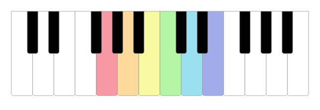
Example: State-specific styling
/* Different stroke colors for pressed and highlighted states */
.diatonic-piano-key[data-pressed="true"] {
  stroke: darkred;
  stroke-width: 3;
}

.diatonic-piano-key[data-highlighted="true"] {
  stroke: lightblue;
  stroke-width: 2;
}
Interactivity
You can add interactivity using the onClick, onMouseEnter, onMouseLeave, onFocus, and onBlur events.
| Prop | Description |
|---|---|
| onClick | Called with note string when a key is pressed |
| onMouseEnter | Called with note string when the cursor enters a key |
| onMouseLeave | Called with note string when the cursor leaves a key |
| onFocus | Called with note string when a key receives focus (when focusable) |
| onBlur | Called with note string when a key loses focus (when focusable) |
The component does not have any internal state, and relies on the parent component to update the piano if you want to press or highlight keys. This gives the caller full control over how the piano can be used, and allows synchronization with other components.
Using React hooks, you only need a few lines of code to accomplish this. The following is the complete App.js file of two pianos, where the second mirrors the first, but transposed a perfect fifth.
import { useState } from "react";
import { Piano } from "@diatonic/piano";
import { NoteList } from "kamasi";

function App() {
  const [pressed, setPressed] = useState(new NoteList());
  const [highlighted, setHighlighted] = useState(new NoteList());

  return (
    <div style={{ width: "300px" }}>
      <Piano
        pressed={pressed}
        highlighted={highlighted}
        onClick={(n) => setPressed((state) => state.toggle(n))}
        onMouseEnter={(n) => setHighlighted(new NoteList([n]))}
        onMouseLeave={() => setHighlighted(new NoteList())}
      />
      <Piano
        pressed={pressed.transpose("P5")}
        highlighted={highlighted.transpose("P5")}
      />
    </div>
  );
}

export default App;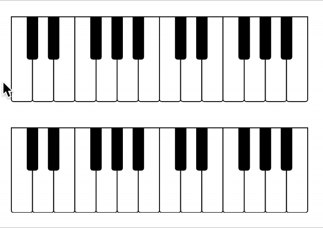
See kamasi's documentation for more manipulation you can do, or check the Diatonic web site for inspiration.
Accessibility
If you enable interactivity through use of the mouse, it's strongly encouraged that you also enable keyboard access for users who can't (or prefer not to) use a mouse or track pad. The component offers two compatible modes of keyboard access:
| Prop | Description | Default |
|---|---|---|
| keyboardShortcuts | Enables keyboard control of piano keys | false |
| focusable | Enables browser keyboard navigation with <tab> and <Enter> | false |
The keyboardShortcuts prop makes the keyboard into a virtual piano. 'Q'–'U' is used for the third octave, 'A'–'J' for the fourth, and 'Z'–'M' for the fifth. 'Shift' will increase the pitch by a half tone, allowing you to play the black keys.
The focusable prop allows the user to traverse through the keys in chromatic order (left to right) using <tab>, and activate a key with <Enter>. This works for all visible keys on the piano. For visual feedback, you can use the onFocus and onBlur handlers to update the highlighted prop, just like you would with onMouseEnter and onMouseLeave for hover effects.