
Package Exports
- @iamkoushik/kp-textinput
This package does not declare an exports field, so the exports above have been automatically detected and optimized by JSPM instead. If any package subpath is missing, it is recommended to post an issue to the original package (@iamkoushik/kp-textinput) to support the "exports" field. If that is not possible, create a JSPM override to customize the exports field for this package.
Readme
KPTextInput
A simple react-native implementation of TextInput.
Features
- Can be used as a Custom TextInput
- Custom Styling
- Supports Password show/hide
- Supports Label Text as TextInput Label
Getting started
Install the library using either Yarn:
npm i @iamkoushik/kp-textinputor yarn:
js
yarn add @iamkoushik/kp-textinput
Usage
import KPTextInput from '@iamkoushik/kp-textinput';
const App = () => {
const [value, setValue] = useState('');
return (
<View>
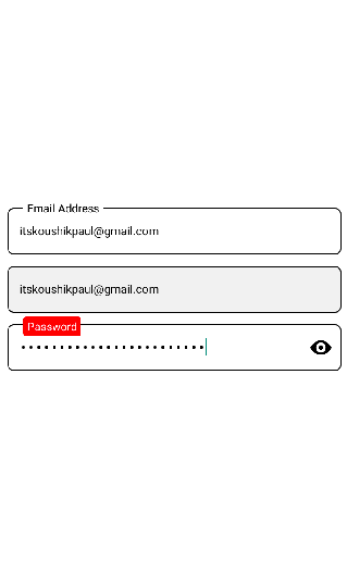
<KPTextInput
textboxStyle={{ height: 48, fontSize: 14, marginTop: 12 }}
placeholder="Email Address"
textboxvalue={value}
type={"email-address"}
isPassword={false}
onChangeText={(value) => setValue(value)}
keyboardType={"default"}
labelplaceholder="Email Address"
/>
<KPTextInput
textboxStyle={{ height: 48, fontSize: 14, marginTop: 12 }}
placeholder="Email Address"
textboxvalue={value}
type={"email-address"}
isPassword={false}
onChangeText={(value) => setValue(value)}
keyboardType={"default"}
editable={false} // Can't edit now
isShowLabel={false} // Not to show the label text
/>
<KPTextInput
labelBackgroundColor="red"
customlabelStyle={{ borderRadius: 3, padding: 2 }}
labelTextColor="#fff"
textboxStyle={{ height: 48, fontSize: 15, marginTop: 12, fontWeight: 'bold' }}
placeholder="Password"
textboxvalue={value}
type={"email-address"}
isPassword={true} // To show the TextInput as Password field
onChangeText={(value) => setValue(value)}
keyboardType={"default"}
showPassword={true}
labelplaceholder="Password"
/>
</View>
)
}Properties
| Name | Type | Description | Default |
|---|---|---|---|
textboxStyle |
Object | Custom styling | {} |
textboxvalue |
String | value of the textinput | '' |
isPassword |
Boolean | To show as Password | false |
isShowLabel |
Boolean | To show the label | false |
showPassword |
Boolean | To show the eye-icon | false |
editable |
Boolean | To restrict the edit mode | false |
onChangeText |
Function (value: String) | Function called when user start typing | null |
labelBackgroundColor |
String | Background color of the Label text | "#fff" |
labelTextColor |
String | Text color of the Label | "#000" |
Contributing
If you'd like to see something added or changed to this module please open a new GitHub issue. Pull requests are always welcome.
License
© Koushik Paul