
Package Exports
- @jentic/arazzo-ui
- @jentic/arazzo-ui/standalone
- @jentic/arazzo-ui/styles.css
Readme
@jentic/arazzo-ui
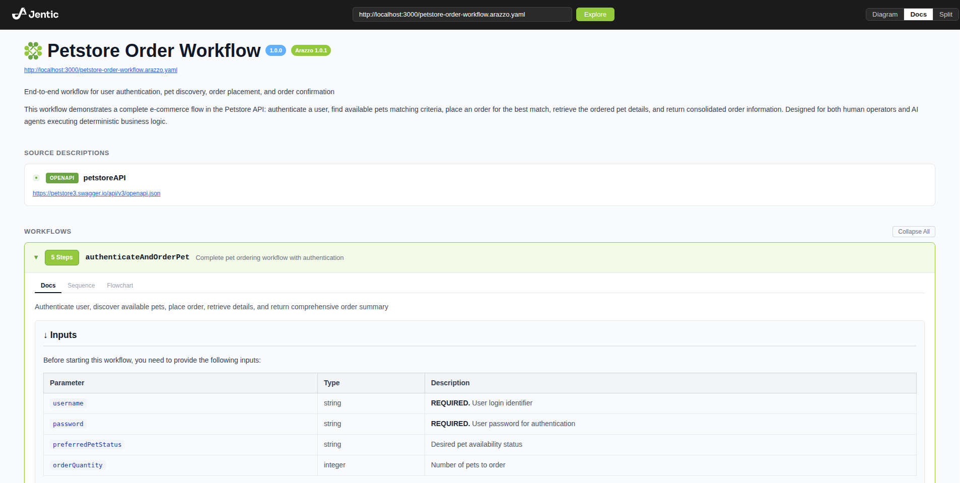
@jentic/arazzo-ui is a UI component for visualizing Arazzo Specification workflows.
It provides interactive diagram views, documentation views, and a split view combining both.
Load any Arazzo Document by appending a ?document= query parameter:
https://arazzo-ui.jentic.com?document=https://arazzo-ui.jentic.com/petstore-order-workflow.arazzo.yamlSupported Arazzo versions:
Installation
You can install this package via npm CLI by running the following command:
npm install @jentic/arazzo-uiPeer dependencies: React 18 or 19 (react and react-dom).
CLI
Open any Arazzo document in the browser without installing anything locally:
# from a URL
npx @jentic/arazzo-ui https://arazzo-ui.jentic.com/petstore-order-workflow.arazzo.yaml

# from a local file
npx @jentic/arazzo-ui ./workflow.arazzo.yaml
This opens https://arazzo-ui.jentic.com with the document pre-loaded.
Local files are passed via the URL fragment (#document=), so the document content is never sent to the server.
The resulting URL is also shareable if the workflow size is not too large.
Components
ArazzoUI
Headless viewer controlled entirely via props. Use this when you need full control over the surrounding layout and view switching.
import { useState } from 'react';
import { ArazzoUI } from '@jentic/arazzo-ui';
import '@jentic/arazzo-ui/styles.css';

function App() {
  const [view, setView] = useState('split');

  return (
    <ArazzoUI
      document="https://example.com/workflow.arazzo.yaml"
      view={view}
      onViewChange={setView}
    />
  );
}
ArazzoUIStandalone
Self-contained viewer with a built-in header including the Jentic logo, a URL input for loading documents, and a view mode toggle. Use this for a drop-in widget that works without any external UI.
import { ArazzoUIStandalone } from '@jentic/arazzo-ui/standalone';
import '@jentic/arazzo-ui/styles.css';

function App() {
  return (
    <ArazzoUIStandalone
      document="https://example.com/workflow.arazzo.yaml"
      initialView="docs"
    />
  );
}
UMD (script tag)
Both components are available as UMD builds that bundle all dependencies into a single file and expose an imperative API. Build artifacts are located in ./dist/:
| File | Description |
|---|---|
dist/arazzo-ui.js |
ArazzoUI UMD bundle |
dist/arazzo-ui-standalone.js |
ArazzoUIStandalone UMD bundle |
dist/arazzo-ui.css |
Required stylesheet |
ArazzoUI
<link rel="stylesheet" href="dist/arazzo-ui.css" />
<div id="root"></div>
<script src="dist/arazzo-ui.js"></script>
<script>
  const ui = ArazzoUI({
    dom_id: '#root',
    document: 'https://example.com/workflow.arazzo.yaml',
    view: 'split',
  });

  // ui.getRef()   — access the imperative ref API
  // ui.unmount()  — remove the component from the DOM
</script>
ArazzoUIStandalone
<link rel="stylesheet" href="dist/arazzo-ui.css" />
<div id="root"></div>
<script src="dist/arazzo-ui-standalone.js"></script>
<script>
  const ui = ArazzoUIStandalone({
    dom_id: '#root',
    document: 'https://example.com/workflow.arazzo.yaml',
  });

  // ui.getRef()   — access the imperative ref API
  // ui.unmount()  — remove the component from the DOM
</script>
Document sources
The document prop accepts multiple input types:
- URL string — fetches and parses a remote Arazzo document (JSON or YAML)
- String content — parses inline Arazzo JSON or YAML
- ArazzoDocument object — uses the document directly
// From URL
<ArazzoUI document="https://example.com/workflow.arazzo.yaml" view="docs" />

// From inline YAML string
<ArazzoUI document={yamlString} view="docs" />

// From object
<ArazzoUI document={arazzoDocumentObject} view="docs" />
When the document is a URL, it is displayed below the title in the docs view.
View modes
The view prop (or initialView for standalone) controls the display:
| Mode | Description |
|---|---|
diagram |
Interactive React Flow diagram of workflows |
docs |
Documentation view with workflow details, steps, parameters, and actions |
split |
Side-by-side diagram and docs |
In split view, clicking a step node in the diagram expands the workflow and scrolls to that step in the docs pane. Switching workflow tabs in the diagram scrolls to the corresponding workflow in docs.
Props
ArazzoUIProps
| Prop | Type | Default | Description |
|---|---|---|---|
document |
ArazzoDocument | string |
required | Arazzo document, URL, or inline content |
view |
'diagram' | 'docs' | 'split' |
'docs' |
Active view mode |
activeWorkflowId |
string | null |
first workflow | Currently active workflow |
selectedNodeId |
string | null |
null |
Currently selected diagram node |
className |
string |
— | CSS class for the root element |
style |
CSSProperties |
— | Inline styles for the root element |
onNodeSelect |
(nodeId, node) => void |
— | Called when a diagram node is clicked |
onEdgeSelect |
(edgeId, edge) => void |
— | Called when a diagram edge is clicked |
onWorkflowSelect |
(workflowId) => void |
— | Called when a workflow tab is selected |
onViewChange |
(view) => void |
— | Called when the view mode changes |
ArazzoUIStandaloneProps
Inherits all ArazzoUIProps except view, plus:
| Prop | Type | Default | Description |
|---|---|---|---|
initialView |
'diagram' | 'docs' | 'split' |
'docs' |
Initial view mode (managed internally) |
Ref API
Both components expose an imperative API via React ref:
const ref = useRef(null);

<ArazzoUI ref={ref} document={doc} view="diagram" />

// Later:
ref.current.fitView();
ref.current.setZoom(1.5);
ref.current.setActiveWorkflow('myWorkflow');
ref.current.selectStep('step1');
ref.current.clearSelection();
ref.current.getDocument();
ref.current.getActiveWorkflowId();
ref.current.getSelectedStepId();