
Package Exports
- @miblanchard/react-native-slider
- @miblanchard/react-native-slider/lib/index.js
This package does not declare an exports field, so the exports above have been automatically detected and optimized by JSPM instead. If any package subpath is missing, it is recommended to post an issue to the original package (@miblanchard/react-native-slider) to support the "exports" field. If that is not possible, create a JSPM override to customize the exports field for this package.
Readme
@miblanchard/react-native-slider


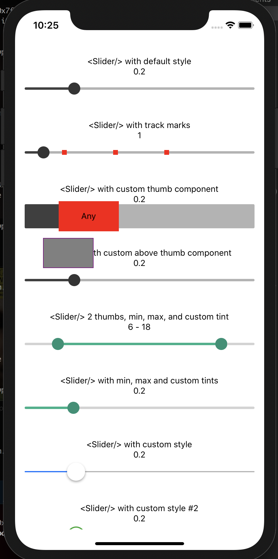
A pure JavaScript version of the <Slider> component for react-native and react-native-web. This can be a direct replacement for the Slider component from react-native/@react-native-community. Ideas and contributions are very welcome.
Try it out live on Expo Snack.
Install
yarn add @miblanchard/react-native-slideror
npm i --save @miblanchard/react-native-sliderVersion 1.x.x only supports React Native >= 0.59.0
| React Native version(s) | Supporting react-native-slider version(s) |
|---|---|
| v0.59.0+ | v1.x.x |
Usage
import React from 'react';
import {Slider} from '@miblanchard/react-native-slider';
import {AppRegistry, StyleSheet, View, Text} from 'react-native';

class SliderExample extends React.Component {
    state = {
        value: 0.2,
    };

    render() {
        return (
            <View style={styles.container}>
                <Slider
                    value={this.state.value}
                    onValueChange={value => this.setState({value})}
                />
                <Text>Value: {this.state.value}</Text>
            </View>
        );
    }
}

const styles = StyleSheet.create({
    container: {
        flex: 1,
        marginLeft: 10,
        marginRight: 10,
        alignItems: 'stretch',
        justifyContent: 'center',
    },
});

AppRegistry.registerComponent('SliderExample', () => SliderExample);
Props
| Prop | Type | Optional | Default | Description |
|---|---|---|---|---|
| animateTransitions | bool | Yes | false | Set to true if you want to use the default 'spring' animation |
| animationConfig | object | Yes | undefined | Used to configure the animation parameters. These are the same parameters in the Animated library. |
| animationType | string | Yes | 'spring | 'timing' | Set to 'spring' or 'timing' to use one of those two types of animations with the default animation properties. |
| containerStyle | style | Yes | The style applied to the container view around everything | |
| debugTouchArea | bool | Yes | false | Set this to true to visually see the thumb touch rect in green. |
| disabled | bool | Yes | false | If true the user won't be able to move the slider |
| maximumTrackTintColor | string | Yes | '#b3b3b3' | The color used for the track to the right of the button |
| maximumValue | number | Yes | 1 | Initial maximum value of the slider |
| minimumTrackTintColor | string | Yes | '#3f3f3f' | The color used for the track to the left of the button |
| minimumValue | number | Yes | 0 | Initial minimum value of the slider |
| onSlidingComplete | function | Yes | Callback called when the user finishes changing the value (e.g. when the slider is released) | |
| onSlidingStart | function | Yes | Callback called when the user starts changing the value (e.g. when the slider is pressed) | |
| onValueChange | function | Yes | Callback continuously called while the user is dragging the slider | |
| renderAboveThumbComponent | function | Yes | null | Function which returns a custom Component of your liking to be rendered above the thumb and pass as props index of a thumb starting from 0 and its current value. |
| renderBelowThumbComponent | function | Yes | null | Function which returns a custom Component of your liking to be rendered below the thumb and pass as props index of a thumb starting from 0 and its current value. |
| renderThumbComponent | function | Yes | null | Function which returns a custom Component of your liking to be rendered within the thumb. |
| renderTrackMarkComponent | function | Yes | null | Function which returns a custom Component of your liking to be rendered on top of the slider truck at the values provided by trackMarks property. It accepts an index of a mark from trackMarks array the method is being executed for. |
| step | number | Yes | 0 | Step value of the slider. The value should be between 0 and maximumValue - minimumValue) |
| thumbImage | source | Yes | Sets an image for the thumb. | |
| thumbStyle | style | Yes | The style applied to the thumb | |
| thumbTintColor | string | Yes | '#343434' | The color used for the thumb |
| thumbTouchSize | object | Yes | {width: 40, height: 40} |
The size of the touch area that allows moving the thumb. The touch area has the same center as the visible thumb. This allows to have a visually small thumb while still allowing the user to move it easily. |
| trackClickable | bool | Yes | false | If true the user will be able to click anywhere on the track to set the value to that position. |
| trackMarks | Array | Yes | The value should be an array of numbers between minimumValue and maximumValue. In order to render a mark on top of the slider track at provided numbers renderTrackMarkComponent property should also be provided. |
|
| trackRightPadding | number | Yes | The padding that extends the track after the maximumValue (if not specified it will use the width of the thumb component) | |
| trackStyle | style | Yes | The style applied to the track | |
| minimumTrackStyle | style | Yes | The style applied to the track left of the thumb | |
| maximumTrackStyle | style | Yes | The style applied to the track right of the thumb | |
| value | number or Array | Yes | 0 | Initial value of the slider. The value should be a number or array of numbers between minimumValue and maximumValue, which default to 0 and 1 respectively. Default value is 0. This is not a controlled component, e.g. if you don't update the value, the component won't be reset to its inital value. |