
Package Exports
- @pspatel/react-native-app-intro
This package does not declare an exports field, so the exports above have been automatically detected and optimized by JSPM instead. If any package subpath is missing, it is recommended to post an issue to the original package (@pspatel/react-native-app-intro) to support the "exports" field. If that is not possible, create a JSPM override to customize the exports field for this package.
Readme
React Native App Intro


This project is a React Native onboarding library that can be used to beautify user onboarding experience.
The library is completely written in typescript and highly customizable.
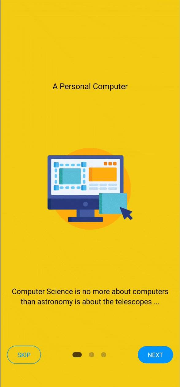
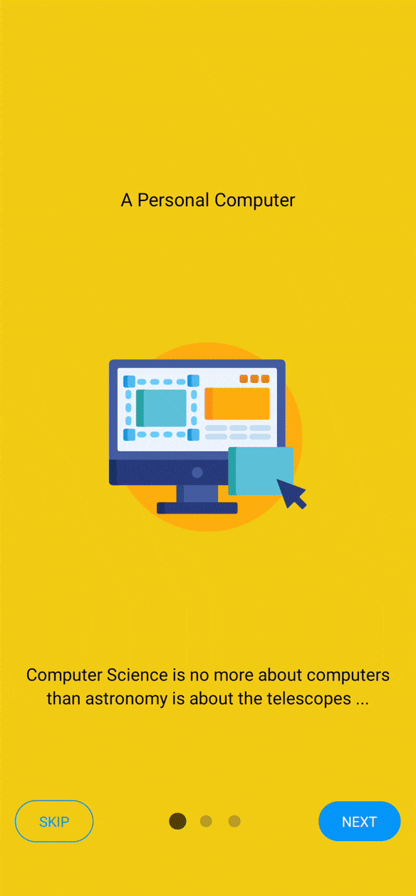
Demo
| Expand | Scale Dot | Slide Dot | Slide Border |
|---|---|---|---|
 |
 |
 |
 |
Library Highlights
Some of the key highlights of this library is as below:
- Beautiful pagination animations.
- Custom pagination component support.
- Custom Next and Skip button component support.
- Completely written in typescript.
- Cross-platform support.
- Highly customizable.
Properties
Interfaces
// page indicator animation whlie changing screen.
type animationType =
  | "sliding-border"
  | "sliding-dot"
  | "scaling-dot"
  | "expanding";

interface renderSkipButtonProps {
  activeIndex: number;
  totalSlides: number;
  goToSlide: (slideNumber: number) => void;
  onSkipPress: () => void; // same function that you sent via BottomProps
}

interface renderNextButtonProps {
  activeIndex: number;
  totalSlides: number;
  goToSlide: (slideNumber: number) => void;
  isLastPage: boolean;
  onNextPress: (activeIndex: number, nextIndex: number) => void; // same function that you sent via BottomProps
}

// Bottom Button Props
interface BottomProps {
  showSkipButton?: boolean;
  skipButtonText?: string;
  nextButtonText?: string;
  skipTextStyle?: StyleProp<TextStyle>;
  nextTextStyle?: StyleProp<TextStyle>;
  skipContainerStyle?: StyleProp<ViewStyle>;
  nextContainerStyle?: StyleProp<ViewStyle>;
  bottomContainerStyle?: StyleProp<ViewStyle>;
  onSkipPress?: () => void;
  onNextPress?: (activeIndex: number, nextIndex: number) => void;
  onDonePress?: () => void;
  renderSkipButton?: (props: renderSkipButtonProps) => ReactNode; // To render custom Skip button. Refer RenderSkipButtonProps Interface above for further details.
  renderNextButton?: (props: renderNextButtonProps) => ReactNode; // To render custom Next button. Refer RenderNextButtonProps Interface above for further details.
}

// Pagination component props
interface PaginationProps {
  activeDotColor?: string;
  inactiveDotColor?: string;
  dotSize?: number;
  dotSpacing?: number;
  animationType?: animationType;
  dotStyle?: StyleProp<ViewStyle>;
  containerStyle?: StyleProp<ViewStyle>;
  activeDotStyle?: StyleProp<ViewStyle>;
}

// Page Component Props
interface PageProps {
  title: string;
  image: ImageSourcePropType;
  description?: string;
  containerStyle?: StyleProp<ViewStyle>;
  titleStyle?: StyleProp<TextStyle>;
  imageStyle?: StyleProp<ImageStyle>;
  descriptionStyle?: StyleProp<TextStyle>;
}| Property Name | Expected Type | Default Value | Required |
|---|---|---|---|
| showPagination | boolean | false | - |
| paginationProps | Pagination Props | undefined | - |
| buttonProps | Bottom Props | undefined | - |
| renderPagination | ( activeIndex:number , totalSlides:number ) => ReactNode | undefined | - |
| onSlideChange | (currentIndex: number, prevIndex: number) => void | undefined | - |
Start
To add this library, simply run :
$ npm install @pspatel/react-native-app-introor
$ yarn add @pspatel/react-native-app-introUsage
import React from "react";
import { View, Text } from "react-native";
import { IntroSlider } from "@pspatel/react-native-app-intro";

const Screen = ({ title }) => {
  return (
    <View style={{ flex: 1, justifyContent: "center", alignItems: "center" }}>
      <Text>{title}</Text>
    </View>
  );
};

const App = () => {
  return (
    <IntroSlider
      showPagination
      buttonProps={{
        showSkipButton: true,
      }}
    >
      <IntroSlider.Page
        title={"Any Title"}
        image={require("./path-to-image")}
        desciption={"screen description"}
        // Read more about supported props in interfaces section
      />
      <Screen title={"Screen 2"} />
      <Screen title={"Screen 3"} />
    </IntroSlider>
  );
};