Package Exports
- @ptdx/modal
- @ptdx/modal/dist/@ptdx-modal.es.js
- @ptdx/modal/dist/@ptdx-modal.umd.js
This package does not declare an exports field, so the exports above have been automatically detected and optimized by JSPM instead. If any package subpath is missing, it is recommended to post an issue to the original package (@ptdx/modal) to support the "exports" field. If that is not possible, create a JSPM override to customize the exports field for this package.
Readme
@ptdx/modal
@ptdx/modal is an accessible, customizable, and easy-to-integrate modal component for React projects. It uses React portals for rendering outside the DOM tree and follows best accessibility practices.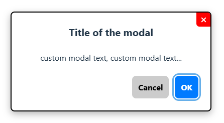


Try it here: https://ptdx-modal.vercel.app
npm i @ptdx/modal
GitHub
ReadMe Fr version
✨ Features
- ✅ Accessibility (WAI-ARIA, focus trap, close on
Escape) - ✅ Keyboard support and outside click detection
- ✅ Minimalist design, easy to customize
- ✅ Renders with
ReactDOM.createPortal
🚀 Installation
npm install @ptdx/modal🔧 Usage
import React, { useState } from 'react';
import { Modal } from '@ptdx/modal';

function App() {
  const [isOpen, setIsOpen] = useState(false);

  const handleConfirm = () => {
    // action to confirm
    setIsOpen(false);
  };

  return (
    <>
      <button onClick={() => setIsOpen(true)}>Open Modal</button>
      <Modal
        isOpen={isOpen}
        onClose={() => setIsOpen(false)}
        onConfirm={handleConfirm}
        title="Modal Title"
        content="Custom content text"
      />
    </>
  );
};

export default App;
🧩 Props
| Name | Type | Required | Description |
|---|---|---|---|
isOpen |
boolean |
✅ | Controls modal visibility |
onClose |
function |
✅ | Called when modal is closed |
onConfirm |
function |
❌ | Called when confirmation button is clicked |
title |
string | ReactNode |
❌ | Modal title, accepts a string or JSX |
content |
string | ReactNode |
❌ | Modal content, accepts a string or JSX |
confirmText |
string |
❌ | Confirmation button text default = 'OK' |
cancelText |
string |
❌ | Cancel button text default = 'Cancel' |
btnClose |
boolean |
❌ | Show close (X) button default = true |
showFooter |
boolean |
❌ | Show footer with action buttons default = true |
variant |
string |
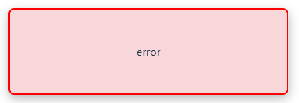
❌ | Modal color theme default = 'default' / options: 'success' or 'error' |
timeToClose |
number |
❌ | Auto-close delay in milliseconds default = null |
width |
string |
❌ | Modal width default = '400px' |
className |
string |
❌ | Custom class name default = 'modal-wrapper' |
🎨 Customization
The component uses base CSS classes. You can override them using your global stylesheet:
.your-custom-className {
    .modal-overlay {/*your css*/}
    .modal-container {/*your css*/}
    .modal-container-success {/*your css*/}
    .modal-container-error {/*your css*/}
    .modal-title {/*your css*/}
    .modal-content {/*your css*/}
    .modal-close {/*your css*/}
    .modal-footer {/*your css*/}
    .modal-border {
        --border-radius: Xpx;
        --border-width: Xpx;
        /*your css*/
    }
    .modal-btn {/*your css*/}
    .modal-btn-confirm {/*your css*/}
    .modal-btn-cancel {/*your css*/}
    .modal-btn:focus-visible,
    .modal-close:focus-visible {/*your css*/}
    .modal-forceFocusVisible {/*your css*/}
}
📦 Local Development
git clone https://github.com/PierreTDX/ptdx-modal.git
cd ptdx-modal
npm install
and to test the demo
cd demo
npm install
npm run dev
🛠 Tech Stack
- React
- Portals (
ReactDOM.createPortal) - Vite (development environment)
- Sass (development environment)
📄 License
MIT – © PierreTDX
🚨 Issues
Found a bug or have a suggestion? Feel free to open an issue.
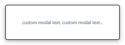
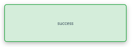
Modal Variants
Default Modal
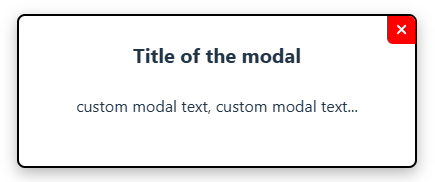
Modal without footer
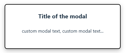
Modal without footer and close button
Modal without footer, close button, and title
Modal with success variant
Modal with error variant