
Package Exports
- @ratsmakemecrazy/react-gradient-progress
- @ratsmakemecrazy/react-gradient-progress/build/index.js
This package does not declare an exports field, so the exports above have been automatically detected and optimized by JSPM instead. If any package subpath is missing, it is recommended to post an issue to the original package (@ratsmakemecrazy/react-gradient-progress) to support the "exports" field. If that is not possible, create a JSPM override to customize the exports field for this package.
Readme
React Gradient Progress
Simple and light gradient-enabled circular progressbar for reactjs/nextjs
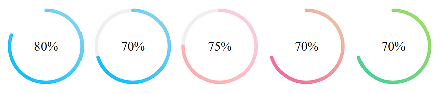

Installation
Using npm
npm i -s react-gradient-progressBasic Usage
import {CircleProgress} from 'react-gradient-progress'

<CircleProgress percentage={75} strokeWidth={8} />
Props
| Name | Description |
|---|---|
percentage |
Percentage progress. Required. |
width |
Width of the progressbar container in px. Default: 200. |
strokeWidth |
The stroke width of the progress bar. Default: 5. |
strokeLinecap |
Stroke linecap type. Default: 'round'. Accepted values: 'butt', 'round', 'square' |
fontSize |
The size of the percentage text. Default: '30px'. |
fontColor |
The color of the font. Default: 'inherit'. |
fontFamily |
Font family. Default: inherit. |
primaryColor |
The Gradient color. Should be an array of size 2. Default: ['#00BBFF', '#92d7f1']. |
secondaryColor |
The color of the uncovered percentage. Default: 'transparent'. |
fill |
Color to fill in the progressbar. Default: 'transparent'. |
Read more
Buy me a coffee if you like this repo

Contributing
Pull requests are welcome. For major changes, please open an issue first to discuss what you would like to change.
Please make sure to update tests as appropriate.