

Package Exports
- @roy-ui/ui
- @roy-ui/ui/button
- @roy-ui/ui/card
- @roy-ui/ui/checkbox
- @roy-ui/ui/data-table
- @roy-ui/ui/date-range-picker
- @roy-ui/ui/dropdown
- @roy-ui/ui/form
- @roy-ui/ui/gradient-button
- @roy-ui/ui/made-by
- @roy-ui/ui/notification-bell
- @roy-ui/ui/number-input
- @roy-ui/ui/package.json
- @roy-ui/ui/pagination
- @roy-ui/ui/popover
- @roy-ui/ui/radio-group
- @roy-ui/ui/stat-card
- @roy-ui/ui/switch
- @roy-ui/ui/table
- @roy-ui/ui/table-search
- @roy-ui/ui/text-morph
- @roy-ui/ui/textarea
- @roy-ui/ui/time-picker
- @roy-ui/ui/tree-nav
- @roy-ui/ui/upload-files
Readme
@roy-ui/ui
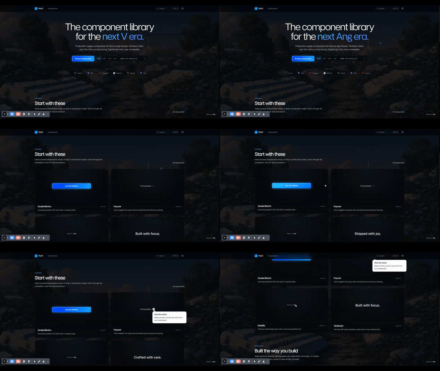
A modern React component library for Next.js 15, Vite, Remix, TanStack Start, and any React 18+ bundler. Ships a fully-featured React data table with search, date range picker, analog & digital time picker, pagination, column reorder / resize / hide, CSV / JSON export & import, per-zone typography, plus animated micro-interaction primitives — TypeScript-first, RSC-safe, tree-shakable ESM, zero config.





Why @roy-ui/ui?
You're building a React dashboard, admin panel, internal tool, or product UI in Next.js 15 App Router, Vite, Remix, Astro, or TanStack Start. You want a production-grade table component with filtering, paginate, sort, drag-to-reorder columns, resize, hide, export — without wiring up TanStack Table, AG Grid, or React Table from scratch. You want clean, animated micro-interaction components — without installing Tailwind, configuring PostCSS, or pulling in Framer Motion. You want TypeScript and React Server Component support out of the box.
@roy-ui/ui is that library. One npm install. One import. Production-ready.
- Drop-in React DataTable with search, date range, time, pagination, reorder, resize, hide, CSV / JSON IO
- Built-in custom date range picker — 2-month modal, hover-preview, presets, no
date-fnsrequired - Built-in custom time picker — analog wristwatch and digital, AM / PM toggle, user-switchable
- Animated primitives — gradient button with loading spinner, popover, text morph, tree nav, floating "Made by" badge
- Zero runtime config — no Tailwind plugin, no theme provider, no design-token setup
- TypeScript-first — tree-shakable ESM with first-class
.d.tstypes and source maps - RSC-safe (React Server Components-safe) —
"use client"boundary inside the bundle; import directly from a Next.js App Router server component - Framework-agnostic — Next.js, Vite, Remix, Astro (React island), TanStack Start, CRA, any ESM bundler
Install
npm install @roy-ui/ui
# or
pnpm add @roy-ui/ui
# or
yarn add @roy-ui/ui
# or
bun add @roy-ui/ui
Peer dependency: React 18 or newer (React 19 supported).
Quick start — React DataTable
'use client';

import { useState } from 'react';
import { DataTable, type Column } from '@roy-ui/ui';

type Order = {
  id: string;
  customer: string;
  total: number;
  placedAt: Date;
  status: 'paid' | 'pending' | 'refunded';
};

const columns: Column<Order>[] = [
  { key: 'id', header: 'Order', accessor: (r) => r.id, isRowHeader: true },
  { key: 'customer', header: 'Customer', accessor: (r) => r.customer },
  { key: 'status', header: 'Status', accessor: (r) => r.status },
  { key: 'placedAt', header: 'Placed', accessor: (r) => r.placedAt, type: 'date' },
  {
    key: 'time',
    header: 'Time',
    accessor: (r) => r.placedAt,
    type: 'time',
  },
  {
    key: 'total',
    header: 'Total',
    accessor: (r) => r.total,
    type: 'number',
    cell: (v) => `$${(v as number).toFixed(2)}`,
  },
];

export default function OrdersTable({ orders }: { orders: Order[] }) {
  const [data, setData] = useState(orders);

  return (
    <DataTable<Order>
      data={data}
      columns={columns}
      visibleRows={8}
      search={{ enabled: true, placeholder: 'Search orders' }}
      dateFilter={{ column: 'placedAt', monthsVisible: 2 }}
      timeFilter={{ column: 'time', variant: 'analog', toleranceMinutes: 60 }}
      pagination={{ pageSize: 25 }}
      dataIO={{
        export: { enabled: true, filename: 'orders' },
        import: { enabled: true, onImport: setData },
      }}
    />
  );
}
Using the Next.js App Router? Import directly from a Server Component — the interactive bits inside
@roy-ui/uicarry their own"use client"boundary.
What's in the box
Display / Data
| Component | What it does |
|---|---|
DataTable<T> |
Generic, fully-featured React data table. Search across columns, sort, paginate, drag headers to reorder, drag the right edge to resize, Columns menu to hide & restore, CSV / JSON export & import, per-zone typography for headers / row-headers / cells, optional fitColumns to disable horizontal scroll, optional localStorage persistence. |
Table + parts |
Standalone primitive — Table, TableHeader, TableBody, TableRow, TableHead, TableCell. Scrollable rows (visibleRows, default 7), sticky header, density scale (compact / cozy / comfortable), inline Spinner. |
TableSearch |
Debounced search input, clear button, controlled & uncontrolled modes. |
Pagination |
Numbered pages with text Prev / Next, ellipsis, optional Page X of Y summary. |
DateRangePicker |
Custom React date range picker — 2 (or N) months side-by-side in a popover, hover-preview the range, preset sidebar (Today / Last 7d / Last 30d / This month / Last month), min / max bounds, zero date-fns dependency. |
TimePicker |
Custom React time picker with two variants — analog clock face (drag the hour & minute hands, AM / PM segmented pill) and digital (scroll-wheel or arrow keys per segment). User can switch between them. 12h or 24h cycle, configurable minute step. |
Spinner |
Inline animated SVG spinner. Used as the default loading state across the library. |
TreeNav + TreeNavItem |
Sidebar sub-nav with file-explorer-style L-shaped branch connectors. Router-agnostic via asChild, active state driven by aria-current. |
TextMorph |
Character-by-character text diff animation — great for live counters, currency tickers, status text. |
MadeBy |
Floating "Made by ___" attribution badge with corner positioning. |
Inputs / Overlay
| Component | What it does |
|---|---|
GradientButton |
Animated blue → cyan → blue gradient CTA with a built-in loading spinner. |
Popover |
Accessible click-to-open popover with corner alignment (left / right) and width presets. |
DataTable feature matrix
| Feature | Prop / API | Notes |
|---|---|---|
| Search across all columns | search={{ enabled: true }} |
Debounced; override matcher with search.predicate |
| Date range filter on a column | dateFilter={{ column, monthsVisible }} |
2-month modal by default; pass any N |
| Time-of-day filter on a column | timeFilter={{ column, variant, toleranceMinutes }} |
variant: 'analog' | 'digital', both user-switchable |
| Click-to-sort | always on | Tri-state per column: asc → desc → off |
| Pagination | pagination={{ pageSize }} or false |
Text Prev / Next + numbered pages |
| Column drag-to-reorder | reorderable (default true) |
Native HTML5 DnD, drop indicator |
| Column resize | resizable (default true) |
Drag right edge of header; double-click resets |
| Column hide / restore | columnMenu (default true) |
"Columns" popover + hidden-count chip for instant restore |
| Pinned columns | pinned: 'left' | 'right' per column |
Excluded from reorder |
| CSV export | dataIO.export |
Built-in RFC 4180 writer |
| JSON export | dataIO.export |
Native JSON.stringify |
| CSV / JSON import | dataIO.import |
File picker → parsed rows → onImport |
| Per-zone fonts | headerFont, rowHeaderFont, cellFont |
Plus per-column font |
| Persist layout | storageKey |
Order, sizes, hidden state in localStorage |
| Disable horizontal scroll | fitColumns |
Columns auto-distribute; cells wrap |
| Loading state | loading |
Dims body, overlays inline Spinner |
| Custom empty slot | empty |
Any ReactNode |
| Generic over row type | DataTable<T> |
Full TypeScript inference |
Custom date range picker — standalone
'use client';

import { useState } from 'react';
import { DateRangePicker, type DateRange } from '@roy-ui/ui';

export function BookingPicker() {
  const [range, setRange] = useState<DateRange>({ from: null, to: null });

  return (
    <DateRangePicker
      value={range}
      onChange={setRange}
      monthsVisible={2}
      weekStartsOn={1}
      minDate={new Date()}
    />
  );
}
Custom time picker — analog and digital
'use client';

import { useState } from 'react';
import { TimePicker, type TimeValue } from '@roy-ui/ui';

export function ShiftStartPicker() {
  const [time, setTime] = useState<TimeValue | null>(null);

  return (
    <TimePicker
      value={time}
      onChange={setTime}
      variant="analog"     // or "digital" — user can also switch from the panel
      hourCycle={12}       // or 24
      minuteStep={5}
    />
  );
}
Standalone table primitives
If DataTable is more than you need, the primitives ship on their own.
import {
  Table,
  TableHeader,
  TableBody,
  TableRow,
  TableHead,
  TableCell,
} from '@roy-ui/ui';

<Table visibleRows={5} stickyHeader>
  <TableHeader>
    <TableRow>
      <TableHead>Order</TableHead>
      <TableHead>Customer</TableHead>
      <TableHead align="right">Total</TableHead>
    </TableRow>
  </TableHeader>
  <TableBody>
    {orders.map((o) => (
      <TableRow key={o.id}>
        <TableCell isRowHeader>{o.id}</TableCell>
        <TableCell>{o.customer}</TableCell>
        <TableCell align="right">${o.total.toFixed(2)}</TableCell>
      </TableRow>
    ))}
  </TableBody>
</Table>
React data table comparison — @roy-ui/ui vs TanStack Table vs AG Grid vs Material React Table
@roy-ui/ui (DataTable) |
TanStack Table v8 | AG Grid Community | Material React Table | |
|---|---|---|---|---|
| Ships visual styles | Yes | No (headless) | Yes | Yes (Material UI required) |
| Built-in date range filter | Yes | No (build it) | Enterprise only | No |
| Built-in time picker filter | Yes (analog + digital) | No | No | No |
| Built-in CSV / JSON export | Yes | No | Yes | Partial |
| Drag-to-reorder columns | Yes (native, no deps) | Manual + DnD lib | Yes | Yes (Material UI) |
| Column resize | Yes | Manual | Yes | Yes |
| Column hide / show menu | Yes | Manual | Yes | Yes |
| Required dependency tree | React only | React only | @ag-grid-community/* |
@mui/* + @tanstack/* |
| RSC-safe with Next.js App Router | Yes | Manual | Manual | Manual |
TypeScript-first generic over row type T |
Yes | Yes | Partial | Yes |
| License | MIT | MIT | MIT (community) | MIT |
When to use each:
- Need maximum flexibility, no styles, you wire everything? Use TanStack Table v8.
- Need Excel-style spreadsheet with pivot, master-detail, infinite scroll, enterprise license? Use AG Grid.
- Already deep in Material UI? Use Material React Table.
- Need a clean, modern React data table with search + date range + time + paginate + reorder + resize + hide + CSV / JSON working out of the box in a Next.js app, zero setup? Use
@roy-ui/ui.
React UI library comparison — @roy-ui/ui vs shadcn/ui vs Aceternity vs MUI vs Radix
@roy-ui/ui |
shadcn/ui | Aceternity / Magic UI | Radix / Headless UI | MUI | |
|---|---|---|---|---|---|
Single npm install (no CLI, no copy) |
Yes | No (copy-paste CLI) | No (copy-paste) | Yes | Yes |
| Ships visual styles | Yes | Yes | Yes | No | Yes |
| RSC-safe out of the box | Yes | Yes | Manual | Manual | Manual |
| Tailwind required | No | Yes | Yes | No | No |
| Framer Motion required | No | No | Yes | No | No |
| Animation built in | Yes | Sometimes | Yes | No | Sometimes |
| Ships a full DataTable | Yes | No (build it) | No | No | Partial (DataGrid is paid) |
Theming
Every component exposes its visual surface as CSS custom properties. Override on the component, on a parent class, or globally on :root.
.royui-table {
  --royui-table-bg: #ffffff;
  --royui-table-fg: #141414;
  --royui-table-border: rgba(20, 20, 20, 0.1);
  --royui-table-header-bg: #f7f7f7;
  --royui-table-cell-size: 14px;
  --royui-table-cell-font: 'Inter', system-ui, sans-serif;
}
A dark scheme override ships under @media (prefers-color-scheme: dark) for every component.
Framework support
| Framework | Status |
|---|---|
| Next.js 13 / 14 / 15 (App Router) | Supported |
| Next.js (Pages Router) | Supported |
| Vite + React 18 / 19 | Supported |
| Remix | Supported |
| Astro (React island) | Supported |
| TanStack Start | Supported |
| Create React App | Supported |
| Plain React 18+ + ESM bundler | Supported |
FAQ
Is this a free React data table library? Yes. MIT licensed, free for personal and commercial use, no paid tier.
Does the DataTable work with React Server Components?
Yes. The component carries its own "use client" boundary inside the published bundle, so you can render <DataTable /> from a Next.js App Router server component without manually marking the file.
Is Tailwind CSS required? No. Styles are scoped CSS, side-effect imported by each component. No Tailwind plugin, no PostCSS config, no theme provider.
Can I use this with TanStack Table?
Yes, but you don't need to — the DataTable here ships its own state pipeline (search → date filter → time filter → sort → paginate) and column-layout state (order, sizes, hidden). If you already use TanStack Table, use the Table, TableHead, TableRow, TableCell primitives from @roy-ui/ui for styles and wire your TanStack instance to them.
How do I render every column without a horizontal scrollbar?
Pass fitColumns to <DataTable /> — columns will share the container width and cell content wraps instead of overflowing.
Can I persist the user's column layout?
Yes — pass storageKey="orders-table" to <DataTable /> and column order, sizes, and hidden state are saved to localStorage.
Is there a CSV import / export built in?
Yes. dataIO.export.enabled adds an Export button; dataIO.import.enabled adds an Import button with a file picker. CSV writer is RFC 4180; parser handles quoted fields and escaped quotes. JSON IO is also built in. Bring your own parser via dataIO.import.parse for Excel / Parquet / etc.
Links
- Live documentation: https://roy-ui-docs.vercel.app
- Source code: https://github.com/DibbayajyotiRoy/RoyUI
- Issues: https://github.com/DibbayajyotiRoy/RoyUI/issues
- Releases: https://github.com/DibbayajyotiRoy/RoyUI/releases
- npm: https://www.npmjs.com/package/@roy-ui/ui
License
Keywords: react data table · react data grid · react table component · react table library · react table with search and pagination · react table drag and drop columns · react resizable table · react table csv export · react table json export · react date range picker · custom react date picker · two month date range picker · react time picker · analog clock react · digital time picker react · react time range · react pagination component · react table primitives · headless table react · react component library · react ui library · react ui kit · typescript react components · next.js 15 components · next.js app router components · react server components · rsc-safe · vite react components · remix ui components · astro react components · tanstack start components · tanstack table alternative · ag-grid alternative · ag grid community alternative · material react table alternative · mui datagrid alternative · react table v7 alternative · react table v8 alternative · shadcn ui alternative · shadcn data table · aceternity ui alternative · magic ui alternative · radix alternative · headless ui alternative · chakra ui alternative · mantine alternative · daisyui alternative · react 18 · react 19 · esm only · tree shakable · zero config · animated react components · gradient button · animated gradient button · react popover · text morph · typing animation · react tree navigation · react sidebar nav · made by attribution badge · MIT · open source · free