
Package Exports
- @sakit-sa/react-button
This package does not declare an exports field, so the exports above have been automatically detected and optimized by JSPM instead. If any package subpath is missing, it is recommended to post an issue to the original package (@sakit-sa/react-button) to support the "exports" field. If that is not possible, create a JSPM override to customize the exports field for this package.
Readme
@sakit-sa/react-button
Simple, easy button for React

Button
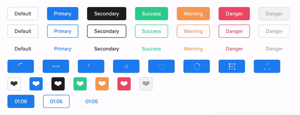
Live Playground
For examples of the react-button in action, go to https://abdilar.github.io/react-button.
OR
To run that demo on your own computer:
- Clone this repository
npm installnpm run storybook- Visit http://localhost:6006/
Getting Started
Install
npm install @sakit-sa/react-buttonUsage
import React from 'react';

import Button, {SPINNER, COLOR, TARGET, ROUNDED, SIZE, TYPE, VARIANT} from '@sakit-sa/react-button';
import '@sakit-sa/react-button/dist/index.css';

const App = () => (
  <Button>Button</Button>
);
Props
| Name | Type | Default | Description |
|---|---|---|---|
| isLoading | boolean |
false |
Boolean value to control whether the spinner is shown. |
| spinnerClasses | object |
{} |
Apply classes to the control spinner. |
| spinnerName | string |
uikit |
Specifies the name of the spinner (name includes: uikit, puff, grid, oval, rings, ball-triangle, tail-spin, three-dots). |
| spinnerRatio | number |
- |
Specifies the size of the spinner. |
| activeTimer | boolean |
false |
Boolean value to control whether the countdown timer is shown. |
| time | number |
0 |
The value of the timer base on second. |
| timeClasses | object |
{} |
Apply classes to the control countdown timer. |
| timeFormat | string |
MM:SS |
Formats a time value. |
| className | object |
{} |
Apply classes to the control button. |
| size | string |
small |
Specifies the size of the button (size includes: small, medium, large, xlarge). |
| id | string |
react-button-[randomNumber] |
The unique identifier for the component. |
| round | string |
low |
Specifies the round border of the button. (round includes: empty, low, more, fully). |
| type | string |
button |
Specifies the type of the button. (type includes: button, submit, reset). |
| variant | string |
contained |
Specifies the variant of the button. (variant includes: contained, outlined, text). |
| color | string |
primary |
Specifies the color of the button. (color includes: primary, secondary, success, danger, warning, default). |
| href | string |
- |
Sets a hyperlink and uses anchor tag instead of a button. |
| hrefTarget | string |
_blank |
Specifies the target of anchor tag. (hrefTarget includes: _blank, _self, _parent, _top). |
| isIcon | boolean |
false |
Boolean value to control whether is the icon button. |
| disabled | boolean |
false |
Boolean value to control the button is disabled. |
| animatable | boolean |
false |
Boolean value to show an animation effect when clicking on the button. |
| children* | node |
- (Required) |
Contents to be displayed within root element. |
| onClick | function |
- |
Trigger when Clicking on the button. |
| onCompleteTime | function |
- |
Trigger when countdown timer is zero. |
className Token
button content
See examples for more information (go to https://abdilar.github.io/react-button/?path=/story/theme-prop--class-name)
spinnerClasses Token
wrapper spinner
See examples for more information (go to https://abdilar.github.io/react-spinner/?path=/story/theme-prop--class-name)
timeClasses Token
wrapperClass symbolClass digitClass hourClass minuteClass secondClass hourWrapperClass minuteWrapperClass secondWrapperClass
See examples for more information (go to https://abdilar.github.io/countdown-timer/?path=/story/theme--class-name)
License
MIT Licensed. © Copyright Saeed Abdilar