
Package Exports
- @stackline/vue-multiselect-dropdown
Readme
@stackline/vue-multiselect-dropdown
A maintained Vue multiselect dropdown with Vue 2 and Vue 3 release lines, controlled
v-modelstate, scoped slots, renderless/state composables, searchable/grouped options, lazy loading hooks, custom render functions, skins, body-overlay positioning, and accessibility-focused and keyboard/ARIA tested behavior.


Documentation & Live Demos | Vue 2 Demo | Vue 3 Demo | npm | Issues | Repository | Community Discussions
Latest Vue 3 release: 3.1.3 for Vue 3.x
Maintained Vue 2 release: 2.0.2 for Vue 2.x
Credits: Current maintenance, Vue release-line stewardship, publishing, and documentation by Alexandro Paixao Marques.
Why this library?
@stackline/vue-multiselect-dropdown provides maintained Vue 2 and Vue 3 multiselect release lines for applications that need predictable selection state, search, grouping, skins, keyboard support, custom Vue markup, and live tested examples.
The package follows the familiar Stackline settings contract while staying idiomatic for Vue: pass :data, bind selected values with v-model, customize behavior through :settings, and listen for Vue events such as @select, @de-select, @select-all, @de-select-all, @open, and @close.
The current stable Vue 3 release is 3.1.3. It adds renderless composables, a state composable, scoped-slot customization, helper APIs, and a strengthened combobox contract while keeping the styled <VueMultiselectDropdown /> component compatible with the existing visual contract.
Features
| Feature | Supported |
|---|---|
| Vue 2 and Vue 3 maintained release lines | Yes |
| Multi-select and single-select modes | Yes |
Controlled v-model selection |
Yes |
| Scoped slots for custom Vue HTML | Yes |
Renderless useMultiSelectDropdown composable |
Yes |
State-only useMultiSelectState composable |
Yes |
| Search and filter | Yes |
| Group by field or callback | Yes |
| Custom item render functions | Yes |
| Custom badge render functions | Yes |
| Lazy loading hooks | Yes |
| Add-new-item from search text | Yes |
| Instance methods for open, close, focus, select all, and clear | Yes |
Built-in classic, material, dark, custom, and brand skins |
Yes |
| Accessibility-focused and keyboard/ARIA tested navigation, focus states, and ARIA labels | Yes |
Multiselect options expose both aria-selected and aria-checked |
Yes |
| Backspace/Escape combobox contract | Yes |
| Selected object preservation across async data refreshes | Yes |
Dialog and overflow-container support through appendToBody / tagToBody |
Yes |
| Left-aligned, vertically centered placeholder and single-value text | Yes |
| Versioned docs builds per Vue line | Yes |
Table of Contents
- Vue Version Compatibility
- Installation
- Setup
- Styling and Skins
- Basic Usage
- Customization Paths
- Typed Helper API
- Scoped Slots
- Headless Usage
- Combobox Contract
- Official Vue 3 Test Matrix
- Custom Render Functions
- Forms and Controlled State
- Lazy Loading and Dynamic Data
- Dialogs and Overflow Containers
- Events
- Instance Methods
- Run Locally
- License
Vue Version Compatibility
Each package family installs on its matching Vue family. Keep the package family aligned with the Vue major used by your application.
| Package family | Vue family | Peer range | Tested release window | Demo link |
|---|---|---|---|---|
| 3.x | Vue 3 only | >=3.0.0 <4.0.0 |
3.1.3 through 3.5.35 | Vue 3 family docs |
| 2.x | Vue 2 only | >=2.0.0 <3.0.0 |
2.0.2 | Vue 2 family docs |
Installation
For Vue 3 applications:
npm install @stackline/vue-multiselect-dropdown@3.1.3 --save-exactFor Vue 2 applications:
npm install @stackline/vue-multiselect-dropdown@2.0.2 --save-exactThe styled component injects its component styles at runtime. The renderless composables do not require the built-in DOM and let your application own the markup and styling.
Setup
1. Import the component
import { createApp } from 'vue';
import {
  VueMultiselect,
  VueMultiselectDropdown
} from '@stackline/vue-multiselect-dropdown';
2. Keep selection in Vue state
const selectedCountries = ref([]);3. Pass a stable settings object
const settings = {
  text: 'Select countries',
  enableSearchFilter: true,
  primaryKey: 'id',
  labelKey: 'itemName',
  badgeShowLimit: 3,
  skin: 'classic'
};
Register globally:
const app = createApp(App);

app.use(VueMultiselect);
app.mount('#app');
Or register locally:
export default {
components: { VueMultiselectDropdown }
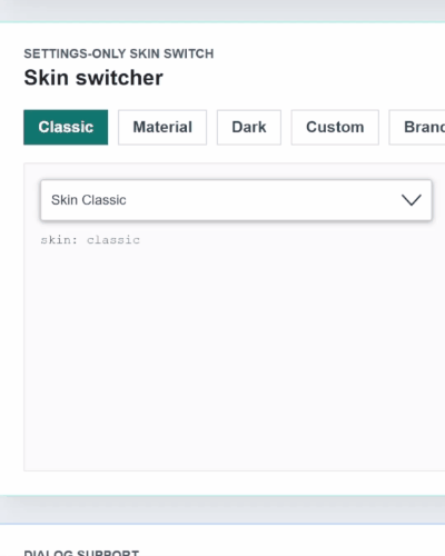
};Styling and Skins
Use settings.skin to switch the visual mode:
settings.skin = 'material';Built-in skins:
| Skin | Usage |
|---|---|
classic |
Compact classic dropdown styling. |
material |
Material-style rounded controls and chips. |
dark |
Dark UI surfaces. |
custom |
CSS-variable starter skin for custom projects. |
brand |
Stackline brand skin. |
settings.theme is accepted as a legacy alias, but new Vue usage should configure only settings.skin.
Basic Usage
<script setup>
import { ref } from 'vue';
import {
  VueMultiselectDropdown,
  defineSettings
} from '@stackline/vue-multiselect-dropdown';

const countries = [
  { id: 1, itemName: 'Brazil', capital: 'Brasilia', region: 'South America' },
  { id: 2, itemName: 'Canada', capital: 'Ottawa', region: 'North America' },
  { id: 3, itemName: 'Portugal', capital: 'Lisbon', region: 'Europe' },
  { id: 4, itemName: 'United States', capital: 'Washington, DC', region: 'North America' },
  { id: 5, itemName: 'Argentina', capital: 'Buenos Aires', region: 'South America' },
  { id: 6, itemName: 'Mexico', capital: 'Mexico City', region: 'North America' }
];

const selectedCountries = ref([countries[1]]);

const settings = defineSettings({
  singleSelection: false,
  text: 'Select countries',
  selectAllText: 'Select all',
  unSelectAllText: 'Clear all',
  enableSearchFilter: true,
  searchPlaceholderText: 'Search',
  primaryKey: 'id',
  labelKey: 'itemName',
  badgeShowLimit: 4,
  maxHeight: 260,
  showCheckbox: true,
  noDataLabel: 'No data',
  skin: 'classic',
  appendToBody: false
});

function handleSelect(item) {
  console.log('selected', item);
}

function handleRemove(item) {
  console.log('removed', item);
}
</script>

<template>
  <VueMultiselectDropdown
    :data="countries"
    v-model="selectedCountries"
    :settings="settings"
    @select="handleSelect"
    @de-select="handleRemove"
    @select-all="(items) => console.log('selected all', items)"
    @de-select-all="(items) => console.log('cleared all', items)"
  />
</template>
Customization Paths
Use the API layer that matches the amount of control your team needs:
| Layer | Best for | What you own |
|---|---|---|
<VueMultiselectDropdown /> |
Fast forms, filters, dashboards, and admin screens. | Data, selected state, settings, events, and optional render functions. |
createVueMultiselectDropdown<T>() |
Teams that want a typed helper around settings and composables. | Typed state/composable usage for a feature or design-system wrapper. |
| Scoped slots | Custom Vue HTML around the proven component behavior. | Specific DOM pieces such as trigger, badges, menu footer, group headers, and options. |
useMultiSelectDropdown |
Fully custom interfaces and design systems. | All markup and CSS, while Stackline provides state, ARIA prop bags, keyboard flow, grouping, and callbacks. |
useMultiSelectState |
Advanced state engines or existing combobox shells. | Every element, every event binding, and all visual behavior. |
For most teams, start with the component. Use scoped slots when the component works but your layout needs a different shell. Use the renderless composables when the application must own the whole combobox contract.
Typed Helper API
Use createVueMultiselectDropdown<T>() when a feature, package, or design-system wrapper should bind the item type once and reuse it across settings and composables.
This is optional. The normal <VueMultiselectDropdown /> API remains the fastest path for most screens.
import {
  createVueMultiselectDropdown
} from '@stackline/vue-multiselect-dropdown';

type Country = {
  id: number;
  itemName: string;
  capital: string;
  region: string;
};

const CountryMultiselect = createVueMultiselectDropdown<Country>();

const countrySettings = CountryMultiselect.defineSettings({
  text: 'Choose countries',
  primaryKey: 'id',
  labelKey: 'itemName',
  searchBy: ['itemName', 'capital'],
  groupBy: 'region',
  enableSearchFilter: true,
  badgeShowLimit: 2
});

export function useCountryMultiselect(countries, selectedCountries) {
  return CountryMultiselect.useMultiSelectDropdown({
    data: countries,
    selectedItems: selectedCountries,
    settings: countrySettings,
    onChange(items) {
      selectedCountries.value = items;
    }
  });
}
The helper is useful when a design-system wrapper wants one typed place for settings, state, and renderless dropdown behavior. The styled Vue component remains available for normal template usage.
Scoped Slots
Scoped slots let you replace the visible Vue HTML pieces while the package still owns the tested selection, filtering, keyboard, focus, ARIA, body overlay, and async behavior.
The important rule is simple: keep the provided slot callbacks and ARIA values connected to your custom elements. They carry the behavior that makes the component accessible.
<script setup>
import { ref } from 'vue';
import { VueMultiselectDropdown } from '@stackline/vue-multiselect-dropdown';

const selectedCountries = ref([]);

const countries = [
  { id: 1, itemName: 'Brazil', capital: 'Brasilia', region: 'South America' },
  { id: 2, itemName: 'Canada', capital: 'Ottawa', region: 'North America' },
  { id: 3, itemName: 'Portugal', capital: 'Lisbon', region: 'Europe' }
];

const settings = {
  text: 'Choose countries',
  enableSearchFilter: true,
  groupBy: 'region',
  primaryKey: 'id',
  labelKey: 'itemName',
  badgeShowLimit: 2,
  skin: 'classic'
};
</script>

<template>
  <VueMultiselectDropdown
    :data="countries"
    v-model="selectedCountries"
    :settings="settings"
  >
    <template #option="{ item, label, selected, ariaSelected, ariaChecked, toggle }">
      <button
        type="button"
        class="country-option"
        :aria-pressed="selected"
        @click.stop="toggle"
      >
        <span>
          <strong>{{ label }}</strong>
          <small>{{ item.capital }} - {{ item.region }}</small>
        </span>
        <code>{{ ariaSelected }}/{{ ariaChecked }}</code>
      </button>
    </template>

    <template #badge="{ label, remove }">
      <span class="country-badge">
        {{ label }}
        <button type="button" @click.stop="remove">Remove</button>
      </span>
    </template>

    <template #menu-footer="{ selected, filteredItems }">
      <div class="country-footer">
        {{ selected.length }} selected - {{ filteredItems.length }} visible
      </div>
    </template>
  </VueMultiselectDropdown>
</template>
Available scoped slots:
trigger, placeholder, badge, option, loading, empty, group-header, and menu-footer.
Headless Usage
Use useMultiSelectDropdown when you want Stackline selection, filtering, keyboard handling, ARIA prop bags, grouping, limits, and callbacks without the built-in DOM/CSS.
The flag sample below uses SVG country icons from flag-icons. You can replace that import with your own icon system if your app already has one.
npm install flag-icons<script setup>
import { computed, ref } from 'vue';
import 'flag-icons/css/flag-icons.min.css';
import { useMultiSelectDropdown } from '@stackline/vue-multiselect-dropdown';
const countries = [
{ id: 1, itemName: 'Brazil', flag: 'BR', capital: 'Brasilia', region: 'Americas' },
{ id: 2, itemName: 'Canada', flag: 'CA', capital: 'Ottawa', region: 'Americas' },
{ id: 3, itemName: 'Portugal', flag: 'PT', capital: 'Lisbon', region: 'Europe' }
];
const selectedItems = ref([countries[0]]);
const dropdown = useMultiSelectDropdown({
data: countries,
selectedItems,
onChange(items) {
selectedItems.value = items;
},
settings: {
text: 'Choose countries',
enableSearchFilter: true,
searchPlaceholderText: 'Search country',
groupBy: 'region',
primaryKey: 'id',
labelKey: 'itemName',
badgeShowLimit: 2,
clearAll: true
}
});
const selectedSummary = computed(() => (
dropdown.selectedItems.value.length
? `${dropdown.selectedItems.value.length} selected`
: 'No selected countries'
));
function flagClass(code) {
return `fi fi-${code.toLowerCase()}`;
}
</script>
<template>
<div class="country-picker" v-bind="dropdown.getRootProps()">
<button class="country-trigger" v-bind="dropdown.getTriggerProps()">
<span>{{ dropdown.label.value }}</span>
<strong>{{ dropdown.isOpen.value ? 'Close' : 'Open' }}</strong>
</button>
<div class="country-chips" :aria-label="selectedSummary">
<span
v-for="item in dropdown.selectedItems.value"
:key="dropdown.getItemKey(item)"
class="country-chip"
>
<span :class="['country-flag', flagClass(item.flag)]" aria-hidden="true" />
{{ dropdown.getItemLabel(item) }}
<button v-bind="dropdown.getRemoveButtonProps(item)">x</button>
</span>
</div>
<div
v-if="dropdown.isOpen.value"
class="country-panel"
v-bind="dropdown.getListboxProps()"
>
<input class="country-search" v-bind="dropdown.getSearchInputProps()" />
<div
v-for="option in dropdown.visibleOptions.value"
:key="option.key"
v-bind="dropdown.getOptionProps(option, {
class: option.selected ? 'country-option selected' : 'country-option'
})"
>
<span :class="['country-flag', flagClass(option.item.flag)]" aria-hidden="true" />
<span>
<strong>{{ option.label }}</strong>
<small>{{ option.item.capital }} - {{ option.item.region }}</small>
</span>
<input type="checkbox" :checked="option.selected" readonly />
</div>
</div>
</div>
</template>Use useMultiSelectState when you want the selection/filter/grouping engine without prop bags:
import { useMultiSelectState } from '@stackline/vue-multiselect-dropdown';

const state = useMultiSelectState({
  data: countries,
  selectedItems,
  onChange(items) {
    selectedItems.value = items;
  },
  settings: {
    primaryKey: 'id',
    labelKey: 'itemName',
    enableSearchFilter: true
  }
});
The styled component remains available for drop-in usage. The renderless composables are for teams that want a headless-style ownership model where the application controls layout, elements, and CSS.
Combobox Contract
Version 3.1.3 tightens the interaction details that usually matter most in production forms:
| Behavior | Contract |
|---|---|
| Focus after selection/removal | Focus returns to search while the list stays open, or to the trigger when the list closes. |
| Option selection state | Multiselect options expose matching aria-selected and aria-checked values. |
| Backspace in search | Edits the query. With an empty query it does not remove selected values by default. |
| Backspace/Delete on focused badge remove button | Removes that selected badge. |
| Escape | Closes the list without clearing selected values. |
| Async option refresh | Selected object values stay stable by primaryKey when data refreshes. |
| Keyboard navigation | Trigger ArrowDown/ArrowUp, option Home/End, and option ids keep focus and ARIA predictable. |
Keyboard behavior is enabled by default. You can turn each part off from settings.keyboard when an application needs a stricter interaction model:
const settings = {
  text: 'Countries',
  enableSearchFilter: true,
  keyboard: {
    space: true,
    spaceOptionAction: 'toggle',
    tab: true,
    arrows: true,
    escape: true,
    backspaceRemovesLastWhenSearchEmpty: false,
    deleteRemovesFocusedBadge: true
  }
};
Set any key to false to disable that behavior. backspaceRemovesLastWhenSearchEmpty can be turned on for applications that want the legacy "empty search removes last badge" pattern. keyboard.backspace is still accepted as a deprecated alias for that legacy behavior. spaceOptionAction controls only focused options:
'toggle' keeps focus on the current option, while 'toggle-and-next' toggles and moves to the next enabled option.
escapeToClose: false is still supported and also disables keyboard.escape.
Official Vue 3 Test Matrix
The Vue 3 release was tested in a clean Vue 3.5.35 application with @stackline/vue-multiselect-dropdown@3.1.3. The docs use the same examples from that test app, including keyboard navigation, focus, ARIA behavior, badge counters, responsive action buttons, scrollable lists, dialog-safe body overlays, the corrected left-aligned placeholder with vertical centering, scoped-slot customization, headless/custom HTML, and the combobox contract checks for Backspace, Escape, focused badge removal, focus, and option ARIA.
The same core scenarios are validated for the visual skins:
| # | Scenario | Main settings tested |
|---|---|---|
| 01 | Basic multi | { enableSearchFilter: true } |
| 02 | All selected badges visible | { badgeShowLimit: 10 } |
| 03 | Single selection | { singleSelection: true } |
| 04 | Search by fields | { searchBy: ['itemName', 'capital'] } |
| 05 | Grouped options | { groupBy: 'category', selectGroup: true } |
| 06 | Selection limit | { limitSelection: 2, badgeShowLimit: 2 } |
| 07 | Custom rendering | renderItem and renderBadge |
| 08 | Search and add item | { addNewItemOnFilter: true } |
| 09 | Disabled state | { disabled: true } |
| 10 | Controlled form validation | Vue state and derived validation |
| 11 | Long list with keyboard scroll | { maxHeight: 140 } |
| 12 | Local lazy loading | { lazyLoading: true } |
| 13 | Dialog and overflow container | { appendToBody: true, tagToBody: true } |
| 14 | Body overlay auto direction | { autoPosition: true, position: 'top' } |
| 15 | Instance methods | openDropdown, closeDropdown, selectAll, clearSelection |
| 16 | Scoped slots custom HTML | #trigger, #option, #badge, #group-header, #menu-footer |
Custom Render Functions
Use renderItem for option rows and renderBadge for selected chips when you only need to replace inner content. Use scoped slots when you need to replace component structure.
<script setup>
import { h, ref } from 'vue';
import { VueMultiselectDropdown } from '@stackline/vue-multiselect-dropdown';

const selectedCountries = ref([]);

function renderItem(item, context) {
  return h('span', [
    h('strong', context.label),
    h('small', item.capital)
  ]);
}

function renderBadge(item) {
  return h('span', item.itemName);
}
</script>

<template>
  <VueMultiselectDropdown
    :data="countries"
    v-model="selectedCountries"
    :settings="settings"
    :render-item="renderItem"
    :render-badge="renderBadge"
  />
</template>
Forms and Controlled State
Keep the selected array in Vue state and derive validity from that state:
<script setup>
import { computed, ref } from 'vue';
import { VueMultiselectDropdown } from '@stackline/vue-multiselect-dropdown';

const name = ref('');
const email = ref('');
const selectedSkills = ref([]);

const formIsValid = computed(() => (
  email.value.trim().length > 0 && selectedSkills.value.length > 0
));
</script>

<template>
  <form @submit.prevent>
    <input v-model="name" />
    <input v-model="email" />

    <VueMultiselectDropdown
      :data="skills"
      v-model="selectedSkills"
      :settings="skillSettings"
    />

    <button type="submit" :disabled="!formIsValid">
      Submit
    </button>
  </form>
</template>
Lazy Loading and Dynamic Data
Enable lazy loading through the settings object and append more rows when the list reaches the end:
<script setup>
import { ref } from 'vue';
import { VueMultiselectDropdown } from '@stackline/vue-multiselect-dropdown';

const people = ref(loadFirstPage());
const selectedPeople = ref([]);

const settings = {
  text: 'Select people',
  enableSearchFilter: true,
  lazyLoading: true,
  labelKey: 'name',
  primaryKey: 'id',
  maxHeight: 140
};

function appendPeople() {
  people.value = people.value.concat(loadMorePeople());
}
</script>

<template>
  <VueMultiselectDropdown
    :data="people"
    v-model="selectedPeople"
    :settings="settings"
    @scroll-to-end="appendPeople"
  />
</template>
Dialogs and Overflow Containers
Use appendToBody: true or tagToBody: true when the dropdown is inside dialogs, modals, drawers, or containers that set overflow: hidden or overflow: auto.
const settings = {
  text: 'Dialog dropdown',
  enableSearchFilter: true,
  skin: 'material',
  appendToBody: true,
  tagToBody: true,
  autoPosition: true
};
With body overlay enabled, the open panel is rendered against document.body, aligned to the original trigger, sized to the trigger, recalculated on open, scroll, resize, and content changes, and cleaned up when the dropdown closes or the component unmounts.
autoPosition: true treats position as a preferred direction. The menu opens upward only when there is meaningfully less room below and enough room above; otherwise it opens below and shrinks the scrollable list height to stay visible without covering the trigger.
Events
Available Vue events:
inputchangeselectde-selectselect-allde-select-allgroup-selectgroup-de-selectscroll-to-endadd-filter-new-itemopenclose
Instance Methods
<script setup>
import { ref } from 'vue';
import { VueMultiselectDropdown } from '@stackline/vue-multiselect-dropdown';

const dropdownRef = ref(null);

function openDropdown() {
  dropdownRef.value?.openDropdown();
}

function clearSelection() {
  dropdownRef.value?.clearSelection();
}
</script>

<template>
  <VueMultiselectDropdown
    ref="dropdownRef"
    :data="countries"
    v-model="selectedCountries"
    :settings="settings"
  />
</template>
Available methods:
openDropdown()closeDropdown()focusSearch()selectAll()deSelectAll()clearSelection()getSelectedItems()
Run Locally
npm install
npm run build
npm test
Vue 3 docs:
cd docs-src/vue-3
npm install
npm run build
License
MIT