
Package Exports
- @tomickigrzegorz/react-circular-progress-bar
- @tomickigrzegorz/react-circular-progress-bar/dist/index.esm.js
- @tomickigrzegorz/react-circular-progress-bar/dist/index.js
This package does not declare an exports field, so the exports above have been automatically detected and optimized by JSPM instead. If any package subpath is missing, it is recommended to post an issue to the original package (@tomickigrzegorz/react-circular-progress-bar) to support the "exports" field. If that is not possible, create a JSPM override to customize the exports field for this package.
Readme
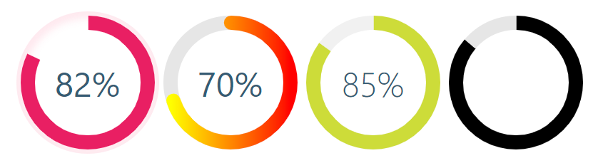
react-circular-progress-bar
React library to help developers to draw animated, cross-browser, highly customizable progress circles using SVG. IntersectionObserver support, the animation starts when the individual chart appears in the view.

Demo
See the demo - example
Install
yarn add @tomickigrzegorz/react-circular-progress-bar
# or
npm install @tomickigrzegorz/react-circular-progress-bar
Usage
import { CircularProgressBar } from "@tomickigrzegorz/react-circular-progress-bar";// available control variables
const props = {
percent: 60, // is require
colorSlice: "#00a1ff",
colorCircle: "#00a1ff",
fontColor: "#365b74",
fontSize: "1.6rem",
fontWeight: 400,
size: 200,
stroke: 10,
strokeBottom: 5,
speed: 60,
cut: 0,
rotation: -90,
fill: "#00897B",
unit: "%",
textPosition: "0.35em",
animationOff: false,
strokeDasharray: "10,1",
inverse: false,
round: false,
number: false,
linearGradient: ["#ffff00", "brown"],
styles: {
borderRadius: "50%",
boxShadow: "inset 0 0 25px 10px #a2caff"
}
};
<CircularProgressBar {...props} />;Update percent
If you want to update component you have to add
idto each of them
const config = {
  id: 0, // important
  percent: 50,
  colorSlice: "#E91E63"
};

function App() {
  const [update, setUpdate] = useState(config);

  useEffect(() => {
    const interval = setInterval(() => {
      setUpdate({
        ...config,
        id: 0, // we indicate which component we want to change
        percent: Math.floor(Math.random() * 100 + 1)
        colorSlice: "#000",
        fontColor: "#F50057",
        fontSize: "1.2rem",
        fontWeight: 700
      });
    }, 3000);
    return () => clearInterval(interval);
  }, []);

  const newObject = { ...config, ...update };

  return (
    <div>
      <CircularProgressBar {...newObject} />
    </div>
  );
}
Add photos and text
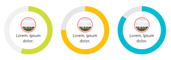
const config = {
  percent: 55,
  colorSlice: "#E91E63",
  colorCircle: "#f1f1f1",
  fontWeight: 100,
  number: false // turn off the percentage animation first
};

<CircularProgressBar key={index} {...props}>
  <img
    src="https://picsum.photos/100/100"
    style={{
      width: "60px",
      borderRadius: "50%",
      padding: "2px",
      border: "3px solid salmon"
    }}
    alt="Random image"
  />
  <div style={{ textAlign: "center", padding: "0 35px" }}>
    Lorem, ipsum dolor.
  </div>
</CircularProgressBar>;
Add photos and percent animation
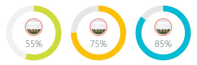
const config = {
  percent: 55,
  colorSlice: "#CDDC39",
  colorCircle: "#f1f1f1",
  fontWeight: 100,
  fontSize: "1rem",
  textPosition: "1.5em" // needed element to move the percentage animation lower
};

<CircularProgressBar key={index} {...props}>
  <img
    src="https://picsum.photos/100/100"
    style={{
      width: "60px",
      borderRadius: "50%",
      marginTop: "-40px",
      padding: "2px",
      border: "3px solid salmon"
    }}
    alt="Random image"
  />
</CircularProgressBar>;
How to turn off % or style them?
Turning off the percentage and leaving the number alone is very simple.
Each percent (%) has a class of circular-unit-x of course you must add for each circle id. If you don't do this, the class will always be circular-unit-0. Just add .circular-unit-x { display: none } to our styles. Digit animation remains but percent sign [%] disappears.
You can also style this elements to create your own styles, example below:
.circular-unit-15 {
  fill: #f50057;
  font-size: 0.8rem;
  font-weight: 700;
}
Instead of adding styles to a component, you can add them in the configuration stage.
const examples = [
  {
    percent: 75,
    styles: {
      borderRadius: "50%",
      boxShadow: "inset 0 0 25px 10px #a2caff"
    }
  }
];

{examples.map((props, index) => {
  return <CircularSection key={index} {...props} />;
})}
See an example Minimal Width Shadow
Configuration of the plugin
| props | type | default | require | description |
|---|---|---|---|---|
| percent | number | ✔ | Represents the progress bar and animation of the animation progress expressed by a number e.g. 65% | |
| id | number | If you want to update a component, you need to add an id to each of them. Also when you want to display several components with different gradients - linearGradient |
||
| speed | number | Frame rate animation [fps]. Let's say you want the animation to be 60fps, just add the parameter speed: 60 |
||
| animationOff | boolean | false |
Turn off the progress animation | |
| animationSmooth | string | `` | The transition property allows you to create animations (a smooth transition effect), e.g. 500ms ease-out |
|
| colorSlice | string | '#00a1ff' |
Progress layer color and background "#ffff00","brown" * | |
| colorCircle | string | '#00a1ff' |
Bottom circle color Font "#ffff00","brown" * | |
| stroke | number | 10 |
Stroke width, chart thickness | |
| strokeBottom | number | 10 |
If "strokBottom" is set, it is used to generate a background circle size | |
| round | boolean | false |
Path rounding | |
| inverse | boolean | false |
Counterclockwise animation | |
| rotation | number | -90 |
Chart rotation | |
| number | boolean | true |
Add props number and set to false to hide the number with percent | |
| size | number | 200 |
Size progress bar width and height in px | |
| cut | number | 0 |
Angle of the circle sector | |
| unit | string | % |
Different unit instead of percentage (%) inside the circle | |
| fill | string | none |
Inner circle background color | |
| strokeDasharray | string | `` | It works only on the lowest circle and only on whole circles - stroke-dasharray | |
| textPosition | string | 0.35em |
The position of the SVG TEXT element vertically | |
| fontSize | string | 1.6rem |
Font size. The font can be shown in units rem, em, px ... | |
| fontWeight | number | 400 |
400, 600, ... | |
| fontColor | string | '#365b74' |
Font color "#ffff00","brown" * | |
| linearGradient | array | Array of colors "lineargradient": "#ffff00","brown" * | ||
| styles | object | Possibility to add styles to parent div see example Minimal Width Shadow |
Colors names
Browser support
react-circular-progress-bar supports all major browsers including IE 11 and above