
Package Exports
- @toostoned/react-google-flight-datepicker
- @toostoned/react-google-flight-datepicker/dist/index.js
This package does not declare an exports field, so the exports above have been automatically detected and optimized by JSPM instead. If any package subpath is missing, it is recommended to post an issue to the original package (@toostoned/react-google-flight-datepicker) to support the "exports" field. If that is not possible, create a JSPM override to customize the exports field for this package.
Readme
react-google-flight-datepicker


Google flight date picker implemented in ReactJS
Demo
- Live demo: https://codesandbox.io/s/react-google-flight-datepicker-zultp
- To run demo on your computer:
- Clone this repository
yarn installyarn run dev
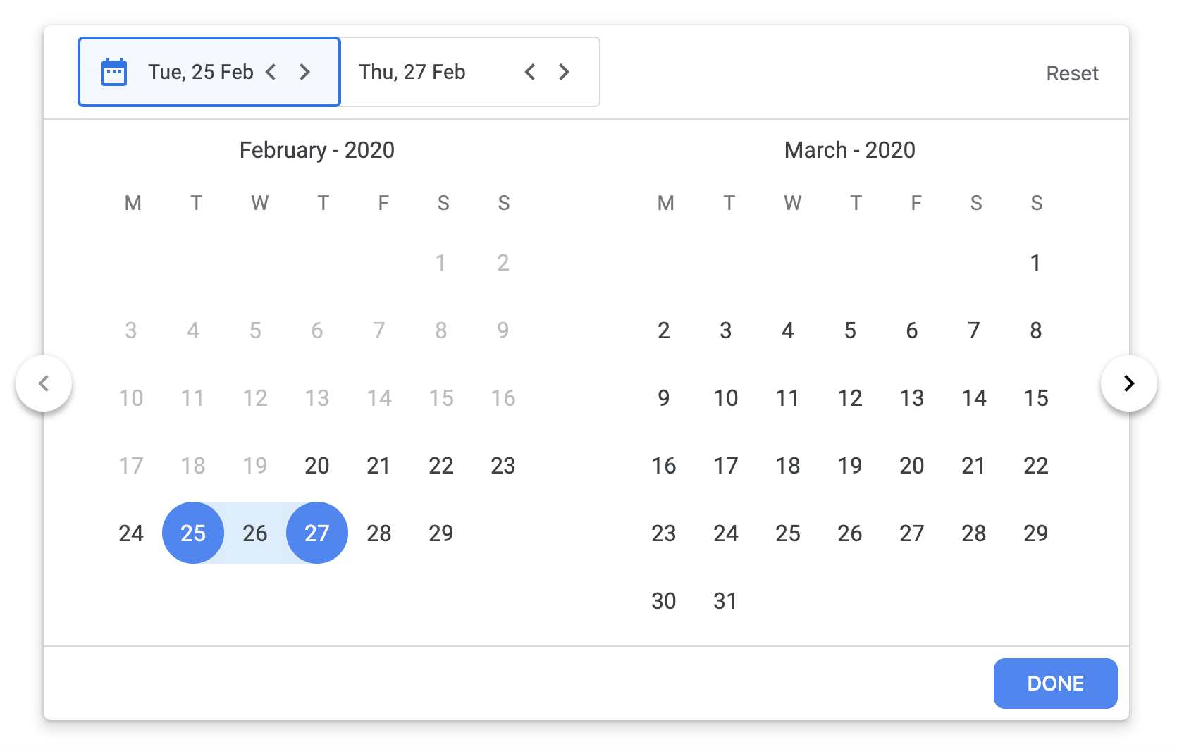
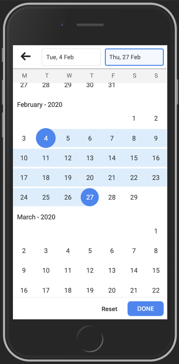
Screenshot
Usage
RangeDatePicker
import { RangeDatePicker } from 'react-google-flight-datepicker';
import 'react-google-flight-datepicker/dist/main.css';

<RangeDatePicker
  startDate={new Date()}
  endDate={new Date()}
  onChange={(startDate, endDate) => onDateChange(startDate, endDate)}
  minDate={new Date(1900, 0, 1)}
  maxDate={new Date(2100, 0, 1)}
  dateFormat="D"
  monthFormat="MMM YYYY"
  startDatePlaceholder="Start Date"
  endDatePlaceholder="End Date"
  disabled={false}
  className="my-own-class-name"
  startWeekDay="monday"
/>
SingleDatePicker
import { SingleDatePicker } from 'react-google-flight-datepicker';
import 'react-google-flight-datepicker/dist/main.css';

<SingleDatePicker
  startDate={new Date()}
  onChange={(startDate) => onDateChange(startDate)}
  minDate={new Date(1900, 0, 1)}
  maxDate={new Date(2100, 0, 1)}
  dateFormat="D"
  monthFormat="MMM YYYY"
  startDatePlaceholder="Date"
  disabled={false}
  className="my-own-class-name"
  startWeekDay="monday"
/>
Props
| Prop name | Prop type | Default value | Description |
|---|---|---|---|
| startDate | Date | null | Selected start date |
| endDate | Date | null | Selected end date |
| dateFormat | String | D | Display format for date. Check momentjs doc for information (https://momentjs.com/docs/#/displaying/) |
| monthFormat | String | MMM YYYY | Display format for month. Check momentjs doc for information (https://momentjs.com/docs/#/displaying/) |
| onChange | Function | null | Event handler that is called when startDate and endDate are changed |
| onFocus | Function | null | Return a string (START_DATE, END_DATE) which indicate which text input is focused |
| minDate | Date | 1900 Jan 01 | Minimum date that user can select |
| maxDate | Date | 2100 Jan 01 | Maximum date that user can select |
| className | String | Custom CSS className for datepicker | |
| disabled | String | false | Disable the datepicker |
| startDatePlaceholder | String | Start Date | Placeholder text for startDate text input |
| endDatePlaceholder | String | End Date | Placeholder text for endDate text input |
| startWeekDay | String (monday or sunday) | monday | Determine the start day for a week (monday or sunday) |
| highlightToday | Bool | false | Hightlight "today" date |
| singleCalendar | Bool | false | Only applicable on SingleDatePicker. When this prop is actived, the datepicker will display 1 calendar instead of 2 calendar in the the container |
Author
- David Tran - david@jslancer.com
- Leo Phan - leo.phan@jslancer.com
License
MIT