
Package Exports
This package does not declare an exports field, so the exports above have been automatically detected and optimized by JSPM instead. If any package subpath is missing, it is recommended to post an issue to the original package (@tovobi/primevue) to support the "exports" field. If that is not possible, create a JSPM override to customize the exports field for this package.
Readme


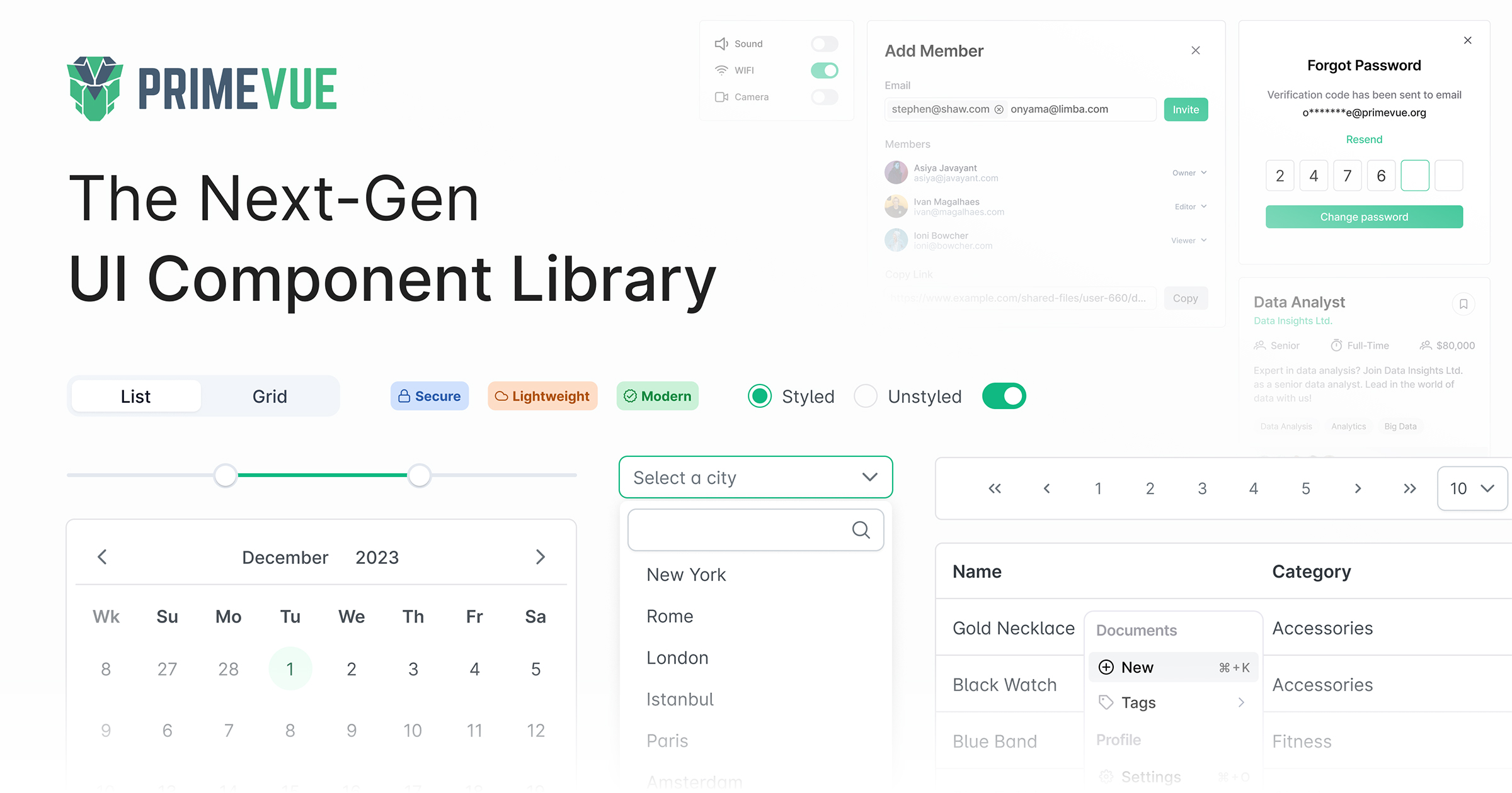
PrimeVue
PrimeVue is a rich set of open source UI Components for Vue. See PrimeVue homepage for live showcase and documentation.
Download
PrimeVue is available at npm.
# Using npm
npm install primevue

# Using yarn
yarn add primevue

# Using pnpm
pnpm add primevue
Plugin
PrimeVue plugin is required to be installed with the use function to set up the default configuration.
import { createApp } from 'vue';
import PrimeVue from 'primevue/config';
const app = createApp(App);

app.use(PrimeVue);
Theming
PrimeVue has two theming has modes; styled or unstyled.
Styled Mode
Styled mode is based on pre-skinned components with opinionated themes like Material, Bootstrap or PrimeOne themes. Theme is the required css file to be imported, visit the Themes section for the complete list of available themes to choose from.
// theme
import 'primevue/resources/themes/aura-light-green/theme.css';
Unstyled Mode
Unstyled mode is disabled by default for all components. Using the PrimeVue plugin during installation, set unstyled as true to enable it globally. Visit the Unstyled mode documentation for more information and examples.
import { createApp } from 'vue';
import PrimeVue from 'primevue/config';
const app = createApp(App);

app.use(PrimeVue, { unstyled: true });
Usage
Each component can be imported individually so that you only bundle what you use. Import path is available in the documentation of the corresponding component.
import Button from 'primevue/button';

const app = createApp(App);
app.component('Button', Button);
Prop Cases
Component prop names are described as camel case throughout the documentation however kebab-case is also fully supported. Events on the other hand should always be kebab-case.
<Dialog :showHeader="false"></Dialog>

<!-- can be written as -->

<Dialog :show-header="false"></Dialog>
Nuxt Integration
The nuxt-primevue package is the official module by PrimeTek.
# Using npm
npm install --save-dev nuxt-primevue

# Using yarn
yarn add --dev nuxt-primevue

# Using pnpm
pnpm add -D nuxt-primevue
The module is enabled by adding nuxt-primevue to the modules option. Configuration values are defined with the primevue property.
export default defineNuxtConfig({
    modules: ['nuxt-primevue'],
    primevue: {
        /* Options */
    }
});
Whether to install the PrimeVue plugin, defaults to true. Disable this option if you prefer to configure PrimeVue manually e.g. with a Nuxt plugin.
primevue: {
    usePrimeVue: true;
}
The names of the components, directives and composables to import and register are provided using the include property. When the value is ignored or set using the * alias, all of the components, directives and composables are registered respectively.
primevue: {
    components: {
        include: ['Button', 'DataTable']
    },
    directives: {
        include: ['Ripple', 'Tooltip']
    },
    composables: {
        include: ['useStyle']
    }
}
In styled mode, the theme can be defined at Nuxt configuration with the css property. Note that this only applies to styled mode, in unstyled mode a theme file is not required as styling is done externally.
export default defineNuxtConfig({
    css: ['primevue/resources/themes/aura-dark-green/theme.css']
});
For detailed information
Example
We've created various samples for the popular options in the Vue ecosystem. Visit the primevue-examples repository for the samples.