
Package Exports
- @unpourtous/react-native-search-list
This package does not declare an exports field, so the exports above have been automatically detected and optimized by JSPM instead. If any package subpath is missing, it is recommended to post an issue to the original package (@unpourtous/react-native-search-list) to support the "exports" field. If that is not possible, create a JSPM override to customize the exports field for this package.
Readme
A searchable ListView which supports Chinese PinYin and alphabetical index.


React Native Search List
A searchable ListView which supports Chinese PinYin and alphabetical index.
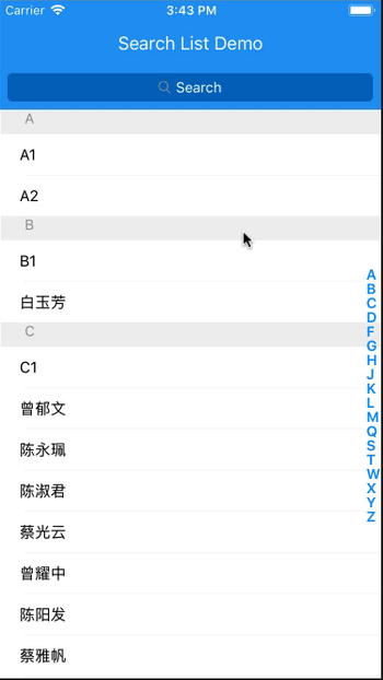
The following pic may be helpful when understanding the structure and APIs:

Installation
$ npm install @unpourtous/react-native-search-list --save
Usage
To Use SearchList, need a array of object as data source,and each object has searchStr property, eample code are put in ./entry.js.
export default class example extends Component {
  constructor (props) {
    super(props)
    this.state = {
      dataSource: demoList
    }
  }

  // custom render row
  renderRow (item, sectionID, rowID, highlightRowFunc, isSearching) {
    return (
      <Touchable onPress={() => {
        Alert.alert('Clicked!', `sectionID: ${sectionID}; item: ${item.searchStr}`,
          [
            {text: 'OK', onPress: () => console.log('OK Pressed')},
          ],
          {cancelable: true})
      }}>
        <View key={rowID} style={{flex: 1, marginLeft: 20, height: rowHeight, justifyContent: 'center'}}>
          {/*use `HighlightableText` to highlight the search result*/}
          <HighlightableText
            matcher={item.matcher}
            text={item.searchStr}
            textColor={'#000'}
            hightlightTextColor={'#0069c0'}
          />
        </View>
      </Touchable>
    )
  }

  // render empty view when datasource is empty
  renderEmpty () {
    return (
      <View style={styles.emptyDataSource}>
        <Text style={{color: '#979797', fontSize: 18, paddingTop: 20}}> No Content </Text>
      </View>
    )
  }

  // render empty result view when search result is empty
  renderEmptyResult (searchStr) {
    return (
      <View style={styles.emptySearchResult}>
        <Text style={{color: '#979797', fontSize: 18, paddingTop: 20}}> No Result For <Text
          style={{color: '#171a23', fontSize: 18}}>{searchStr}</Text></Text>
        <Text style={{color: '#979797', fontSize: 18, alignItems: 'center', paddingTop: 10}}>Please search again</Text>
      </View>
    )
  }

  render () {
    return (
      <View style={styles.container}>
        <StatusBar backgroundColor='#F00' barStyle='light-content' />
        <SearchList
          data={this.state.dataSource}
          renderRow={this.renderRow.bind(this)}
          renderEmptyResult={this.renderEmptyResult.bind(this)}
          renderBackButton={() => null}
          renderEmpty={this.renderEmpty.bind(this)}

          rowHeight={rowHeight}

          toolbarBackgroundColor={'#2196f3'}
          title='Search List Demo'
          cancelTitle='取消'
          onClickBack={() => {}}

          searchListBackgroundColor={'#2196f3'}

          searchBarToggleDuration={300}

          searchInputBackgroundColor={'#0069c0'}
          searchInputBackgroundColorActive={'#6ec6ff'}
          searchInputPlaceholderColor={'#FFF'}
          searchInputTextColor={'#FFF'}
          searchInputTextColorActive={'#000'}
          searchInputPlaceholder='Search'
          sectionIndexTextColor={'#6ec6ff'}
          searchBarBackgroundColor={'#2196f3'}
        />
      </View>
    )
  }
}
APIs
| prop name | type | description | default value |
|---|---|---|---|
| data | array | The rows of list view.each object should contain searchStr, it will be used for search source. If you have custom row id,you should set searchKey for each object. |
|
| renderRow | number | Render your custom row content. | |
| rowHeight | number | The height of the default row content, it will be used for scroll calculate. | 40 |
| sectionHeaderHeight | number | The height of section header content. | 24 |
| searchListBackgroundColor | string | BackgroundColor for searchList. | #171a23 |
| toolbarBackgroundColor | string | Toolbar background color. | #171a23 |
| searchBarToggleDuration | number | Custom search bar animation duration. | 300 |
| searchBarBackgroundColor | string | Custom search bar background color. | #171a23 |
| searchInputBackgroundColor | string | Custom search input default state background color. | |
| searchInputBackgroundColorActive | string | Custom search input searching state background color. | |
| searchInputPlaceholder | string | Custom search input placeholder text. | |
| searchInputPlaceholderColor | string | Custom search input placeholder text color. | |
| searchInputTextColor | string | Custom search input default state text color. | |
| searchInputTextColorActive | string | Custom search input searching state text color. | |
| searchBarBackgroundColor | string | Custom search bar background color. | |
| title | string | Toolbar title. | |
| titleTextColor | string | Toolbar title text color. | |
| cancelTextColor | string | Search bar cancel text color. | |
| cancelTitle | string | Search bar cancel text color. | |
| sectionIndexTextColor | string | Section index text color. | |
| hideSectionList | bool | Whether to hide the alphabetical section listing view or not. | |
| renderSectionIndexItem | func | Custom render SectionIndexItem. | |
| sortFunc | func | The sort function for the list view data source,sorting alphabetical by default | |
| resultSortFunc | func | The sort function for the search result,sorting first match position by default | |
| onScrollToSection | func | The callback of alphabetical section view be clicked or touch. | |
| renderBackButton | func | Render a custom back buttom on Toolbar. | |
| renderEmpty | func | Render a view when data is empty. | |
| renderEmptyResult | func | Render a view when search result is empty. | |
| renderSeparator | func | Render row separator. | |
| renderSectionHeader | func | renderSectionHeader for the internal ListView |
|
| renderHeader | func | renderHeader for the internal ListView |
|
| renderFooter | func | renderFooter for the internal ListView |
|
| renderRow | func | renderRow for the internal ListView |
|
| onSearchStart | func | Callback when searching start. | |
| onSearchEnd | func | Callback when searching end. |
Thanks
TODO
add hightlight demotest ios & android & android with status bar and without
License
This library is distributed under MIT Licence.