
Package Exports
- @verino/react
Readme
@verino/react
React adapter for Verino. Reliable OTP inputs from a single core.


Overview
@verino/react wraps @verino/core in a useOTP hook. The hook manages React state, wires all event handlers, and returns everything needed to render a fully accessible OTP field with full control over markup and styling.
HiddenOTPInput is a positioned <input> that captures all keyboard input, paste, and native SMS autofill. Visual slot divs are purely decorative mirrors, hold no event listeners and carry no state of their own.
The core instance stays stable across ordinary re-renders. Callback options (onComplete, onExpire, etc.) are stored in refs so they can be updated without restarting the effect, and the machine is only recreated when structural configuration such as length changes.
Why Use This Adapter?
- Full markup control.
useOTPprovides render props — you own the JSX, no opaque wrapper. - React 18 ready. Fully compatible with concurrent features, Suspense, and strict mode.
react-hook-formfriendly. PassvalueandonChangeto integrate with any form library.- Stable instance. The
@verino/corestate machine persists across ordinary re-renders and only rebuilds for structural configuration changes.
Installation
# npm
npm i @verino/react

# pnpm
pnpm add @verino/react

# yarn
yarn add @verino/react
Peer dependency: React ≥ 18. @verino/core installs automatically.
Quick Start
import { useOTP, HiddenOTPInput } from '@verino/react'

function OTPField() {
  const otp = useOTP({ length: 6, onComplete: (code) => verify(code) })

  return (
    <div style={{ position: 'relative', display: 'inline-flex', gap: 8 }}>
      <HiddenOTPInput {...otp.hiddenInputProps} />

      {otp.getSlots().map((slot) => {
        const { char, isActive, isFilled, isError, hasFakeCaret, placeholder } = otp.getSlotProps(slot.index)
        return (
          <div
            key={slot.index}
            className={['slot', isActive && 'is-active', isFilled && 'is-filled', isError && 'is-error'].filter(Boolean).join(' ')}
          >
            {hasFakeCaret && <span className="caret" />}
            {isFilled ? char : placeholder}
          </div>
        )
      })}
    </div>
  )
}
Note:
verify(code)and similar functions used in examples are placeholders — replace them with your own API calls or application logic.
Common Patterns
| Use case | Key options |
|---|---|
| SMS / email OTP | type: 'numeric', timer: 60, onResend |
| TOTP / 2FA with separator | separatorAfter: 3 |
| PIN entry | masked: true, blurOnComplete: true |
| Alphanumeric code | type: 'alphanumeric', pasteTransformer |
| Invite / referral code | separatorAfter: [3, 6], pattern: /^[A-Z0-9]$/ |
| Hex activation key | pattern: /^[0-9A-F]$/ |
| Async verification lock | setDisabled(true / false) around the API call |
| Native form submission | name: 'otp_code' |
| Pre-fill on mount | defaultValue: '123456' |
| Display-only / read-only | readOnly: true |
Usage
Live external control / react-hook-form
Use value for live external control and defaultValue for one-time mount prefill. In React, live external control means passing the current string from parent state and writing changes back through onChange. Programmatic updates do not trigger onComplete:
const [code, setCode] = useState('')
const otp = useOTP({ length: 6, value: code, onChange: setCode })
With react-hook-form:
import { useForm, Controller } from 'react-hook-form'

function OTPField({ value, onChange }: { value: string; onChange: (v: string) => void }) {
  const otp = useOTP({ length: 6, value, onChange })
  return (
    <div style={{ position: 'relative', display: 'inline-flex', gap: 8 }}>
      <HiddenOTPInput {...otp.hiddenInputProps} />
      {otp.getSlots().map((slot) => {
        const { char, isActive, isFilled, isError } = otp.getSlotProps(slot.index)
        return (
          <div key={slot.index} className={['slot', isActive && 'is-active', isFilled && 'is-filled', isError && 'is-error'].filter(Boolean).join(' ')}>
            {char}
          </div>
        )
      })}
    </div>
  )
}

function MyForm() {
  const { control, handleSubmit } = useForm<{ otp: string }>()
  return (
    <form onSubmit={handleSubmit((data) => console.log(data.otp))}>
      <Controller name="otp" control={control} render={({ field }) => (
        <OTPField value={field.value} onChange={field.onChange} />
      )} />
    </form>
  )
}
Async verification
const otp = useOTP({
  length: 6,
  onComplete: async (code) => {
    otp.setDisabled(true)
    const ok = await api.verify(code)
    otp.setDisabled(false)
    ok ? otp.setSuccess(true) : otp.setError(true)
  },
})
Timer
timerSeconds is a live reactive countdown, it updates every second:
const otp = useOTP({ length: 6, timer: 60, onExpire: () => showExpired() })
{otp.timerSeconds > 0 && (
<p>
Expires in {Math.floor(otp.timerSeconds / 60)}:
{String(otp.timerSeconds % 60).padStart(2, '0')}
</p>
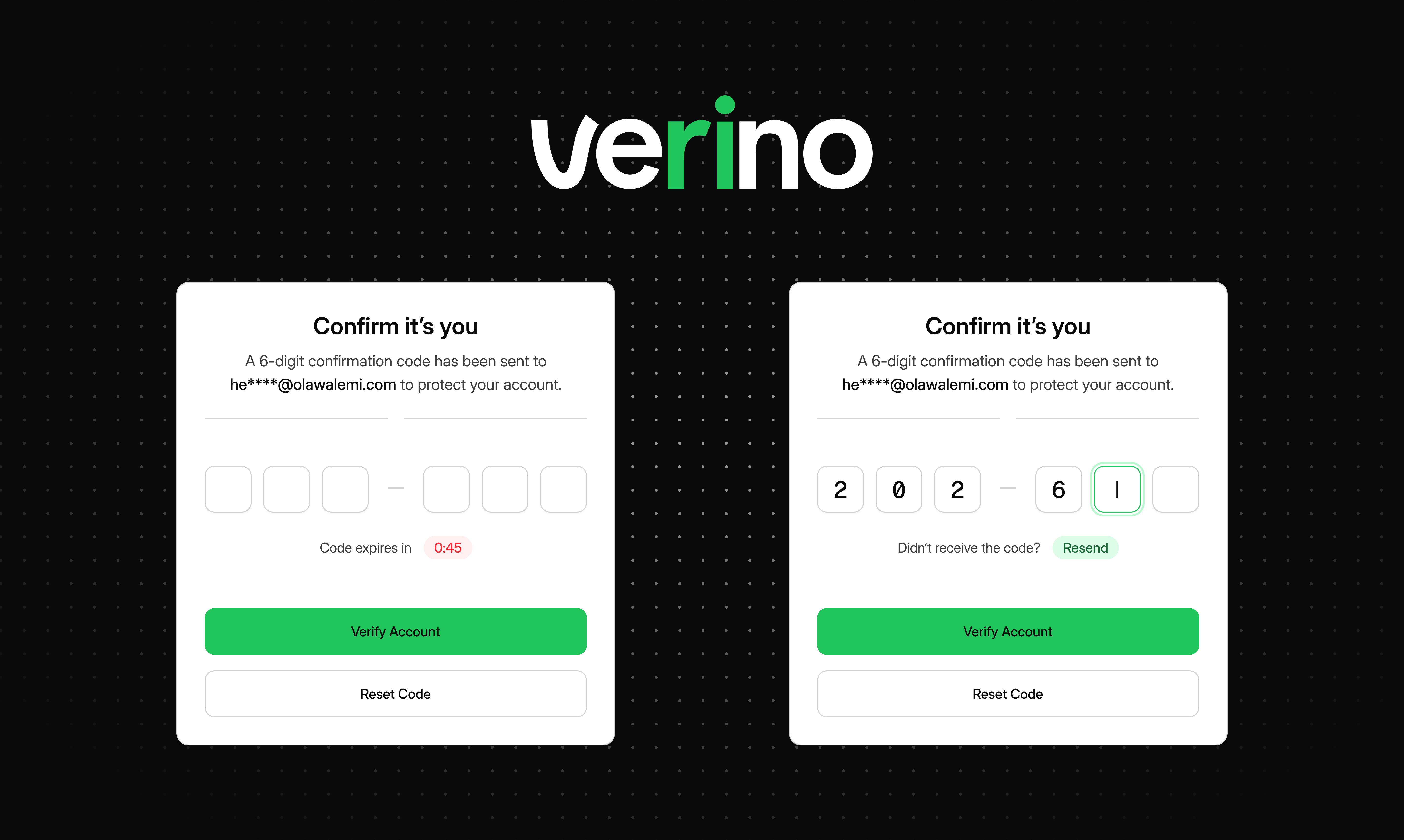
)}Separator
import { Fragment } from 'react'

const otp    = useOTP({ length: 6, separatorAfter: 3, separator: '—' })
const sepSet = new Set(
  Array.isArray(otp.separatorAfter) ? otp.separatorAfter : [otp.separatorAfter]
)

{otp.getSlots().map((slot) => (
  <Fragment key={slot.index}>
    {sepSet.has(slot.index) && <span aria-hidden="true">{otp.separator}</span>}
    <div className="slot">{otp.getSlotProps(slot.index).char}</div>
  </Fragment>
))}
Masked input
const otp = useOTP({ length: 6, masked: true, maskChar: '●' })

{otp.getSlots().map((slot) => {
  const { char, isFilled, masked, maskChar, placeholder } = otp.getSlotProps(slot.index)
  return (
    <div key={slot.index} className="slot">
      {isFilled ? (masked ? maskChar : char) : placeholder}
    </div>
  )
})}
data-* state attributes
Spread data-* props onto slot divs for CSS driven state styling:
function dataAttrs(props: Record<string, unknown>) {
  const out: Record<string, unknown> = {}
  for (const key in props) if (key.startsWith('data-')) out[key] = props[key]
  return out
}

{otp.getSlots().map((slot) => (
  <div key={slot.index} className="slot" {...dataAttrs(otp.getInputProps(slot.index))}>
    {otp.getSlotProps(slot.index).char}
  </div>
))}
Slot attributes
Slot-level attributes use string values ("true" / "false"):
| Attribute | Meaning |
|---|---|
data-active |
Logical cursor is at this slot (set even when the field is blurred) |
data-focus |
Browser focus is on the hidden input |
data-filled |
Slot contains a character |
data-empty |
Slot is unfilled (complement of data-filled) |
data-invalid |
Error state is active |
data-success |
Success state is active (mutually exclusive with data-invalid) |
data-disabled |
Field is disabled |
data-readonly |
Field is in read-only mode |
data-complete |
All slots are filled |
data-first |
This is the first slot 0 |
data-last |
This is the last slot |
data-slot |
Zero-based position of the slot as a string ("0", "1", …) |
Wrapper attributes
Set on the wrapper element as boolean presence attributes (no value):
| Attribute | When present |
|---|---|
data-complete |
All slots are filled |
data-invalid |
Error state is active |
data-success |
Success state is active |
data-disabled |
Field is disabled |
data-readonly |
Field is read-only |
/* Slot-level — scope to your field with an id or class prefix */
.slot[data-active="true"][data-focus="true"] { border-color: #3D3D3D; }
.slot[data-filled="true"]                    { background:   #FFFFFF; }
.slot[data-empty="true"]                     { background:   #FAFAFA; }
.slot[data-invalid="true"]                   { border-color: #FB2C36; }
.slot[data-success="true"]                   { border-color: #00C950; }
.slot[data-disabled="true"]                  { opacity: 0.45; pointer-events: none; }
.slot[data-readonly="true"]                  { cursor: default; }
.slot[data-complete="true"]                  { border-color: #00C950; }

/* Connected pill layout */
.slot[data-first="true"]                              { border-radius: 8px 0 0 8px; }
.slot[data-last="true"]                               { border-radius: 0 8px 8px 0; }
.slot[data-first="false"][data-last="false"]          { border-radius: 0; }

/* Target a specific slot by index */
.slot[data-slot="0"] { font-weight: 700; }
Spread wrapperProps on the container for wrapper-level attributes:
<div className="otp-wrapper" {...otp.wrapperProps}>
  {/* receives data-complete, data-invalid, data-success, data-disabled, data-readonly */}
</div>
CSS Custom Properties
Style the field using --verino-* CSS custom properties on the wrapper element:
.verino-wrapper {
  /* Dimensions */
  --verino-size:          56px;
  --verino-gap:           12px;
  --verino-radius:        10px;
  --verino-font-size:     24px;

  /* Colors */
  --verino-bg:            #FAFAFA;
  --verino-bg-filled:     #FFFFFF;
  --verino-color:         #0A0A0A;
  --verino-border-color:  #E5E5E5;
  --verino-active-color:  #3D3D3D;
  --verino-error-color:   #FB2C36;
  --verino-success-color: #00C950;
  --verino-caret-color:   #3D3D3D;

  /* Placeholder, separator & mask */
  --verino-placeholder-color: #D3D3D3;
  --verino-placeholder-size:  16px;
  --verino-separator-color:   #A1A1A1;
  --verino-separator-size:    18px;
  --verino-masked-size:       16px;
}
Accessibility
- Single ARIA-labelled input — the hidden input carries
aria-label="Enter your N-digit code"(orN-character codefor non-numeric types). Screen readers announce one field, not multiple slots. - All visual elements are
aria-hidden— slots, separators, caret, and timer UI are removed from the accessibility tree. inputMode— set to"numeric"or"text"based ontype, triggering the correct mobile keyboard.autocomplete="one-time-code"— enables native SMS autofill on iOS and Android.- Anti-interference —
spellcheck="false",autocorrect="off", andautocapitalize="off"prevent unwanted browser input behavior. maxLength— constrains the hidden input tolength, preventing overflow from IME and composition events.type="password"in masked mode — enables secure input and triggers the password keyboard on mobile.- Native form integration — the
nameoption includes the hidden input in<form>submission andFormData. - Keyboard navigation — full support for
←,→,Backspace,Delete, andTab.
API Reference
useOTP(options?)
function useOTP(options?: ReactOTPOptions): UseOTPResultReactOTPOptions
Builds on CoreOTPOptions from @verino/core with React-specific state and rendering options:
type ReactOTPOptions = CoreOTPOptions & {
  value?:          string                   // live external control; does not trigger onComplete
  onChange?:       (code: string) => void   // fires on INPUT, DELETE, CLEAR, PASTE
  separatorAfter?: number | number[]
  separator?:      string                   // default: '—'
  masked?:         boolean
  maskChar?:       string                   // default: '●'
}
UseOTPResult
type UseOTPResult = {
  // Reactive state (plain values — update triggers re-render)
  slotValues:     string[]
  activeSlot:     number
  isComplete:     boolean
  hasError:       boolean
  hasSuccess:     boolean
  isDisabled:     boolean
  isFocused:      boolean
  timerSeconds:   number           // live countdown; 0 when expired or no timer
  separatorAfter: number | number[]
  separator:      string

  // Bindings
  hiddenInputProps: HiddenInputProps
  wrapperProps:     Record<string, string | undefined>

  // Slot helpers
  getCode():                         string
  getSlots():                        SlotEntry[]
  getSlotProps(index: number):       SlotRenderProps
  getInputProps(index: number):      InputProps & { 'data-focus': 'true' | 'false' }

  // Programmatic control
  reset():                           void
  resend():                          void
  setError(v: boolean):              void
  setSuccess(v: boolean):            void
  setDisabled(v: boolean):           void
  setReadOnly(v: boolean):           void
  focus(slotIndex: number):          void
}

### `SlotRenderProps`

```ts
type SlotRenderProps = {
  char:         string
  index:        number
  isActive:     boolean
  isFilled:     boolean
  isError:      boolean
  isSuccess:    boolean
  isComplete:   boolean
  isDisabled:   boolean
  isFocused:    boolean
  hasFakeCaret: boolean   // render your caret here: active + empty + focused
  masked:       boolean
  maskChar:     string
  placeholder:  string
}
HiddenOTPInput
const HiddenOTPInput: React.ForwardRefExoticComponent<
  React.InputHTMLAttributes<HTMLInputElement>
>
Renders a position: absolute; opacity: 0 input that covers the slot row. Spread otp.hiddenInputProps directly — all event wiring is included.
Compatibility
| Environment | Requirement |
|---|---|
| React | ≥ 18 |
@verino/core |
Same monorepo release |
| TypeScript | ≥ 5.0 |
| Node.js (SSR) | ≥ 18 |
| Module format | ESM + CJS |
Integration with Core
useOTP creates a stable createOTP() machine from @verino/core for the current field shape, then routes dynamic adapter behavior through refs and toolkit helpers. Filtering, cursor logic, paste normalization, and event routing live in core; countdown, feedback, and input-scheduling come from @verino/core/toolkit.
See the @verino/core README for the full state machine and event reference.
Contributing
This package lives in the verino monorepo. See CONTRIBUTING.md for guidelines.
# Clone and install
git clone https://github.com/boastack/verino.git
cd verino && pnpm i

# Run before opening a PR
pnpm --filter @verino/react build && pnpm test
Ecosystem
| Package | Purpose |
|---|---|
@verino/core |
OTP state machine + toolkit |
@verino/vanilla |
Vanilla DOM adapter + timerUIPlugin, webOTPPlugin, pmGuardPlugin |
@verino/vue |
useOTP composable with reactive Vue refs (Vue ≥ 3) |
@verino/svelte |
useOTP store + use:action directive (Svelte ≥ 4) |
@verino/alpine |
VerinoAlpine plugin — x-verino directive (Alpine.js ≥ 3) |
@verino/web-component |
<verino-input> Shadow DOM custom element |
License
MIT © 2026 Olawale Balo