
Package Exports
- @vj97/react-date-picker
- @vj97/react-date-picker/dist/index.js
This package does not declare an exports field, so the exports above have been automatically detected and optimized by JSPM instead. If any package subpath is missing, it is recommended to post an issue to the original package (@vj97/react-date-picker) to support the "exports" field. If that is not possible, create a JSPM override to customize the exports field for this package.
Readme
React Date Picker
A lightweight plugin to select both Single Date and a Date Range.
Features
- Single Date Selection
- Date Range Selection
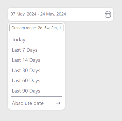
- Relative and Absolute Picker Option
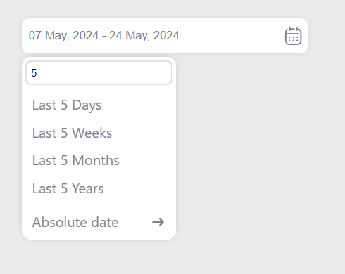
- Search on Relative Option
- Month/Year Selection View
Demo
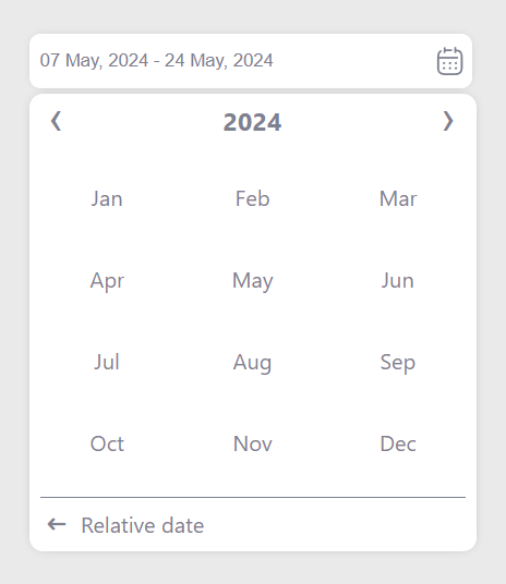
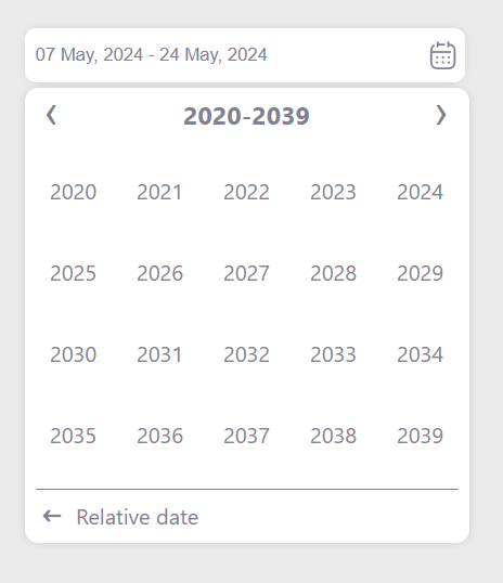
Screenshots
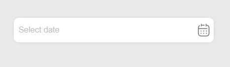
Date Picker
Relative Options
Relative Search
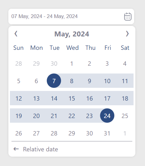
Absolute Date Picker
Month Selection
Year Selection
Usage/Examples
Import css
import "@vj97/react-date-picker/dist/style.css";Code Example
import { DatePicker } from '@vj97/react-date-picker'

 <DatePicker
    placeholder="Choose Date"
    selectionType="range"
    onChange={handleDateChange}
    />

function handleDateChange (dates) {
    console.log(dates)

    // output for single date will be string
    // output for date range will be object as below
    // {stateDate: "", endDate: ""}
}
Supported props
| Property name | Type | Default | Description |
|---|---|---|---|
| selectionType | single/range | single | Type of the picker |
| dateFormat | string | DD MMM, YYYY | The date format to be returned in the onChange event |
| viewFormat | string | dateFormat | The date format to be shown in the input field |
| selectedDates | string/date for single and array of 2 string/date for range, in 'YYYY-MM-DD' format | NULL | Date/Range to be selected |
| minDate | string/date | NULL | Minimun date |
| maxDate | string/date | dark | Maximum date |
| placeholder | string | NULL | Placeholder |
| colors | object | {} | Theme colors, refer below for supported colors |
| showCalendarIcon | boolean | true | To show calendar icon on input right |
| containerStyle | style object | {} | Style of the input container |
| inputStyle | style object | {} | Style of the input |
| containerClass | string | NULL | Custom class for input container |
| inputClass | string | NULL | Custom class for input |
| disabled | boolean | false | disable datepicker input |
| required | boolean | false | required datepicker input |
| defaultPickerType | relative/absolute | absolute | Picker type to be opened be default |
| onChange | function | n/a | Callback called when date is selected |
Colors
{
    selection: "", // Highlight color for selected dates
    text: "", // Text color for picker
    background: "", // Background color for date picker popup
}