
Package Exports
- @vuesimple/vs-alert
- @vuesimple/vs-alert/dist/index.esm.js
- @vuesimple/vs-alert/dist/index.umd.js
This package does not declare an exports field, so the exports above have been automatically detected and optimized by JSPM instead. If any package subpath is missing, it is recommended to post an issue to the original package (@vuesimple/vs-alert) to support the "exports" field. If that is not possible, create a JSPM override to customize the exports field for this package.
Readme
Vue Simple Alert
🗃 A simple vue alert. Perfect for all your alert scenarios.
A light weight vue plugin built groundup.


📺 Live Demo
Code Sandbox: Link
🛠 Install
npm i @vuesimple/vs-alert🚀 Usage
<template>
  <vs-alert variant="success"> Success </vs-alert>
</template>

<script>
  import VsAlert from '@vuesimple/vs-alert';

  export default {
    components: {
      VsAlert,
    },
  };
</script>
🌎 CDN
<script src="https://unpkg.com/@vuesimple/vs-alert@<version>/dist/vs-alert.min.js"></script>// Main/Entry file
app.use(VsAlert.plugin);<template>
<vs-alert variant="success"> Success </vs-alert>
</template>
 Nuxt.js
Nuxt Code Snippet
After installation,
Create a file
/plugins/vs-alert.jsimport Vue from 'vue'; import VsAlert from '@vuesimple/vs-alert'; Vue.component('vs-alert', VsAlert);
Update
nuxt.config.jsmodule.exports = { ... plugins: [ { src: '~plugins/vs-alert', mode: 'client' } ... ] }
In the page/ component
<template>
  <vs-alert variant="success"> Success </vs-alert>
</template>
Note
- For older Nuxt versions, use
<no-ssr>...</no-ssr>tag. - You can also do
import VsAlert from '@vuesimple/vs-alert'& add incomponent:{VsAlert}and use it within component, without globally installing in plugin folder.
⚙ Props
| Name | Type | Default | Description |
|---|---|---|---|
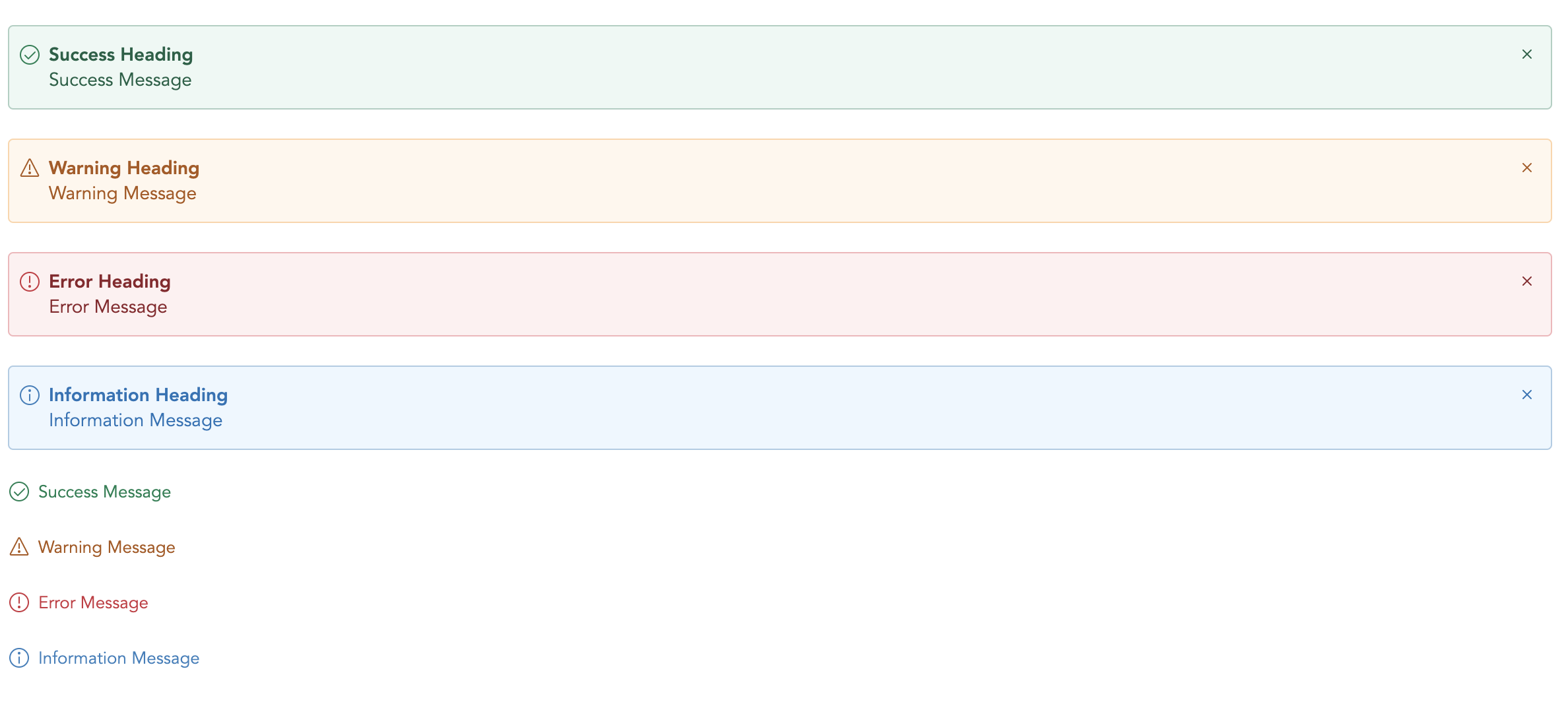
| variant | String | - | Type of alert to be shown. (success, warning, error, info, secondary) |
| title | String | - | The alert title (text only). For HTML, use the header slot. |
| showClose | Boolean | false | Show alert close icon |
| small | Boolean | false | Applies reduced padding |
| toast | Boolean | false | Applies toast design |
| noBg | Boolean | false | Remove background color |
🔥 Events
| Name | Description |
|---|---|
| close | Emitted when the alert close icons is clicked. Listen for it using @close. |
📎 Slots
You can define own item markup via slots:
| Name | Description |
|---|---|
| (default) | Holds the alert content and can contain HTML. |
| icon | Slot to add custom icon for type |
| title | Slot to add custom title |