
Package Exports
- beastmode-ui
This package does not declare an exports field, so the exports above have been automatically detected and optimized by JSPM instead. If any package subpath is missing, it is recommended to post an issue to the original package (beastmode-ui) to support the "exports" field. If that is not possible, create a JSPM override to customize the exports field for this package.
Readme
Based on react-native-minimalist by Dave Hudson dave@applification.net.
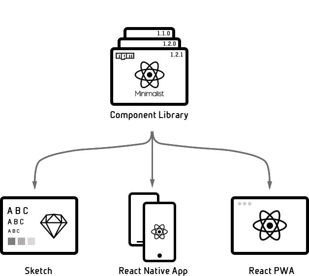
BeastMode UI Framework - Cross Platform React UI Component Library for iOs, Android, Web, VR, Sketch...
Status: Alpha (It is not recommended you use in a production app yet).
The Problem
You want a set of universal components that work across React & React Native, perhaps even Sketch and React VR.
The Solution
A React component library that utilises React Primitives and React Native Web to target multiple platforms using React Native.
Approach
This library is highly inspired by Nicolas Gallagher's view that developing great web apps using the DOM is hard and React Native is a better platform for developing web apps.
The use of Leland Richardson's React Primitives is a logical extension enabling the use of React Native to deliver native mobile apps, web apps and other mediums using universally rendered components.
Components are developed using a Pure UI approach as advocated by Guillermo Rauch, where the UI is a pure function of state.
Table of Contents
Installation
npm install --save beastmode-uiDependencies
This library makes use of SVG icons via BeastMode Icons which is a based off Nicolas Gallagher's blog post on Making SVG icon libraries for React apps and Dave Hudson's (dave@applification.net) react-native-minimalist-icons package.
To install:
npm install --save beastmode-iconsUsage
import {
  Content,
  Header,
  Text
} from 'beastmode-ui';

<Content>
  <Header>Big header with padding</Header>
  <Text>Body text with padding</Text>
</Content>
Examples
All components have been developed and tested using storybook. View the Storybook Component API
Test app shells:
-
Dave Hudson
📖 💻 💡 ⚠️License
MIT
Issues
react-primitives warning
When running tests you get
ReactClass: You're attempting to include a mixin that is either null or not an object. Check the mixins included by the component, as well as any mixins they include themselves. Expected object but got undefined.This is because react-primitives does not yet support React 16 https://github.com/lelandrichardson/react-primitives/issues/75
Roadmap
- Skeleton loader component
- TextInput component
- Button component
- Toast Notification component
- Search Bar component
- Card component
- Swipeable Views component
- MapView component
- Video component
- Theme support
