
Package Exports
- enum-plus
- enum-plus/cjs
- enum-plus/enum
- enum-plus/enum-item
- enum-plus/enum-items
- enum-plus/es-legacy
- enum-plus/esm
- enum-plus/extension
- enum-plus/localize-interface
- enum-plus/package.json
- enum-plus/types
- enum-plus/utils
Readme

Like native enum, but much better!


⬇️ Introduction | Features | Installation | Enum Initialization | API | Static Methods | Global Configuration | User Stories | Plugin System | Localization | Extensibility | Naming Conflicts | Best Practices | Compatibility | Q&A | Support ⬇️
🎉 v3.0 is Released!
The new version is a major milestone that brings many exciting features and improvements. Please refer to the Release Notes and Migration Guide for details.
If the enum types become
anyafter upgrading to v3.0, please see here.
Supported Platforms

Introduction
enum-plus is an enhanced enumeration library that is fully compatible with the native enum and serves as a drop-in replacement library. It supports adding display text to enum items and extending more custom metadata fields. Enums can be generated into various UI components such as dropdowns and menus, which greatly simplifies front-end development.
It also provides many extension methods for iterating over enum items and data transformations. You can convert values directly into names in the current language, since it supports internationalization. It's very useful for displaying business data in the UI.
It is a lightweight, zero-dependency library, and it works with any front-end framework, including vanilla projects.
What other exciting features are there? Please continue to explore! Or you can check out this video first.

Here are some hot questions, feel free to check them out
- Why do I need this library? TypeScript already has the built-in enums
- Do I have to install TypeScript? What if my project is in JavaScript?
- How about the performance of this library?
- It seems that TypeScript is going to deprecate enum?
- I have a great idea and would like to contribute to this project. What should I do?
Features
- Compatible with the usage of native enums
- Supports multiple data types such as
numberandstring - Enhanced enum items with display names
- Internationalization support for display names, can be integrated with any i18n library
- Converts values directly into display names, simplifying data display in the UI
- Extensible design, allowing custom metadata fields for enum items
- Plugin system design, extending enum functionality through plugin installations
- Supports type narrowing to enhance type safety TypeScript
- Generates dropdowns from enums, compatible with UI libraries like Ant Design, Element Plus, Material-UI
- Compatible with various environments including Browsers, Node.js, React Native, Taro, and mini-programs
- Supports server-side rendering (SSR)
- Compatible with any front-end development framework, including vanilla projects
- TypeScript‑oriented, providing excellent type inference and code completion capabilities
- Zero dependencies
- Lightweight (min+gzip 2KB+ only)
Installation
Install using npm:
npm install enum-plusInstall using pnpm:
pnpm add enum-plusInstall using bun:
bun add enum-plusOr using yarn:
yarn add enum-plusRuns in the Browser:
- The specific version:
<!-- Modern version, ES2020 compatible -->
<script src="https://cdn.jsdelivr.net/npm/enum-plus@v3.1.8/umd/enum-plus.min.js"></script>
<!-- Legacy version, ES2015 compatible -->
<script src="https://cdn.jsdelivr.net/npm/enum-plus@v3.1.8/umd/enum-plus-legacy.min.js"></script>- The latest version:
<!-- Modern version, ES2020 compatible -->
<script src="https://cdn.jsdelivr.net/npm/enum-plus/umd/enum-plus.min.js"></script>
<!-- Legacy version, ES2015 compatible -->
<script src="https://cdn.jsdelivr.net/npm/enum-plus/umd/enum-plus-legacy.min.js"></script>
⬇️ Download:
- enum-plus.umd.min.js.gz
- enum-plus.umd.tar.gz (Full package with sourcemap)
- enum-plus-legacy.umd.min.js.gz
- enum-plus-legacy.umd.tar.gz (Full package with sourcemap)
You can also download these files from the GitHub Releases.
Enum Initialization
This section shows the various ways to initialize enums using the Enum function. Understanding these different initialization formats allows you to choose the most convenient approach for your specific use case.
1. Key-Value Format
The simplest format is a direct mapping of keys to values. This is similar to the native enum format.
import { Enum } from 'enum-plus';

// With number values
const WeekEnum = Enum({
  Sunday: 0,
  Monday: 1,
});

WeekEnum.Monday; // 1

// With string values
const WeekEnum2 = Enum({
  Sunday: 'Sun',
  Monday: 'Mon',
});

WeekEnum2.Monday; // 'Mon'
If your project uses TypeScript and the version is below 5.0, it is recommended to add the
as consttype assertion to the parameter of theEnummethod. In this way, the enum values will remain their original literal values instead of being converted tonumberorstring. For more details, please refer to here.
2. Standard Format (Recommended)
The standard format includes both a value and a label for each enum item. This is the most commonly used format and is recommended for most cases. This format allows you to specify a display name for each enum item, which can be used in UI components. Please refer to the Localization section for internationalization support.
import { Enum } from 'enum-plus';

const WeekEnum = Enum({
  Sunday: { value: 0, label: 'I love Sunday' },
  Monday: { value: 1, label: 'I hate Monday' },
});

WeekEnum.Sunday; // 0
WeekEnum.items[0].key; // 'Sunday'
WeekEnum.items[0].label; // I love Sunday
Want to enable code completion when entering
label? Please refer to the Enable Code Intelligence for Enum Item Labels section for more details.Want to customize the logic of the
labelfield? You can pass in a function. Please refer to the Custom Label Logic section for more details.
3. Label-Only Format
Create an enumeration that only provides the key and label fields. If the value field is omitted, it defaults to the same value as the key field.
import { Enum } from 'enum-plus';

const WeekEnum = Enum({
  Sunday: { label: 'I love Sunday' },
  Monday: { label: 'I hate Monday' },
});

WeekEnum.Sunday; // 'Sunday'
WeekEnum.items[0].key; // 'Sunday'
WeekEnum.items[0].label; // I love Sunday
4. Array Format
The array format is useful when you need to create enums with dynamic data, for example the data from an API.
You can also use dynamic field mapping rules to adapt to various different data structures. Please refer to the Custom Field Mapping section for more details.
import { Enum } from 'enum-plus';

const pets = [
  { value: 1, key: 'Dog', label: 'Dog' },
  { value: 2, key: 'Cat', label: 'Cat' },
  { value: 3, key: 'Rabbit', label: 'Rabbit' },
];
const PetEnum = Enum(pets);

PetEnum.Dog; // 1
PetEnum.label(1); // Dog
5. Native Enum Format
Create from native enums. It benefits from the native enum's auto-incrementing behavior.
import { Enum } from 'enum-plus';

enum WeekNative {
  Sunday = 0,
  Monday,
  Tuesday,
  Wednesday,
  Thursday,
  Friday,
  Saturday,
}
const WeekEnum = Enum(WeekNative);

WeekEnum.Sunday; // 0
WeekEnum.Monday; // 1
WeekEnum.Saturday; // 6
Please note that when creating enums, all enum items must maintain a consistent data structure. For example, you cannot use both Key-Value format and Standard format in the same enum.
You can pass in some optional configuration options to better control the behavior of the enum. Please refer to the Enum Configuration Options section for details.
API
💎 Pick enum values
Enum.XXX
Works like native enum, allowing you to access enum values directly.
WeekEnum.Sunday; // 0
WeekEnum.Monday; // 1
💎 named
Record<string, EnumItemClass>
An object that aggregates all enum items, allowing quick access to a specific enum item object through its key.
WeekEnum.named.Monday; // { key: 'Monday', value: 1, label: 'Monday' }💎 items
{ value, label, key, raw }[]
Returns a read-only array of all enum items.
WeekEnum.items; // [ { value: 0, label: 'Sunday', key: 'Sunday' }, { value: 1, label: 'Monday', key: 'Monday' }, ... ]💎 values
(string | number)[]
Returns an array of all enum item value(s).
WeekEnum.values; // [0, 1, 2, 3, 4, 5, 6]💎 labels
string[]
Returns an array of all enum item label(s). If localization has been enabled, the localized texts of each enum item will be returned.
WeekEnum.labels; // ['Sunday', 'Monday', ... 'Friday', 'Saturday']💎 keys
string[]
Returns an array of all enum item key(s)
WeekEnum.keys; // ['Sunday', 'Monday', 'Tuesday', 'Wednesday', 'Thursday', 'Friday', 'Saturday']💎 meta
Record<string, any[]>
Returns an object containing arrays of custom field values for all enum items. Each key in the object corresponds to a custom field name, and the value is an array of that field's values across all enum items.
const ColorEnum = Enum({
  Red: { value: 1, label: 'Red', hex: '#FF0000' },
  Green: { value: 2, label: 'Green', hex: '#00FF00' },
  Blue: { value: 3, label: 'Blue', hex: '#0000FF' },
});
ColorEnum.meta.hex; // ['#FF0000', '#00FF00', '#0000FF']
Additionally, you can quickly access custom fields of an enum item through the named and raw properties.
ColorEnum.named.Red.raw.hex; // '#FF0000'💎 has
[F] has(keyOrValue?: string | number): boolean
Check if the value or key of an enum item exists.
WeekEnum.has(1); // true
WeekEnum.has('Sunday'); // true
WeekEnum.has(9); // false
WeekEnum.has('Birthday'); // false
💎 findBy
[F] findBy(field: string, value: any): EnumItemClass | undefined
Find an enum item by a specific field and its value. Returns the enum item object if found, otherwise returns undefined.
The field parameter can be one of the built-in fields: key, value, label, or any meta field defined in the enum item.
ColorEnum.findBy('value', 1); // { key: 'Red', value: 1, label: 'Red', hex: '#FF0000' }
ColorEnum.findBy('key', 'Red'); // { key: 'Red', value: 1, label: 'Red', hex: '#FF0000' }
ColorEnum.findBy('hex', '#FF0000'); // { key: 'Red', value: 1, label: 'Red', hex: '#FF0000' }
If you need to get the meta fields of a known enum item, it is recommended to use the
namedandrawproperty, for example:ColorEnum.named.Red.raw.hex.
💎 label
[F] label(keyOrValue?: string | number): string | undefined
Gets the display name of an enum item according to its value or key. If localization is enabled, the localized text will be returned.
WeekEnum.label(1); // Monday
WeekEnum.label('Monday'); // Monday, this is label, not key
💎 key
[F] key(value?: string | number): string | undefined
Find the key of an enum item by its value. It's also known as reverse mapping. If not found, undefined is returned.
WeekEnum.key(1); // Monday (this is key, not label)💎 raw
[F^1] raw(): Record<K, T[K]>
[F^2] raw(keyOrValue: V | K): T[K]
The raw method has two overloads. The first one is to return the original initialization object of the whole enum collection, i.e. the first parameter of the Enum method.
The second one is to return the original initialization object of a single enum item, i.e. the sub-object of the corresponding field in the first parameter of the Enum method.
The main purpose of the raw method is to get the extended custom fields of the enum items.
const WeekEnum = Enum({
  Sunday: { value: 0, label: 'Sunday', happy: true },
  Monday: { value: 1, label: 'Monday', happy: false },
});

WeekEnum.raw(0).happy; // true
WeekEnum.raw(0); // { value: 0, label: 'Sunday', happy: true }
WeekEnum.raw('Monday'); // { value: 1, label: 'Monday', happy: false }
WeekEnum.raw(); // { Sunday: { value: 0, label: 'Sunday', happy: true }, Monday: { value: 1, label: 'Monday', happy: false } }
Tips: If you want to access the metadata fields of a known enum item, using
enum.named.XXX.rawis a good option, for example:WeekEnum.named.Sunday.raw.happy.
💎 toList
[F^1] toList(): { value, label }[]
[F^2] toList(options?: { valueField?: string; labelField?: string }): { [key: string]: any }[]
Converts the enum items to an array of objects, each containing value and label fields by default. You can customize the field names using the options parameter.
WeekEnum.toList();
// [
//   { value: 0, label: 'Sunday' },
//   { value: 1, label: 'Monday' },
//   ...
//   { value: 6, label: 'Saturday' }
// ]
WeekEnum.toList({ valueField: 'id', labelField: 'name' });
// [
//   { id: 0, name: 'Sunday' },
//   { id: 1, name: 'Monday' },
//   ...
//   { id: 6, name: 'Saturday' }
// ]
💎 toMap
[F^1] toMap(): Record<string, string | number>
[F^2] toMap(options?: { keySelector?: string; valueSelector?: string }): Record<string, any>
Converts the enum items to a key-value map object, where the keys are the enum values and the values are the enum labels by default. You can customize the key and value fields using the options parameter.
WeekEnum.toMap();
// {
//   "0": 'Sunday',
//   "1": 'Monday',
//   ...
//   "6": 'Saturday'
// }
WeekEnum.toMap({ keySelector: 'key', valueSelector: 'value' });
// {
//   "Sunday": 0,
//   "Monday": 1,
//   ...
//   "Saturday": 6
// }
💎 name
string
The display name of the whole enum collection. It's optional and can be set as the second parameter of the Enum method. This name can be either a plain string or a localization key to support internationalized text. Please refer to the Localization section for more details.
const WeekEnum = Enum(
  {
    Sunday: { value: 0, label: 'Sunday' },
    Monday: { value: 1, label: 'Monday' },
  },
  {
    name: 'i18n.enums.week', // A regular string or localization key
  }
);

WeekEnum.name; // Week or 周, depending on the current language setting
Enums are usually used to generate dropdown menus in forms, or show item text in table cells. The display name of the enum type often serves as the form field label or table caption. By utilizing the
nameproperty, you can centralize the management of both the enum type's display name and its items' labels, simplifying maintenance and ensuring consistency across your application.
⚡️ valueType [TypeScript Only]
value1 | value2 | ...
In TypeScript, provides a union type containing all enum values. It's usually used for type constraints on variables and method parameters, or used in component properties.
const weekValue: typeof WeekEnum.valueType = 1;

function setToday(day: typeof WeekEnum.valueType) {
  // ...
}

const MyComponent = (props: { day: typeof WeekEnum.valueType }) => {
  // ...
};
Note: This is a TypeScript type and cannot be called at runtime. Calling it at runtime will throw an error.
⚡️ keyType [TypeScript Only]
key1 | key2 | ...
Similar to valueType, provides a union type of all enum keys in TypeScript.
type WeekKeys = typeof WeekEnum.keyType; // 'Sunday' | 'Monday'

const weekKey: typeof WeekEnum.keyType = 'Monday';
const weekKeys: (typeof WeekEnum.keyType)[] = ['Sunday', 'Monday'];
Note: This is a TypeScript type and cannot be called at runtime. Calling it at runtime will throw an error.
⚡️ rawType [TypeScript Only]
{ value: V, label: string, [...] }
Provides a type of the original initialization object of the whole enum collection, i.e. the type of the first parameter of the Enum method.
Do not confuse it with the raw method. The raw method is a runtime method, while rawType is a TypeScript type.
type WeekRaw = typeof WeekEnum.rawType;
// { Sunday: { value: 0, label: string }, Monday: { value: 1, label: string } }
Note: This is a TypeScript type and cannot be called at runtime. Calling it at runtime will throw an error.
Static Methods
💎 Enum.isEnum
[F] isEnum(obj: any): boolean
Check if a given object is an instance created by the Enum function.
Enum.isEnum(WeekEnum); // true
Enum.isEnum({}); // false
💎 Enum.localize
[F] (key: string) => string
Set a global localization function for all enums. This function will be used to get the localized text for enum items and enum type names. Please refer to the Localization section for more details.
import i18n from 'i18next';

Enum.localize = (key) => i18n.t(key);
💎 Enum.extends
[F] (obj: Record<string, Function>) => void
Extend the Enum objects with custom methods. More details can be found in the Extensibility section.
Enum.extends({
  sayHello() {
    return `Hello EnumPlus!`;
  },
});
💎 Enum.install
[F] (plugin: Plugin, options?: any) => void
Install a plugin to extend the functionality of all enums. More details can be found in the Plugin System section.
import i18nextPlugin from '@enum-plus/plugin-i18next';

Enum.install(i18nextPlugin);
Global Configuration
Enum.config provides some global configuration options that affect the behavior and features of enums.
autoLabel
Enum.config.autoLabel is a global configuration option used to automatically generate labels for enum items. It allows you to set the options.labelPrefix option when defining an enum, which sets a label prefix for all enum items. Enum items only need to set the base value and can even omit the label field (when same as the key field). This reduces repetitive code and improves the conciseness of enum definitions.
Enum.config.autoLabel can be a boolean value or a function type to implement more complex logic.
true- The default value, enabling the automatic label generation feature. The final value of the enum item'slabelwill be automatically set tolabelPrefix+label. If thelabelfield is omitted, thelabelPrefix+keyrule will be used. Of course, if thelabelPrefixis not set when creating the enum, this option will have no effect.function- A custom function used to customize thelabelgeneration rule for each enum item. This function accepts an options object parameter that contains:item(the enum item object) andlabelPrefix, and returns a string as the finallabelvalue.Enum.config.autoLabel = ({ item, labelPrefix }) => { return `${labelPrefix}.${item.key.lowerFirst()}`; };
false- Disables the automatic label generation feature. Enum items must explicitly provide thelabelfield.
Note that
autoLabelis also an option that can be set when creating an enum asoptions.autoLabel. The usage is the same asEnum.config.autoLabel, and it overrides the global configuration for that specific enum.
User Stories
💡 Prevent Magic Numbers
const WeekEnum = Enum({
  Sunday: { value: 0, label: 'Sunday' },
  Monday: { value: 1, label: 'Monday' },
});

if (today === WeekEnum.Sunday) {
  // It's Sunday, enjoy your day!
} else if (today === WeekEnum.Monday) {
  // Oh no, it's Monday again...
}
💡 Check for Valid Enum Values
if (WeekEnum.has(value)) {
  // It's a valid enum value, safe to use
} else {
  // Throw an error or use a default value
}
💡 Check for Enum Objects
let values: number[] | undefined;
if (Enum.isEnum(data)) {
  values = data.values;
} else if (Array.isArray(data)) {
  values = data;
} else {
  // Throw an error or use a default value
}
💡 Generate UI Controls
Take React and Ant Design as examples. Please refer to the Supports Various Frontend Frameworks section for more examples.
import { Menu, Select, Table } from 'antd';
import { ProFormCheckbox, ProFormSelect } from '@ant-design/pro-components';

const App = () => {
  return (
    <>
      <Select options={WeekEnum.items} />
      <Menu items={WeekEnum.toMenu()} />
      <Table columns={[{ filters: WeekEnum.toFilter() }]} />
      <ProFormSelect valueEnum={WeekEnum.toValueMap()} />
      <ProFormCheckbox valueEnum={WeekEnum.toValueMap()} />
    </>
  );
};
Need to install @enum-plus/plugin-antd plugin
💡 Internationalization for Enum Names and Labels
Internationalization support. Set the label field to a localization key, so that it displays the corresponding text based on the current language environment. Please refer to the Localization section for more details.
WeekEnum.label(1); // Monday or 星期一, depending on the current locale
WeekEnum.named.Monday.label; // Monday or 星期一, depending on the current locale
WeekEnum.name; // Week or 周, depending on the current locale
💡 Type Narrowing [TypeScript Only]
Type narrowing is a TypeScript-specific feature that allows you to use valueType to constrain the types of variables, function parameters, or component props. This prevents invalid assignments and enhances type safety in your code.
- Variables
type WeekValues = typeof WeekEnum.valueType; // 0 | 1 | ... | 5 | 6

const weekValue: WeekValues = 1; // ✅ Correct, 1 is a valid week enum value
const weeks: WeekValues[] = [0, 1]; // ✅ Correct, 0 and 1 are valid week enum values

const badWeekValue1: WeekValues = 'Weekend'; // ❌ Type error, "Weekend" is not a number
const badWeekValue2: WeekValues = 8; // ❌ Error, 8 is not a valid week enum value
const badWeeks: WeekValues[] = [0, 8]; // ❌ Error, 8 is not a valid week enum value- Function Parameters
function setDay(day: typeof WeekEnum.valueType) {
  // The type of day is narrowed to 0 | 1 | ... | 5 | 6
}

setDay(1); // ✅ Correct
setDay('Monday'); // ❌ Type error
setDay(8); // ❌ Error, 8 is not a valid enum value- Component Props
type MyComponentProps = {
  day: typeof WeekEnum.valueType; // 0 | 1 | ... | 5 | 6
};
const MyComponent = (props: MyComponentProps) => {
  return <div>Today is {WeekEnum.label(props.day)}</div>;
};

<MyComponent day={1} />; // ✅ Correct
<MyComponent day="Monday" />; // ❌ Type error, "Monday" is not a number
<MyComponent day={8} />; // ❌ Error, 8 is not a valid enum value
💡 Support Metadata Fields That Can Serve as a Static Configuration System
const ColorEnum = Enum({
  Red: { value: 1, hex: '#FF0000', icon: '🔥' },
  Green: { value: 2, hex: '#00FF00', icon: '🍏' },
  Blue: { value: 3, hex: '#0000FF', icon: '🔵' },
});

ColorEnum.values; // [1, 2, 3]
ColorEnum.keys; // ['Red', 'Green', 'Blue']
ColorEnum.meta.hex; // ['#FF0000', '#00FF00', '#0000FF']
ColorEnum.meta.icon; // ['🔥', '🍏', '🔵']
ColorEnum.named.Red.raw.hex; // '#FF0000'
ColorEnum.named.Red.raw.icon; // '🔥'
💡 Supports Traversing Enum Items in a Read-Only Manner
Array.isArray(WeekEnum.items); // true
WeekEnum.items.map((item) => item.value); // [0, 1, ..., 5, 6]
WeekEnum.items.forEach((item) => {
  // ✅ Traversable
});
for (const item of WeekEnum.items) {
  // ✅ Traversable
}

WeekEnum.items.push({ value: 2, label: 'Tuesday' }); // ❌ Not allowed, read-only
WeekEnum.items.splice(0, 1); // ❌ Not allowed, read-only
WeekEnum.items[0].label = 'foo'; // ❌ Not allowed, read-only
💡 Enum Composition (Merging)
const PrimaryColorEnum = Enum({
  Red: { value: 1, hex: '#FF0000' },
  Green: { value: 2, hex: '#00FF00' },
  Blue: { value: 3, hex: '#0000FF' },
});
const SecondaryColorEnum = Enum({
  Yellow: { value: 4, hex: '#FFFF00' },
  Cyan: { value: 5, hex: '#00FFFF' },
  Magenta: { value: 6, hex: '#FF00FF' },
});
const AllColorEnum = Enum({
  ...PrimaryColorEnum.raw(),
  ...SecondaryColorEnum.raw(),
});
💡 Enable Code Intelligence for Enum Item Labels
If you have internationalization enabled, you may want to enable code intelligence when entering enum item labels, listing all available localization resource key values to simplify the input process. You can achieve this by adding a new property to the EnumLocaleExtends interface.
index.ts
declare module 'enum-plus/extension' {
  type EN = typeof import('./packages/locals/en').default;
  interface EnumLocaleExtends {
    LocaleKeys: keyof EN;
  }
}
💡 Supports JSDoc Comments on Enum Items, Enabling Code Intelligence
Supports inline documentation through JSDoc, allowing engineers to view detailed comments by simply hovering over enum values in the editor. Please refer to the Best Practices section for how to write good code.
const WeekEnum = Enum({
  /** Represents Sunday */
  Sunday: { value: 0, label: 'Sunday' },
  /** Represents Monday */
  Monday: { value: 1, label: 'Monday' },
});

WeekEnum.Monday; // Hover over Monday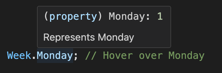
We can see that both the enumeration value and the description of the enumeration item can be displayed at the same time, when the cursor hovers over an enumeration item. There is no need to jump away from the current position in the code to check the definitions.
💡 Supports Various Frontend Frameworks
Enum.items can be consumed as the data source of UI components. Take Select component as examples.
React-based UI libraries
Ant Design | Arco Design Select
import { Select } from 'antd';

<Select options={WeekEnum.items} />;
Material-UI Select
import { MenuItem, Select } from '@mui/material';

<Select>
  {WeekEnum.items.map((item) => (
    <MenuItem key={item.value} value={item.value}>
      {item.label}
    </MenuItem>
  ))}
</Select>;
Kendo UI Select
import { DropDownList } from '@progress/kendo-react-dropdowns';

<DropDownList data={WeekEnum.items} textField="label" dataItemKey="value" />;
Vue-based UI libraries
Element Plus Select
<el-select>
  <el-option v-for="item in WeekEnum.items" v-bind="item" />
</el-select>
Ant Design Vue | Arco Design Select
<a-select :options="WeekEnum.items" />Vuetify Select
<v-select :items="WeekEnum.items" item-title="label" />Angular-based UI libraries
Angular Material Select
<mat-select>
  @for (item of WeekEnum.items; track item.value) {
  <mat-option [value]="item.value">{{ item.label }}</mat-option>
  }
</mat-select>
NG-ZORRO Select
<nz-select>
  @for (item of WeekEnum.items; track item.value) {
    <nz-option [nzValue]="item.value">{{ item.label }}</nz-option>
  }
</nz-select>
💡 Enum Configuration Options
You can pass in an optional configuration object when creating an enum to customize its behavior and features. Here are some commonly used configuration options:
interface EnumOptions {
  /** The name of the enum type, which can be a plain string or a localization key */
  name?: string;
  /**
   * Set a label prefix for all enum items. For more details, please refer to the [Global
   * Configuration] section
   */
  labelPrefix?: string;
  /**
   * The rule for automatically generating enum item labels. For more details, please refer to the
   * [Global Configuration] section
   */
  autoLabel?: boolean | ((params: { item: EnumItemClass; labelPrefix?: string }) => string);
  /**
   * Enum instance-level localization function, which overrides the Enum.localize global
   * configuration function
   */
  localize?: (localeKey: string) => string;
}
For more configuration options, please refer to the next section.
💡 Custom Field Mapping in Array Format Initialization
In the 4. Array Format section, we know that enums can be created from dynamic data arrays. However, the field names in the real world may be different from the default value, label, and key. In such cases, you can pass in a custom option to map these to other field names.
import { Enum } from 'enum-plus';

const data = await getPetsData();
// [   { id: 1, code: 'dog', name: 'Dog' },
//     { id: 2, code: 'cat', name: 'Cat' },
//     { id: 3, code: 'rabbit', name: 'Rabbit' }   ];
const PetTypeEnum = Enum(data, {
  getValue: 'id',
  getLabel: 'name',
  getKey: 'code', // getKey is optional
});
PetTypeEnum.items; // The output is:
// [   { value: 1, label: 'Dog', key: 'dog' },
//     { value: 2, label: 'Cat', key: 'cat' },
// { value: 3, label: 'Rabbit', key: 'rabbit' } ]getValue, getLabel, getKey can also be a function to handle more complex business logic, for example:
const PetTypeEnum = Enum(petTypes, {
  getValue: (item) => item.id,
  getLabel: (item) => `${item.name} (${item.code})`,
  getKey: (item) => item.code,
});
Plugin System
enum-plus provides a plugin system that allows you to extend the functionality of all enums. Plugins can add new methods or properties to all enum instances, greatly enhancing their capabilities. You can choose to install only the plugins you need, keeping the core library lightweight and efficient.
import antdPlugin from '@enum-plus/plugin-antd';
import { Enum } from 'enum-plus';

Enum.install(antdPlugin);
After installing a plugin, it will add new methods or properties to all enum instances. For example, after installing the @enum-plus/plugin-antd plugin, you can use the enum.toSelect method to generate a Select component from the enum.
Optionally, you can provide configuration options to customize the behavior of the plugin. For details on the configuration options for each plugin, please refer to the documentation of the respective plugins.
import antdPlugin from '@enum-plus/plugin-antd';
import { Enum } from 'enum-plus';

Enum.install(antdPlugin, {
  toSelect: {
    valueField: 'id', // Sets the field representing the value in the data object generated by the toSelect method
    labelField: 'name', // Sets the field representing the label in the data object generated by the toSelect method
  },
});
Awesome Plugins
The following plugins are available. You can choose to install them based on your needs:
-
Ant Design oriented features, including
enum.toSelect,enum.toMenu,enum.toFilter, andenum.toValueMap. With these methods, you can directly bind enums to the corresponding Ant Design components, greatly simplifying your code. -
Integrates i18next to enable internationalization of enum labels.
@enum-plus/plugin-react-i18next
Integrates react-i18next to enable internationalization of enum labels.
-
React integration, including support for
Enum.localizeto return React components, and listening for language changes to auto update components. -
Integrates i18next-vue to enable internationalization of enum labels and listen for language changes to auto update components.
-
Integrates vue-i18n to enable internationalization of enum labels and listen for language changes to auto update components.
@enum-plus/plugin-next-international
Integrates next-international in Next.js projects to enable internationalization of enum labels and listen for language changes to auto update components.
We are working on the following plugins:
- @enum-plus/plugin-angular: Angular integration, including support for
Enum.localizeto return Angular components, and listening for language changes to auto update components. We need your help to develop this plugin!
If the plugin you are searching for is not available, or if you want to develop your own plugin, please refer to the Plugin Development Guide. You can develop new plugins in the official enum-plus repository or publish your developed plugins to npm and share your plugin links here. We sincerely need your help to enrich the plugin ecosystem!
Localization
enum-plus does not include built-in internationalization capabilities by default. Therefore, the label field of enum items is treated as a plain string and returns the original text directly.
To add localization support to enum-plus, the simplest way is to install the corresponding i18n plugin, such as @enum-plus/plugin-i18next, which automatically passes the values of the label and name fields to i18next for translation.
npm install @enum-plus/plugin-i18next i18nextThen install the plugin in the project entry file:
index.js
import i18nextPlugin from '@enum-plus/plugin-i18next';
import { Enum } from 'enum-plus';

Enum.install(i18nextPlugin);
After installing the plugin, the label and name fields of the enum will be automatically translated through i18next.
const WeekEnum = Enum(
  {
    Sunday: { value: 0, label: 'week.sunday' },
    Monday: { value: 1, label: 'week.monday' },
  },
  { name: 'weekDays.name' }
);
WeekEnum.label(1); // Monday or 星期一, depending on the current locale
WeekEnum.named.Monday.label; // Monday or 星期一, depending on the current locale
WeekEnum.name; // Week or 周, depending on the current locale
This plugin also supports custom i18next options, and even allows complete control over the localize method. Please refer to the plugin documentation for more details.
If you need to automatically update the UI after switching languages, this requires the capabilities of frameworks like React, Vue, or Angular. Please consider using plugins such as @enum-plus/plugin-react or @enum-plus/plugin-vue.
If you are using other internationalization libraries, such as react-intl, vue-i18next, or ngx-translate, you can integrate these libraries by overwriting the Enum.localize method.
my-extension.js
import { Enum } from 'enum-plus';

Enum.localize = (key) => {
  // This is a pseudo code, please adjust it according to your own logic
  return intl.formatMessage({ id: key });
};
Once you have completed this feature, it is recommended that you consider publishing it as an npm package and share it in the Awesome Plugins section, so that others can benefit from your work. If you believe that this project is very general, you can also consider submitting it to the official enum-plus plugin repository. For specific development rules, please refer to the Plugin Development Guide.
Custom Label Logic
Of course, if you are not using any internationalization framework but want to control the localization rules of enum label yourself, or use different custom logic for each enum item, you can pass a function to the label field:
const WeekEnum = Enum({
  Sunday: { value: 0, label: () => 'Sunday' },
  Monday: { value: 1, label: () => 'Monday' },
});
Additionally, enum.name also supports using a custom function.
const WeekEnum = Enum(
  {
    //...
  },
  {
    name: () => 'Week',
  }
);
Extensibility
Enum provides a wealth of built-in methods and properties that can satisfy most common use cases. However, if they are not sufficient, you can use Enum.extends to add more custom methods. These extensions will be globally applied to all enum instances, including those created before the extension was applied, and will take effect immediately without any additional setup.
In fact, the entire Plugin System and the
Enum.installmethod are implemented usingEnum.extendsat the underlying level.
TypeScript Projects
my-enum-extension.ts
// Implementation code
Enum.extends({
  toMySelect() {
    return this.items.map((item) => ({ value: item.value, title: item.label }));
  },
  reversedItems() {
    return this.items.toReversed();
  },
});

// Type declaration for better type hints
declare module 'enum-plus/extension' {
  export interface EnumExtension<T, K, V> {
    toMySelect: () => { value: V; title: string }[];
    reversedItems: () => EnumItemClass<EnumItemInit<V>, K, V>[];
  }
}
index.ts
Then import this file in the entry file of your project:
import './my-enum-extension';

WeekEnum.toMySelect(); // [{ value: 0, title: 'Sunday' }, { value: 1, title: 'Monday' }]
JavaScript Projects
my-enum-extension.js
import { Enum } from 'enum-plus';

// Implementation code
Enum.extends({
  toMySelect() {
    return this.items.map((item) => ({ value: item.value, title: item.label }));
  },
  reversedItems() {
    return this.items.toReversed();
  },
});
my-enum-extension.js.d.ts
import { EnumExtension, EnumItemClass, EnumItemInit } from 'enum-plus';

// Type declaration for better type hints
declare module 'enum-plus/extension' {
  export interface EnumExtension<T, K, V> {
    toMySelect: () => { value: V; title: string }[];
    reversedItems: () => EnumItemClass<EnumItemInit<V>, K, V>[];
  }
}
index.js
Then import this file in the entry file of your project:
import './my-enum-extension';

WeekEnum.toMySelect(); // [{ value: 0, title: 'Sunday' }, { value: 1, title: 'Monday' }]
Please note that EnumExtension is a generic interface that accepts three type parameters, which represent:
T: Initialization object of the enum type (e.g., the object passed toEnum())K: Key of the enum item (e.g., Sunday, Monday)V: Value of the enum items
If you want to provide more friendly type hints in the extension methods, you may need to use these type parameters. However these are all optional, if you don't need them, you can omit them.
Naming Conflicts?
enum-plus is designed with naming conflicts in mind. The namespace of enum items is separate from the methods and properties of the enum instance, minimizing the chances of conflicts. For example, when an enum item's name conflicts with a method name, you can access the overridden methods through the items property.
import { KEYS, VALUES } from 'enum-plus';

const WeekEnum = Enum({
  foo: { value: 1 },
  bar: { value: 2 },
  keys: { value: 3 }, // Naming conflict
  values: { value: 4 }, // Naming conflict
  label: { value: 5 }, // Naming conflict
  named: { value: 6 }, // Naming conflict
  toList: { value: 7 }, // Naming conflict
});

WeekEnum.foo; // 1
WeekEnum.bar; // 2
// Below are all enum items, which take precedence and override the original methods
WeekEnum.keys; // 3
WeekEnum.values; // 4
WeekEnum.label; // 5
WeekEnum.named; // 6
WeekEnum.toList; // 7

// You can access these overridden methods via .items 🙂
WeekEnum.items[KEYS]; // ['foo', 'bar', 'keys', 'values', 'label', 'named', 'toList']
WeekEnum.items[VALUES]; // [1, 2, 3, 4, 5, 6, 7]
WeekEnum.items.label(1); // 'foo'
WeekEnum.items.named.foo; // { value: 1, label: 'foo', key: 'foo' }
WeekEnum.items.toList(); // [{ value: 1, label: 'foo' }, ...]
Note that
keysandvaluesare special because they are built-in methods of JavaScript arrays. To avoid altering the behavior of theitemsarray, you need to use theKEYSandVALUESsymbols as aliases to access them.
For an even more extreme case, what if items conflicts with an enum item name? Don't worry, you can still access it via the ITEMS alias.
import { ITEMS } from 'enum-plus';

const WeekEnum = Enum({
  foo: { value: 1 },
  bar: { value: 2 },
  items: { value: 3 }, // Naming conflict
  toList: { value: 4 }, // Naming conflict
});

WeekEnum.items; // 3, enum item takes precedence and overrides items
WeekEnum[ITEMS].toList(); // But you can access it via the ITEMS alias
Best Practices
When using enum-plus, following these best practices can help ensure consistency, maintainability, and clarity in your codebase:
- Enum Type Naming: Use
PascalCaseand end withEnum(e.g., WeekEnum, ColorEnum). - Enum Item Naming: Use
PascalCase(e.g., Sunday, Red). This naming approach highlights the static and immutable nature of enumeration members. Moreover, in the IDE's intelligent prompting, they will be displayed at the top instead of being mixed with other method names, making it more convenient for viewing and selection. - Semantic Clarity: Ensure enum and item names have clear semantics. Good semantic naming serves as self-documentation, making code intent explicit and reducing cognitive overhead.
- Single Responsibility Principle: Each enum type should represent a single, cohesive set of related constants. Avoid overlapping responsibilities between different enum types.
- Provide JSDoc Comments: Provide JSDoc comments for each enum item and the enum type itself, explaining their purpose and usage. Comprehensive documentation enables IDE hover tooltips and improves code readability and maintainability.
- Internationalization Architecture: Plan for internationalization from the outset by leveraging the library's localization features. A well-designed internationalization architecture minimizes future refactoring and facilitates global scalability.
Here is an example that combines the above best practices to define an enum:
/** Represents the days of the week */
const WeekEnum = Enum(
  {
    /** Sunday */
    Sunday: { value: 0, label: 'enums.week.sunday' },
    /** Monday */
    Monday: { value: 1, label: 'enums.week.monday' },
    // ...
    /** Friday */
    Friday: { value: 5, label: 'enums.week.friday' },
    /** Saturday */
    Saturday: { value: 6, label: 'enums.week.saturday' },
  },
  { name: 'enums.week.name' }
);
Compatibility
enum-plus is designed to be compatible with a wide range of environments, including modern browsers, Node.js, and various build tools. Below are the compatibility details for different environments:
Browser Environments
Modern Bundlers: For bundlers supporting the exports configuration (such as webpack 5+, vite, rollup), imports will be resolved to the
esdirectory, which targetsES2020.Legacy Bundlers: For older bundlers without exports support (like Webpack 4), imports will be resolved to the
es-legacydirectory, which targetsES2015.UMD Version: For direct browser usage or static projects without bundlers, enum-plus provides UMD format files in the
umddirectory. You can include it via a<script>tag and access it through the globalwindow.EnumPlus. The UMD directory offers two versions:- enum-plus.min.js: Targets
ES2020, suitable for modern browsers. - enum-plus-legacy.min.js: Targets
ES2015, suitable for older browsers.
- enum-plus.min.js: Targets
Polyfill Strategy: enum-plus ships no polyfills to minimize bundle size. For legacy browser support, you can choose from the following polyfill strategies based on your project's needs:
core-js@babel/preset-envwith appropriateuseBuiltInssettings- Alternative polyfill implementations
Node.js Environments
In Node.js environments, you can import enum-plus using either require or import syntax.
require
For all Node.js versions that support CommonJS, you can import enum-plus using
require('enum-plus'). The require statement will be resolved to thelibdirectory, which targetsES2015. The minimum compatible version is Node.jsv7.x.import
For modern versions of Node.js that support ES Modules (Node.js 14.13+), you can import enum-plus using
import { Enum } from 'enum-plus'. The imports will be resolved to theesdirectory, which targetsES2020.
Q&A
Why do I need this library? TypeScript already has the built-in enums
TypeScript's built-in enum only provides the basic functionality of Enumeration: eliminating magic numbers and structuring control flow (e.g. with if / switch). However, as a front-end engineer, the needs for enumerations are not merely these. We also need:
- Eliminate magic numbers
- Used in the
iforswitchstatements for conditional branching - Add display names to enums, and should support internationalization
- Add custom metadata fields, such as color, icon, and description, etc.
- Enums can be generated into various form controls such as dropdowns, menus, tabs, etc.
- Convert values directly into localized names for displaying business data in the UI
If you need these features, then enum-plus is designed for you. If you are a front-end engineer, we strongly recommend you give it a try!
It seems that TypeScript is going to deprecate enum?
Whether the enum feature will be replaced in the future or not, the concept of enumeration will never disappear. It is one of the most basic features in many high-level languages.
enum-plus was precisely created to make up for the shortcomings of TypeScript's built-in enum. It is a pure runtime library and will not be affected by the development of the TypeScript language. Therefore, you can use it with complete confidence. It will neither become outdated nor be deprecated in the future.
The TypeScript team does not have a clear plan to deprecate enum. However, it is indeed not supported in some cases. The key reason is that enum is neither a pure TypeScript type (which can be completely removed during compilation) nor pure JavaScript runtime code, but a mixture of the two, which brings significant complexity to the compiler.
How about the performance of this library?
enum-plus always focuses on performance. One of its design goals is to maintain efficient performance while providing rich functionality.
For the basic usage like WeekEnum.Monday, the performance is the same as the native enum, because they both directly access the member fields of a JavaScript object at the underlying level.
For operations such as traversing or searching the array of enum items, the performance is the same as that of native arrays, because the underlying level of the Enum collection is a frozen native array.
As you can see, the performance has almost reached its peak, and you can use it with complete confidence without worrying about performance issues.
Why doesn't Enum support reverse mapping?
Please use the enum.key(value) method to get the key name according to its value. This reverse mapping method is applicable to both numeric and string enum values.
Why does the search function of the Ant Design Select stop working after enabling internationalization?
This is because Enum.localize returns a component instance instead of a regular string, causing Ant Design to fail in performing string matching correctly. Please use the enum.isMatch method to enable the search functionality. Please refer to @enum-plus/plugin-react for more details.
npm install @enum-plus/plugin-reactimport { Select } from 'antd';
<Select options={WeekEnum.items} filterOption={WeekEnum.isMatch} />;If you are using the
@enum-plus/plugin-i18nextplugin, or have implemented theEnum.localizemethod yourself and it returns a string, then the search functionality in the dropdown should work correctly.
Do I have to install TypeScript? What if my project is in JavaScript?
Don't worry, whether your project is in TypeScript or JavaScript, enum-plus works perfectly fine. Both of them can benefit from type safety and intelligent code completion. You don't have to install TypeScript dependencies in your project, since modern code editors like VSCode have built-in support for TypeScript.
Do I have to upgrade TypeScript to version 5.0+?
Not necessarily. The purpose of upgrading to TypeScript 5.0 is to provide a better development experience. If you choose not to upgrade, it will still work fine with just a little extra effort.
const WeekEnum = Enum({
  Sunday: 0,
  Monday: 1,
} as const);
As you can see, in earlier versions of TypeScript, you may need to use the as const type assertion. as const allows the enum values to remain their original literal values instead of being converted to number or string types. Meanwhile, the enum.valueType will remain as 0 | 1 instead of becoming number. This makes TypeScript's type checking more accurate and enhances code safety. About how to upgrade TypeScript and modify project configurations, please read the Migration Guide carefully.
If you are using JavaScript, you can leverage JSDoc to help the editor accurately recognize types.
/** @type {{ Sunday: 0; Monday: 1 }} */
const weekInit = { Sunday: 0, Monday: 1 };

const WeekEnum = Enum(weekInit);
Why did all enum types become any after upgrading to version 3.0?
This is due to incorrect configuration in tsconfig.json. Please read the Migration Guide carefully.
I want to define a generic enum type that can represent any enum. The current enum type definition is too complex. Is there a simple way?
Please use the AnyEnum type, which is a generic enum type that can represent any enum.
I saw in the release notes that you made Jest and Playwright share the same set of test code, which is interesting. Can you introduce how to achieve this?
Yes, actually it wasn't easy from the beginning. The working principles of Jest and Playwright are quite different. Jest runs in a Node.js environment, while Playwright runs in a browser environment and then returns to the Node.js environment to execute assertions. To make them share a set of test code, we did the following:
- Environment Adaptation: We wrote an adaptation layer to handle the differences between the two testing frameworks.
- Abstract Testing Logic: We abstracted the testing logic into some independent modules, so that these test suites can be reused in different testing frameworks.
- Enhanced Serialization Mechanism: E2E tests require running in a browser environment and then passing the running results to the Node.js environment for assertions. To achieve this, we developed an enhanced serialization library. Since the
enum-plusenums internally use types likeclass,function,Symbol,Date, andRegExp, built-in functions rewritten likeSymbol.toStringTagandSymbol.hasInstance, and even includingGetter/Setter, which are not serializable byJSON.stringify. We implemented support for these complex features through jsoneo. So complex objects can cross different environments throughserialization/deserializationwhile retaining all dynamic behaviors. The transferred object remains "alive", just like the original object has not been serialized.
Based on these efforts, we successfully share a set of test code between Jest and Playwright. It significantly improves the development efficiency of unit tests and reduces maintenance costs. You don't have to maintain two sets of test code. In the future, we will also consider separating the first part into an open-source project. If you are developing a "Universal JavaScript" project, you might also try this approach to share test code.
I have a great idea and would like to contribute to this project. What should I do?
We are very glad to hear that! We sincerely welcome contributions from the community. Here are some guidelines to help you get started:
Thanks to the high flexibility of Plugin System, it is quite easy to extend new features for enum-plus. Depending on the generality and dependencies of the feature, you can choose one of the following three ways to contribute:
- Core Library - The new feature is applicable to everyone and does not introduce external dependencies. You can contribute directly to the core library. Please refer to the CONTRIBUTING guide.
- Official Plugin Library - The new feature needs to depend on an
openframework or library, and many people are already using this framework or library. You can contribute to the official plugin library. Please refer to the Plugin Development Guide. - Custom Plugin - The new feature needs to depend on a
privateexternal dependency, or the field is relatively niche. It is recommended that you publish an npm package yourself and share your plugin link in the Awesome Plugins section, which can still be shared with everyone.
Security
If you find a security issue, please follow the Security Policy to report it responsibly.
Support
If you find this project useful, please consider giving it a STAR ⭐️ on GitHub. It helps more people discover the project and encourages us to continue development.