
Package Exports
- gjl-react-native-actions-sheet
- gjl-react-native-actions-sheet/index.tsx
This package does not declare an exports field, so the exports above have been automatically detected and optimized by JSPM instead. If any package subpath is missing, it is recommended to post an issue to the original package (gjl-react-native-actions-sheet) to support the "exports" field. If that is not possible, create a JSPM override to customize the exports field for this package.
Readme
react-native-actions-sheet


A highly customizable cross platform ActionSheet for react native.
Screenshots


Features
- Cross Platform (iOS and Android)
- Native Animations & Performance
- Identical Working on Android and iOS
- Control ActionSheet with Gestures
- Raw ActionSheet - You can Add Anything
- Allow ActionSheet to be partially shown when opened
- Support TextInputs
- Cool bounce effect on open.
- Support for Tablets and iPads
- Support Horizontal Layout
- Support for Nested Scrolling or Scrollable Content.
- Virtualization Support
Run Example
git clone https://github.com/ammarahm-ed/react-native-actions-sheet.gitthen run yarn or npm install in the example folder and finally to run the example app:
react-native run-androidInstallation Guide
npm install react-native-actions-sheet --saveor if you use yarn:
yarn add react-native-actions-sheetUsage Example
import ActionSheet from "react-native-actions-sheet";
import React, { createRef } from "react";

const actionSheetRef = createRef();

const App = () => {
  let actionSheet;

  return (
    <View
      style={{
        justifyContent: "center",
        flex: 1
      }}
    >
      <TouchableOpacity
        onPress={() => {
          actionSheetRef.current?.setModalVisible();
        }}
      >
        <Text>Open ActionSheet</Text>
      </TouchableOpacity>

      <ActionSheet ref={actionSheetRef}>
        <View>
          <Text>YOUR CUSTOM COMPONENT INSIDE THE ACTIONSHEET</Text>
        </View>
      </ActionSheet>
    </View>
  );
};

export default App;
Reference
Props
ref
Assigns a ref to ActionSheet component to use methods.
| Type | Required |
|---|---|
| ref | Yes |
testID
Test ID for unit testing
| Type | Required |
|---|---|
| string | no |
initialOffsetFromBottom
Use if you want to show the ActionSheet Partially on Opening. **Requires gestureEnabled=true **
| Type | Required |
|---|---|
| number | no |
Default: 1
extraScroll
Normally when the ActionSheet is fully opened, a small portion from the bottom is hidden by default. Use this prop if you want the ActionSheet to hover over the bottom of screen and not hide a little behind it.
| Type | Required |
|---|---|
| number | no |
Default: 0
containerStyle
Any custom styles for the container.
| Type | Required |
|---|---|
| Object | no |
delayActionSheetDraw
Delay draw of ActionSheet on open for android.
| Type | Required |
|---|---|
| boolean | no |
Default: false
delayActionSheetDrawTime
Delay draw of ActionSheet on open for android time.
| Type | Required |
|---|---|
| number (ms) | no |
Default: 50
CustomHeaderComponent
Your custom header component. Using this will hide the default indicator.
| Type | Required |
|---|---|
| React. ReactNode | no |
ExtraOverlayComponent
Render a component over the ActionSheet. Useful for rendering Toast components with which user can interact.
| Type | Required |
|---|---|
| React. ReactNode | no |
headerAlwaysVisible
Keep the header always visible even when gestures are disabled.
| Type | Required |
|---|---|
| boolean | no |
Default: false
animated
Animate the opening and closing of ActionSheet.
| Type | Required |
|---|---|
| boolean | no |
Default: true
openAnimationSpeed
Speed of opening animation. Higher means the ActionSheet will open more quickly. Use it in combination with bounciness prop to have optimize the bounce/spring effect on ActionSheet open.
| Type | Required |
|---|---|
| number | no |
Default: 12
closeAnimationDuration
Duration of closing animation.
| Type | Required |
|---|---|
| number | no |
Default: 300
gestureEnabled
Enables gesture control of ActionSheet
| Type | Required |
|---|---|
| boolean | no |
Default: false
closeOnTouchBackdrop
Control closing ActionSheet by touching on backdrop.
| Type | Required |
|---|---|
| boolean | no |
Default: true
bounceOnOpen
Bounces the ActionSheet on open.
| Type | Required |
|---|---|
| boolean | no |
Default: false
bounciness
How much you want the ActionSheet to bounce when it is opened.
| Type | Required |
|---|---|
| number | no |
Default: 8
springOffset
When touch ends and user has not moved farther from the set springOffset, the ActionSheet will return to previous position.
| Type | Required |
|---|---|
| number | no |
Default: 50
elevation
Add elevation to the ActionSheet container.
| Type | Required |
|---|---|
| number | no |
Default: 0
indicatorColor
Color of the gestureEnabled Indicator.
| Type | Required |
|---|---|
| string | no |
Default: "#f0f0f0"
overlayColor
Color of the overlay/backdrop.
| Type | Required |
|---|---|
| string | no |
Default: "black"
defaultOverlayOpacity
Default opacity of the overlay/backdrop.
| Type | Required |
|---|---|
| number 0 - 1 | no |
Default: 0.3
closable
Prevent ActionSheet from closing on gesture or tapping on backdrop. Instead snap it to bottomOffset location
| Type | Required |
|---|---|
| boolean | no |
Default: true
bottomOffset
Snap ActionSheet to this location if closable is set to false. By default it will snap to the location on first open.
| Type | Required |
|---|---|
| number | no |
Default: 0
keyboardShouldPersistTaps
Setting the keyboard persistence of the ScrollView component. Should be one of "never", "always" or "handled"
| Type | Required |
|---|---|
| string | no |
Default: never
keyboardHandlerEnabled
Allow to choose will content change position when keyboard is visible. This is enabled by default.
| Type | Required |
|---|---|
| boolean | no |
Default: true
keyboardDismissMode
Set how keyboard should behave on tapping the ActionSheet.
| Type | Required |
|---|---|
"on-drag" "none" "interactive" |
no |
Default : "none"
statusBarTranslucent
Determine whether the modal should go under the system statusbar.
| Type | Required |
|---|---|
| boolean | no |
Default: true
closeOnPressBack
Will the ActionSheet close on hardwareBackPress event.
| Type | Required |
|---|---|
| boolean | no |
Default: true
drawUnderStatusBar
Allow ActionSheet to draw under the StatusBar. This is enabled by default.
| Type | Required |
|---|---|
| boolean | no |
Default: false
onPositionChanged(onReachedTop:boolean)
Event called when position of ActionSheet changes.
| Type | Required |
|---|---|
| function | no |
onClose
Event called when the ActionSheet closes.
| Type | Required |
|---|---|
| function | no |
onOpen
An event called when the ActionSheet Opens.
| Type | Required |
|---|---|
| function | no |
Methods
Methods require you to set a ref on ActionSheet Component.
handleChildScrollEnd()
If your component includes any child ScrollView/FlatList you must attach this method to all scroll end callbacks.
<ScrollView
            ref={scrollViewRef}
            nestedScrollEnabled={true}
            onScrollEndDrag={() =>
              actionSheetRef.current?.handleChildScrollEnd()
            }
            onScrollAnimationEnd={() =>
              actionSheetRef.current?.handleChildScrollEnd()
            }
            onMomentumScrollEnd={() =>
              actionSheetRef.current?.handleChildScrollEnd()
            }
.....
show()
Opens the ActionSheet.
import ActionSheet from "react-native-actions-sheet";
import React, { createRef } from "react";

const actionSheetRef = createRef();

// First create a ref on your <ActionSheet/> Component.
<ActionSheet ref={actionSheetRef} />;

// then later in your function to open the ActionSheet:

actionSheetRef.current?.show();
hide()
Closes the ActionSheet.
import ActionSheet from "react-native-actions-sheet";
import React, { createRef } from "react";
const actionSheetRef = createRef();
// First create a ref on your <ActionSheet/> Component.
<ActionSheet ref={actionSheetRef} />;
// then later in your function to open the ActionSheet:
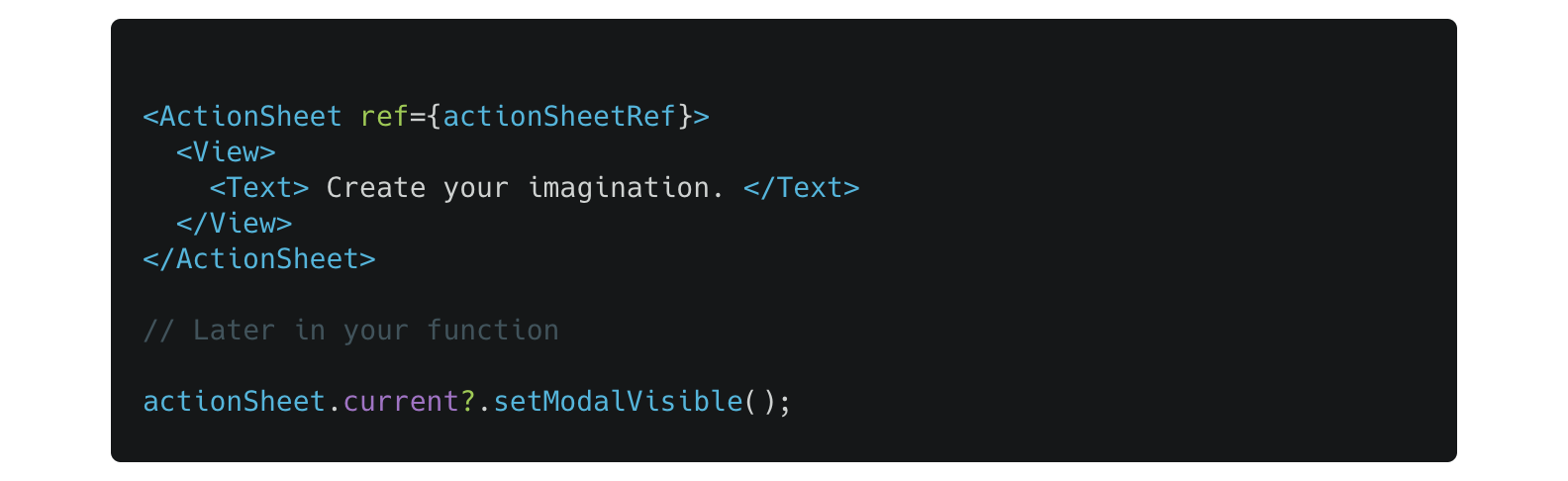
actionSheetRef.current?.hide();setModalVisible
ActionSheet can be opened or closed using its ref.
import ActionSheet from "react-native-actions-sheet";
import React, { createRef } from "react";

const actionSheetRef = createRef();

// First create a ref on your <ActionSheet/> Component.
<ActionSheet ref={actionSheetRef} />;

// then later in your function to open the ActionSheet:

actionSheetRef.current?.setModalVisible();
setModalVisible(visible)
It's also possible to explicitly either show or hide modal.
import ActionSheet from "react-native-actions-sheet";
import React, { createRef } from "react";

const actionSheetRef = createRef();
// First create a ref on your <ActionSheet/> Component.
<ActionSheet ref={actionSheetRef} />;

// then to show modal use
actionSheetRef.current?.setModalVisible(true);

// and later you may want to hide it using
actionSheetRef.current?.setModalVisible(false);
snapToOffset(offset:number)
When the ActionSheet is open, you can progammatically snap it to different offsets.
import ActionSheet from "react-native-actions-sheet";
import React, { createRef } from "react";

const actionSheetRef = createRef();
// First create a ref on your <ActionSheet/> Component.
<ActionSheet ref={actionSheetRef} />;

// snap to this location on screen
actionSheetRef.current?.snapToOffset(200);

actionSheetRef.current?.snapToOffset(150);

actionSheetRef.current?.snapToOffset(300);
Nested scrolling on android
Nested scrolling on android is disabled by default. You can enable it as done below.
import ActionSheet from "react-native-actions-sheet";

const App = () => {
  const actionSheetRef = useRef();

  return (
    <ActionSheet ref={actionSheetRef}>
      <ScrollView
        nestedScrollEnabled={true}
        onMomentumScrollEnd={() =>
          actionSheetRef.current?.handleChildScrollEnd()
        }
      />
    </ActionSheet>
  );
};
Find this library useful? ❤️
Support it by donating or joining stargazers for this repository. ⭐️ and follow me for my next creations!
MIT Licensed
