
Package Exports
- hyper-material-box-brian
This package does not declare an exports field, so the exports above have been automatically detected and optimized by JSPM instead. If any package subpath is missing, it is recommended to post an issue to the original package (hyper-material-box-brian) to support the "exports" field. If that is not possible, create a JSPM override to customize the exports field for this package.
Readme
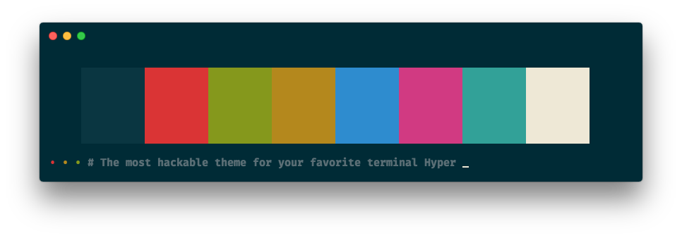
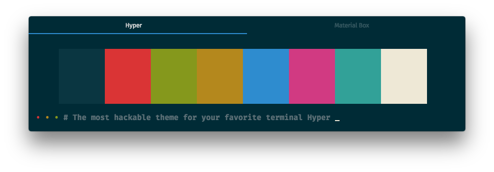
hyper-material-box 

The most hackable theme for your favorite terminal Hyper
🏁 Let's jump right in
All you need is two simple steps !!
📥 Installation
Just add the following script to your .hyper.js:
module.exports = {
  plugins: [ 'hyper-material-box' ],
}
Restart your Hyper.app.
Done 🎉
🔧 Config
You can add the following scripts to your .hyper.js, if you like what you see.
🔧 Color Scheme
The default color scheme is
solarized-dark.
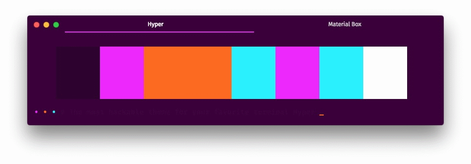
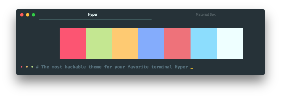
Currently, we provide our user over 30 beautiful color schemes (click the name to see the screenshot):
- 80rave
- apex
- base16-green-screen
- base16-ocean-dark
- base16-ocean-light
- dracula
- gruvbox-dark-hard
- gruvbox-dark-medium
- gruvbox-dark-soft
- gruvbox-light-hard
- gruvbox-light-medium
- gruvbox-light-soft
- material
- material-darker
- material-lighter
- material-palenight
- monokai
- nord
- one-dark
- one-light
- predawn
- seti
- snazzy
- solarized-dark
- solarized-light
- tomorrow
- tomorrow-night
- tomorrow-night-blue
- tomorrow-night-bright
- tomorrow-night-eighties
For example, if you like the material color scheme, you can add the following script:
module.exports = {
  config: {
    materialBox: {
      scheme: 'material',
    }
  }
}
🔧 User
You can override the default color scheme with the
usersection.
If your favorite color scheme isn't in the list, you can create a new scheme by yourself,
for example you can add the following script instead adding scheme: 'material':
module.exports = {
config: {
materialBox: {
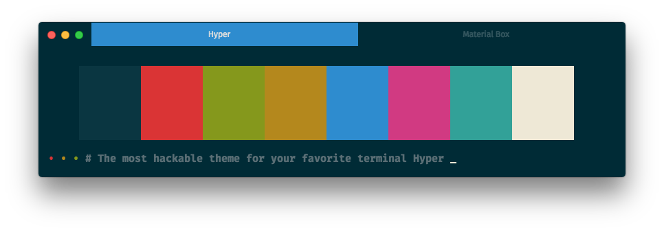
user: {
colors: {
black: '#263238',
red: '#FF5370',
green: '#C3E88D',
yellow: '#FFCB6B',
blue: '#82AAFF',
magenta: '#F07178',
cyan: '#89DDFF',
white: '#EEFFFF',
lightBlack: '#546E7A',
lightRed: '#FF5370',
lightGreen: '#C3E88D',
lightYellow: '#FFCB6B',
lightBlue: '#82AAFF',
lightMagenta: '#F07178',
lightCyan: '#89DDFF',
lightWhite: '#EEFFFF',
},
// Default
backgroundColor: '#263238',
foregroundColor: '#CCCCCC',
cursorColor: '#EEFFFF',
borderColor: 'transparent',
// Accent color
accentColor: '#80CBC4',
// Other (optional, it will be override by foregroundColor)
tabTitleColor: 'rgba(255, 255, 255, 0.2)',
selectedTabTitleColor: '#EEFFFF',
// css (optional)
css: '',
termCSS: '',
}
}
}
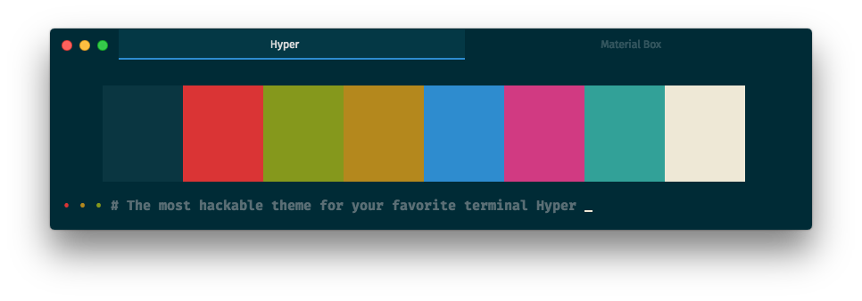
}🔧 Selected Tab Flavor
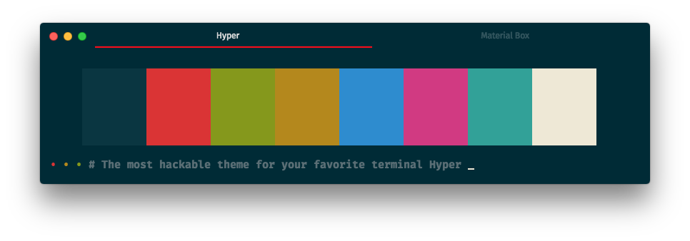
The default selected tab flavor is
underline.
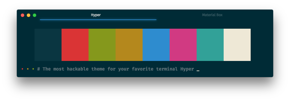
You can change the selected tab flavor by set the selectedTabFlavor to preline, overline, filled or none:
module.exports = {
  config: {
    materialBox: {
      selectedTabFlavor: 'preline',
    }
  }
}
module.exports = {
  config: {
    materialBox: {
      selectedTabFlavor: 'overline',
    }
  }
}
module.exports = {
  config: {
    materialBox: {
      selectedTabFlavor: 'filled',
    }
  }
}
module.exports = {
  config: {
    materialBox: {
      selectedTabFlavor: 'none',
    }
  }
}
🔧 Highlight Selected Tab
highlight selected tab is disable by default
You can highlight the selected tab by set highlightSelectedTab to true:
module.exports = {
  config: {
    materialBox: {
      highlightSelectedTab: true,
    }
  }
}
🔧 Display Border
The
borderis hide by default.
You can enable the border by set the displayBorder to true:
module.exports = {
  config: {
    materialBox: {
      displayBorder: true,
    }
  }
}
🔧 Accent Color
You can change the accent color by set the user: { accentColor } to another color:
module.exports = {
  config: {
    materialBox: {
      user: {
        accentColor: 'red',
      }
    }
  }
}
🔧 Light Effect
The
overlineselected tab flavors doesn't support light effect.
You can enable the light effect by set the lightEffect to true:
module.exports = {
  config: {
    materialBox: {
      lightEffect: true,
    }
  }
}
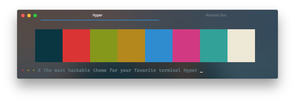
🔧 Background Opacity
The default background opacity is
1.0.
You can change the background opacity by set the backgroundOpacity to 0.1 ~ 0.9:
module.exports = {
  config: {
    materialBox: {
      backgroundOpacity: 0.5,
    }
  }
}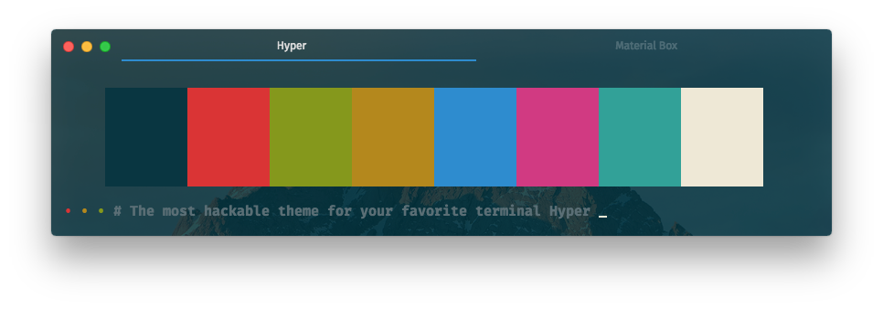
🔧 Background Vibrancy
Background vibrancy only available when background opacity value is between 0.1 ~ 0.9
You can enable the background vibrancy by set the backgroundVibrancy to true:
module.exports = {
  config: {
    materialBox: {
      backgroundVibrancy: true,
    }
  }
}
🔧 Auto Hide Title
auto hide title is disable by default
You can set the autoHideTitle to true, it will hide the title when the window only has one tab:
module.exports = {
  config: {
    materialBox: {
      autoHideTitle: true,
    }
  }
}
🔧 Hide Traffic-Lights
hide traffic light is disable by default
If you want to hide the traffic-lights, you can set the hideTrafficLights to true:
module.exports = {
  config: {
    materialBox: {
      hideTrafficLights: true,
    }
  }
}
🔧 Other
🔧 Left Close Button
left close button is disable by default
If you like the left close button, you can set the closeOnTheLeft to true:
module.exports = {
  config: {
    materialBox: {
      closeOnTheLeft: true,
    }
  }
}
❤️ Contributing to hyper-material-box
You can contribute your own color scheme to this project, see the CONTRIBUTING.md for more details.
⚡ Credit
⚡ The 80rave color scheme contributed by @PetrBarborka
⚡ The apex color scheme inspired by apex/apex-syntax
⚡ The auto hide title inspired by sindresorhus/hyper-hide-title
⚡ The base16 color scheme family inspired by Base16
⚡ The dracula color scheme inspired by Dracula — A dark theme for Atom, Alfred, Brackets, Emacs, iTerm ...
⚡ The gruvbox color scheme family inspired by Briles/gruvbox-atom
⚡ The hide traffic-lights inspired by albinekb/hyperclean
⚡ The left close button inspired by jhen0409/hyperterm-close-on-left
⚡ The light effect inspired by simeydotme/hyperterm-gooey
⚡ The material color scheme family inspired by equinusocio/material-theme
⚡ The material UI inspired by equinusocio/hyper-material-theme
⚡ The matrix color scheme inspired by giuseppeg/hyperterm-green
⚡ The monokai color scheme inspired by the most popular color scheme for Sublime Text
⚡ The nord color scheme inspired by arcticicestudio/nord-hyper
⚡ The one-dark color scheme inspired by atom/one-dark-syntax
⚡ The one-light color scheme inspired by atom/one-light-syntax
⚡ The overline selected tab flavor inspired by pauldariye/hyper-midnight
⚡ The predawn color scheme inspired by jamiewilson/predawn-hyperterm
⚡ The preline selected tab flavor inspired by Kikobeats/hyper-flat
⚡ The seti color scheme inspired by jesseweed/seti-syntax
⚡ The snazzy color scheme contributed by @stoe
⚡ The solarized color scheme faimly inspired by Solarized - Ethan Schoonover
⚡ The tomorrow color scheme family inspired by chriskempson/tomorrow-theme
❤️ Thank you guys, you guys are all amazing !!! ❤️
📄 License
This project is licensed under the MIT License, please see the 📄LICENSE.md for more details 👍