Package Exports
- iconify-icon-picker
- iconify-icon-picker/index.js
This package does not declare an exports field, so the exports above have been automatically detected and optimized by JSPM instead. If any package subpath is missing, it is recommended to post an issue to the original package (iconify-icon-picker) to support the "exports" field. If that is not possible, create a JSPM override to customize the exports field for this package.
Readme
Iconify Icon Picker
A lightweight and customizable Vue 3 component for searching and selecting icons from the Iconify icon library.
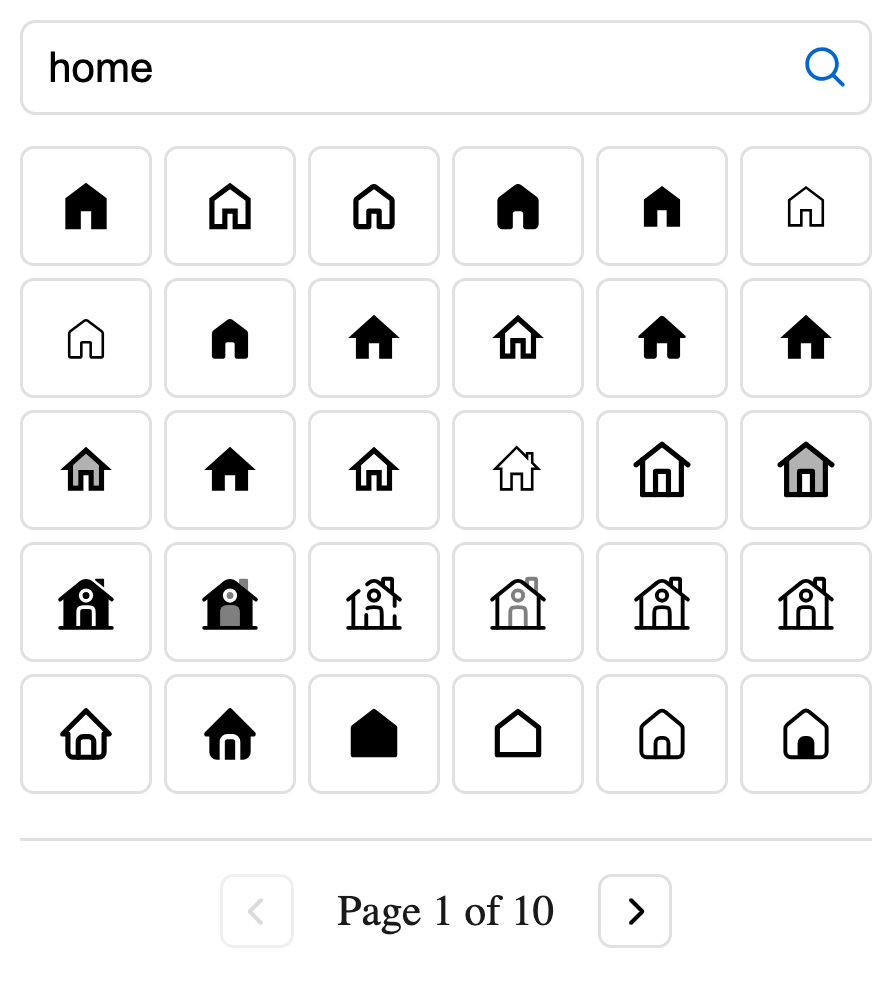
Installation
# npm
npm install iconify-icon-picker @iconify/vue

# yarn
yarn add iconify-icon-picker @iconify/vue

# pnpm
pnpm add iconify-icon-picker @iconify/vue
Usage
Basic Usage
<script setup>
import { ref } from 'vue'
import IconPicker from 'iconify-icon-picker'
import 'iconify-icon-picker/style.css'

// Define a ref to store the selected icon
const selectedIcon = ref('')
</script>

<template>
    <div>
        <h2>Select an Icon</h2>
        <IconPicker v-model="selectedIcon" />

        <div v-if="selectedIcon">
            <p>Selected icon: {{ selectedIcon }}</p>
        </div>
    </div>
</template>
Props
| Prop | Type | Default | Description |
|---|---|---|---|
modelValue |
String | undefined |
v-model binding for the selected icon |
value |
String | undefined |
Selected icon (alternative to v-model) |
placeholder |
String | 'Search icons...' |
Placeholder text for the search input |
debounce |
Number | 300 |
Debounce time (ms) for search input |
itemsPerPage |
Number | 30 |
Number of icons displayed per page |
paginationText |
String | 'Page {0} of {1}' |
Text template for pagination (replace {0} with current page and {1} with total pages) |
Events
| Event | Payload Type | Description |
|---|---|---|
onSelect |
String | Emitted when a new icon is selected |
Styling
The component can be customized using the following CSS variables:
:root {
    --iconPicker-text: #1a1a1a;
    --iconPicker-border: #e0e0e0;
    --iconPicker-primary: #0066cc;
    --iconPicker-primary-fg: #0052a3;
    --iconPicker-primary-hover: #0052a3;
    --iconPicker-radius: 0.375em;
    --iconPicker-gap: 0.25em;
    --iconPicker-input-height: 2.125em;
    --iconPicker-selected-bg: #e6f3ff;
    --iconPicker-font-base: 16px;
    --iconPicker-transition: all 0.2s ease;
}