
Package Exports
- kdu-numeric-input
- kdu-numeric-input/dist/kdu-numeric-input.min.js
This package does not declare an exports field, so the exports above have been automatically detected and optimized by JSPM instead. If any package subpath is missing, it is recommended to post an issue to the original package (kdu-numeric-input) to support the "exports" field. If that is not possible, create a JSPM override to customize the exports field for this package.
Readme
Kdu Numeric Input
Number input component based on Kdu that is a replacement of native input number with optional control.
Installation
Install via NPM
$ npm install kdu-numeric-input --save
Install via CDN
<script src="https://unpkg.com/kdu"></script>
<script src="https://unpkg.com/kdu-numeric-input"></script>
Global
Register KduNumericInput globally:
import Kdu from 'kdu';
import KduNumericInput from 'kdu-numeric-input';

Kdu.use(KduNumericInput)
Local
Include the KduNumericInput directly into your component using import:
import KduNumericInput from 'kdu-numeric-input'

export default {
  components: {
    KduNumericInput
  }
}
Usage
Basic usage
<template>
  <div>
    <kdu-numeric-input  k-model="value" :min="1" :max="10" :step="2"></kdu-numeric-input>
  </div>
</template>

<script>
  export default {
    data() {
      return {
        value: 1,
      };
    },
  };
</script>
PROPS:
| Name | Description | Type | Default | Options |
|---|---|---|---|---|
| name | Component name | String | - | - |
| value | Binding value | Number | - | - |
| placeholder | Input placeholder | String | - | - |
| min | Minimum allowed value | Number | -Infinity | - |
| max | Maximum allowed value | Number | Infinity | - |
| step | Incremental Step | Number | 1 | - |
| align | Alignment of Numeric Value | String | left | left, center, right |
| size | Component Size | String | Inherit | size in px, em, rem etc e.g. '20px' |
| precision | Number of decimals | Number | 0 | Integer value |
| controls | Enable/Disable Controls | Boolean | true | true/false |
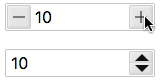
| controlsType | Controls Type | String | plusminus | plusminus/updown |
| autofocus | Autofocus on Page Load | Boolean | false | true/false |
| readonly | Is Readonly | Boolean | false | true/false |
| disabled | Is Disabled | Boolean | false | true/false |
EVENTS:
| Event Name | Description | Parameters |
|---|---|---|
| input | triggers when input | (newValue) |
| change | triggers when the value changes | (newValue) |
| blur | triggers when Input blurs | (event: Event) |
| focus | triggers when Input focus | (event: Event) |
METHODS:
| Method | Description | Parameters |
|---|---|---|
| focus | focus the Input component | - |
| blur | blur the Input component | - |
License
MIT