
Package Exports
- md-rainbow
This package does not declare an exports field, so the exports above have been automatically detected and optimized by JSPM instead. If any package subpath is missing, it is recommended to post an issue to the original package (md-rainbow) to support the "exports" field. If that is not possible, create a JSPM override to customize the exports field for this package.
Readme
md-rainbow
This is a fork of the awesome md-color-picker project by Brian Kelley.
Angular-Material based color picker with no jQuery or other DOM/utility library dependencies.
Install
NPM
- Download tinycolor.js 1.2.1 or higher. Other versions may work, though 1.2.1 was used to develop this.
- Install
md-rainbow.
npm install md-rainbowAngular dependencies
- Angular Material
- ngCookies (optional)
Other dependencies
The only other dependency is tinycolor.js which is an exceptional color manipulation library.
Usage
- Include the css.
<link href="path/to/md-rainbow/dist/mdRainbow.min.css" rel="stylesheet" />- Include the javascript.
<script src="path/to/tinycolor/dist/tinycolor-min.js"></script>
<script src="path/to/md-rainbow/dist/mdRainbow.min.js"></script>- Add dependencies to your application (ngCookies is optional)
var app = angular.module('myApp', ['ngMaterial','ngCookies', 'mdRainbow']);- Place the directive wherever it is needed. note: this breaks the old version 0.1 as it now uses ng-model instead of value
<div md-rainbow ng-model="valueObj"></div>Options
Options may be set either by an options object on the md-rainbow attribute and/or using attributes. If an option is present on both the options object and as an attribute, the attribute will take precedence.
Setting options by scope object
// Controller
$scope.scopeVariable.options = {
    label: "Choose a color",
    icon: "brush",
    default: "#f00",
    genericPalette: false,
    history: false
};<div md-rainbow="scopeVariable.options" ng-model="scopeVariable.color"></div>Setting options by attribute
<div
md-rainbow
ng-model="scopeVariable.color"
label="Choose a color"
icon="brush"
default="#f00"
md-color-generic-palette="false"
md-color-history="false"
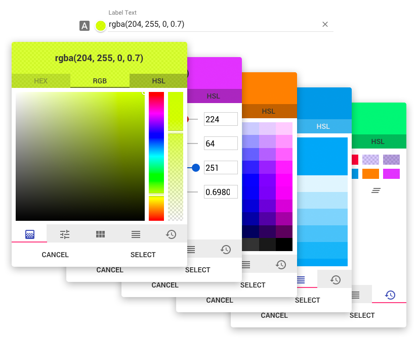
></div>| Option Object name | Attribute Option name | Type | Default | Description | |--------------------- |--------------------------- |------------- |-------------------- |------------------------------------------------------------------------------------------------------------------------------------------------------------------------------------------------------------------------------------------------------ | | type | type | Int | 0 | Default output type. 0: hex, 1: rgb, 2: hsl | | label | label | String | "" | The lable for the input. | | icon | icon | String | "" | Material Icon name. https://design.google.com/icons/ | | random | random | Boolean | false | Select a random color on open | | default | default | Color | "rgb(255,255,255)" | Default color | | openOnInput | open-on-input | Boolean | true | Open color picker when user clicks on the input field. If disabled, color picker will only open when clicking on the preview. | | hasBackdrop | has-backdrop | Boolean | true | Dialog Backdrop. https://material.angularjs.org/latest/api/service/$mdDialog | | clickOutsideToClose | click-outside-to-close | Boolean | true | Dialog click outside to close. https://material.angularjs.org/latest/api/service/$mdDialog | | skipHide | skip-hide | Boolean | true | Allows for opening multiple dialogs. https://github.com/angular/material/issues/7262 | | preserveScope | preserve-scope | Boolean | true | Dialog preserveScope. https://material.angularjs.org/latest/api/service/$mdDialog | | okText | ok-text | String | Select | Label for ok button. | | cancelText | cancel-text | String | Cancel | Label for cancel button. | | clearButton | md-color-clear-button | Boolean | true | Show the "clear" button inside of the input. | | preview | md-color-preview | Boolean | true | Show the color preview circle next to the input. | | alphaChannel | md-color-alpha-channel | Boolean | true | Enable alpha channel. | | spectrum | md-color-spectrum | Boolean | true | Show the spectrum tab. | | sliders | md-color-sliders | Boolean | true | Show the sliders tab. | | genericPalette | md-color-generic-palette | Boolean | true | Show the generic palette tab. | | materialPalette | md-color-material-palette | Boolean | true | Show the material colors palette tab. | | history | md-color-history | Boolean | true | Show the history tab. | | hex | md-color-hex | Boolean | true | Show the HEX values tab. | | rgb | md-color-rgb | Boolean | true | Show the RGB values tab. | | hsl | md-color-hsl | Boolean | true | Show the HSL values tab. | | defaultTab | md-color-default-tab | String, Int | "spectrum" | Which tab should be selected when opening. Can either be a string or index. If the value is an index, do not count hidden/disabled tabs.
- spectrum
- sliders
- genericPalette
- materialPalette
- history