
Package Exports
- mjeditor
Readme
MJ Editor
A modern, plugin-extensible rich text editor for React, built with Slate.js. Features beautiful custom dialogs, notification system, and comprehensive text editing capabilities.
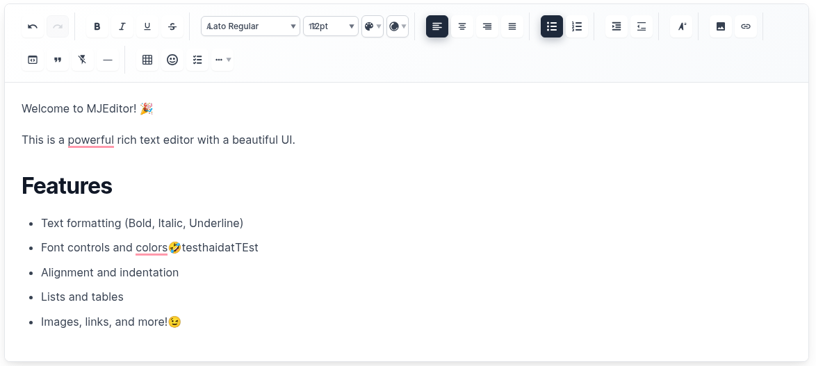 Beautiful, modern interface with comprehensive toolbar and editing capabilities
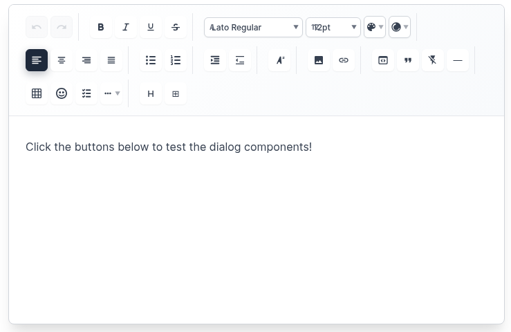 Professional toolbar with text formatting, alignment, lists, and content insertion tools
✨ Features
🎨 Rich Text Editing
- Text Formatting: Bold, Italic, Underline, Strikethrough
- Font Controls: Font family, size, color, background color
- Text Alignment: Left, Center, Right, Justify
- Lists: Bulleted lists, numbered lists, checklists
- Indentation: Increase/decrease text indentation
- Headings: H1-H6 heading support with paragraph options
🖼️ Media & Content
- Images: Insert images with URL, alt text, and captions
- Links: Insert hyperlinks with custom text
- Tables: Create tables with custom rows and columns
- Emojis: Insert emojis with categorized selection
- Code Blocks: Syntax-highlighted code blocks
- Horizontal Rules: Insert dividers
🎯 User Experience
- Custom Dialogs: Beautiful modal dialogs for all insertions
- Notification System: Custom notification cards (no browser alerts)
- Responsive Design: Works perfectly on desktop and mobile
- Dark/Light Themes: Built-in theme support
- Auto-save: Automatic content saving with configurable intervals
- Keyboard Shortcuts: Full keyboard navigation support
🔧 Developer Experience
- Plugin System: Extensible architecture with custom plugins
- TypeScript Support: Full type safety
- Customizable Toolbar: Show/hide specific tools
- Export Options: HTML, Markdown, and JSON export
- Import Support: Import from HTML and Markdown
🚀 Installation
npm install mjeditor📖 Quick Start
import React, { useState } from 'react';
import { MJEditor } from 'mjeditor';
import 'mjeditor/dist/editor.css';

function App() {
  const [value, setValue] = useState([
    {
      type: 'paragraph',
      children: [{ text: 'Hello, MJ Editor!' }],
    },
  ]);

  return (
    <MJEditor
      value={value}
      onChange={setValue}
      placeholder="Start typing..."
      theme="light"
      autoSave={true}
      autoSaveInterval={5000}
      onSave={(content) => console.log('Saved:', content)}
    />
  );
}
🎛️ Advanced Usage
With Custom Toolbar Configuration
import React, { useState } from 'react';
import { MJEditor, NotificationProvider } from 'mjeditor';
import 'mjeditor/dist/editor.css';

function App() {
  const [value, setValue] = useState([]);

  return (
    <NotificationProvider>
      <MJEditor
        value={value}
        onChange={setValue}
        placeholder="Start typing..."
        theme="light"
        toolbarConfig={{
          showTextFormatting: true,
          showFontControls: true,
          showTextStyling: true,
          showTextAlignment: true,
          showIndentation: true,
          showLists: true,
          showTextPositioning: true,
          showInsertOptions: true,
          showAdvancedFeatures: true,
          showUndoRedo: true,
          disabledTools: ['emoji'], // Disable specific tools
          customButtons: [
            <button key="custom" onClick={() => alert('Custom action!')}>
              Custom
            </button>
          ]
        }}
        minHeight="400px"
        maxHeight="600px"
        autoSave={true}
        autoSaveInterval={3000}
        onSave={(content) => {
          console.log('Auto-saved content:', content);
        }}
      />
    </NotificationProvider>
  );
}
🎨 Custom Dialogs
Image Dialog
- URL Input: Enter image URL with validation
- Alt Text: Add accessibility descriptions
- Caption: Optional image captions
- Live Preview: See image before insertion
Link Dialog
- URL Input: Enter target URL
- Link Text: Custom display text
- Validation: URL format validation
- Live Preview: See link before insertion
Table Dialog
- Rows/Columns: Select table dimensions
- Live Preview: See table structure
- Quick Insert: Instant table creation
Emoji Dialog
- Text Input: Type custom emojis
- Quick Selection: Popular emoji buttons
- Categories: Organized emoji selection
- Search: Find emojis quickly
Heading Dialog
- Paragraph: Regular paragraph text
- H1-H6: All heading levels
- Visual Preview: See heading styles
- Descriptions: Understand each option
🔔 Notification System
Custom Notifications (No Browser Alerts!)
import { NotificationProvider, useNotification } from 'mjeditor';

function MyComponent() {
  const { showSuccess, showError, showWarning, showInfo } = useNotification();

  const handleAction = () => {
    showSuccess('Action completed successfully!');
    showError('Something went wrong!');
    showWarning('Please check your input!');
    showInfo('Here is some information!');
  };

  return (
    <NotificationProvider>
      {/* Your app content */}
    </NotificationProvider>
  );
}
Notification Types
- Success: ✅ Green notifications for successful actions
- Error: ❌ Red notifications for errors
- Warning: ⚠️ Yellow notifications for warnings
- Info: ℹ️ Blue notifications for information
📋 Available Plugins
Core Plugins
TablePlugin- Table creation and managementImagePlugin- Image insertion and renderingLinkPlugin- Hyperlink functionalityEmojiPlugin- Emoji insertionHeadingPlugin- H1-H6 and paragraph support
Text Formatting Plugins
BoldPlugin- Bold text formattingItalicPlugin- Italic text formattingUnderlinePlugin- Underline text formattingStrikethroughPlugin- Strikethrough text formattingColorPlugin- Text and background colorsFontPlugin- Font family and size controls
Layout Plugins
AlignmentPlugin- Text alignment controlsListPlugin- Bulleted and numbered listsIndentationPlugin- Text indentationCodeBlockPlugin- Code block insertionHorizontalRulePlugin- Horizontal dividers
⚙️ Configuration
MJEditor Props
| Prop | Type | Default | Description |
|---|---|---|---|
value |
CustomElement[] |
[] |
Editor content |
onChange |
(value: CustomElement[]) => void |
- | Change handler |
plugins |
Plugin[] |
[] |
Array of plugins |
placeholder |
string |
'Start typing...' |
Placeholder text |
readOnly |
boolean |
false |
Read-only mode |
theme |
'light' | 'dark' |
'light' |
Editor theme |
className |
string |
'' |
Custom CSS class |
style |
CSSProperties |
{} |
Custom styles |
autoFocus |
boolean |
false |
Auto focus on mount |
autoSave |
boolean |
false |
Enable auto-save |
autoSaveInterval |
number |
30000 |
Auto-save interval (ms) |
onSave |
(value: CustomElement[]) => void |
- | Save handler |
toolbarConfig |
ToolbarConfig |
{} |
Toolbar configuration |
maxLength |
number |
- | Maximum content length |
minHeight |
string |
'200px' |
Minimum editor height |
maxHeight |
string |
- | Maximum editor height |
ToolbarConfig
| Prop | Type | Default | Description |
|---|---|---|---|
showTextFormatting |
boolean |
true |
Show text formatting buttons |
showFontControls |
boolean |
true |
Show font controls |
showTextStyling |
boolean |
true |
Show text styling options |
showTextAlignment |
boolean |
true |
Show alignment controls |
showIndentation |
boolean |
true |
Show indentation controls |
showLists |
boolean |
true |
Show list controls |
showTextPositioning |
boolean |
true |
Show positioning controls |
showInsertOptions |
boolean |
true |
Show insert options |
showAdvancedFeatures |
boolean |
true |
Show advanced features |
showUndoRedo |
boolean |
true |
Show undo/redo buttons |
disabledTools |
string[] |
[] |
Disable specific tools |
customButtons |
ReactNode[] |
[] |
Custom toolbar buttons |
📤 Export & Import
Export Functions
import {
  serializeToHtml,
  serializeToMarkdown
} from 'mjeditor';

// Export to HTML
const html = serializeToHtml(editorValue);

// Export to Markdown
const markdown = serializeToMarkdown(editorValue);
Import Functions
import {
  deserializeFromHtml,
  deserializeFromMarkdown
} from 'mjeditor';

// Import from HTML
const editorValue = deserializeFromHtml(htmlString);

// Import from Markdown
const editorValue = deserializeFromMarkdown(markdownString);
🎨 Customization
Custom Styles
/* Override default styles */
.mj-editor {
  border: 2px solid #3182ce;
  border-radius: 12px;
  box-shadow: 0 4px 6px rgba(0, 0, 0, 0.1);
}

.mj-toolbar {
  background: linear-gradient(135deg, #667eea 0%, #764ba2 100%);
  border-radius: 8px 8px 0 0;
}

.mj-toolbar-button {
  border-radius: 6px;
  transition: all 0.2s ease;
}

.mj-toolbar-button:hover {
  transform: translateY(-2px);
  box-shadow: 0 4px 12px rgba(0, 0, 0, 0.15);
}
Custom Plugin
const CustomPlugin = {
  name: 'custom',
  commands: {
    customAction: (editor, data) => {
      // Custom command implementation
    }
  },
  renderElement: (props) => {
    // Custom element rendering
    if (props.element.type === 'custom') {
      return <div className="custom-element">{props.children}</div>;
    }
    return undefined;
  },
  renderLeaf: (props) => {
    // Custom leaf rendering
    if (props.leaf.custom) {
      return <span className="custom-leaf">{props.children}</span>;
    }
    return undefined;
  }
};
🌐 Browser Support
- Chrome: 60+
- Firefox: 55+
- Safari: 12+
- Edge: 79+
- Mobile: iOS Safari, Chrome Mobile
📦 Package Structure
mjeditor/
├── dist/                 # Built files
├── src/
│   ├── components/       # Dialog components
│   ├── core/            # Core editor components
│   ├── plugins/         # Built-in plugins
│   ├── styles/          # CSS styles
│   ├── types/           # TypeScript types
│   └── utils/           # Utility functions
├── examples/            # Usage examples
└── demo/               # Demo application
🤝 Contributing
- Fork the repository
- Create your feature branch (
git checkout -b feature/amazing-feature) - Commit your changes (
git commit -m 'Add some amazing feature') - Push to the branch (
git push origin feature/amazing-feature) - Open a Pull Request
📄 License
MIT License - see LICENSE file for details.
📝 Changelog
See CHANGELOG.md for detailed version history.
🆘 Support
- Issues: GitHub Issues
- Documentation: Full Documentation
- Examples: Live Demo
MJ Editor - Modern, beautiful, and powerful rich text editing for React applications. ✨