Package Exports
- ngx-floating-img
This package does not declare an exports field, so the exports above have been automatically detected and optimized by JSPM instead. If any package subpath is missing, it is recommended to post an issue to the original package (ngx-floating-img) to support the "exports" field. If that is not possible, create a JSPM override to customize the exports field for this package.
Readme
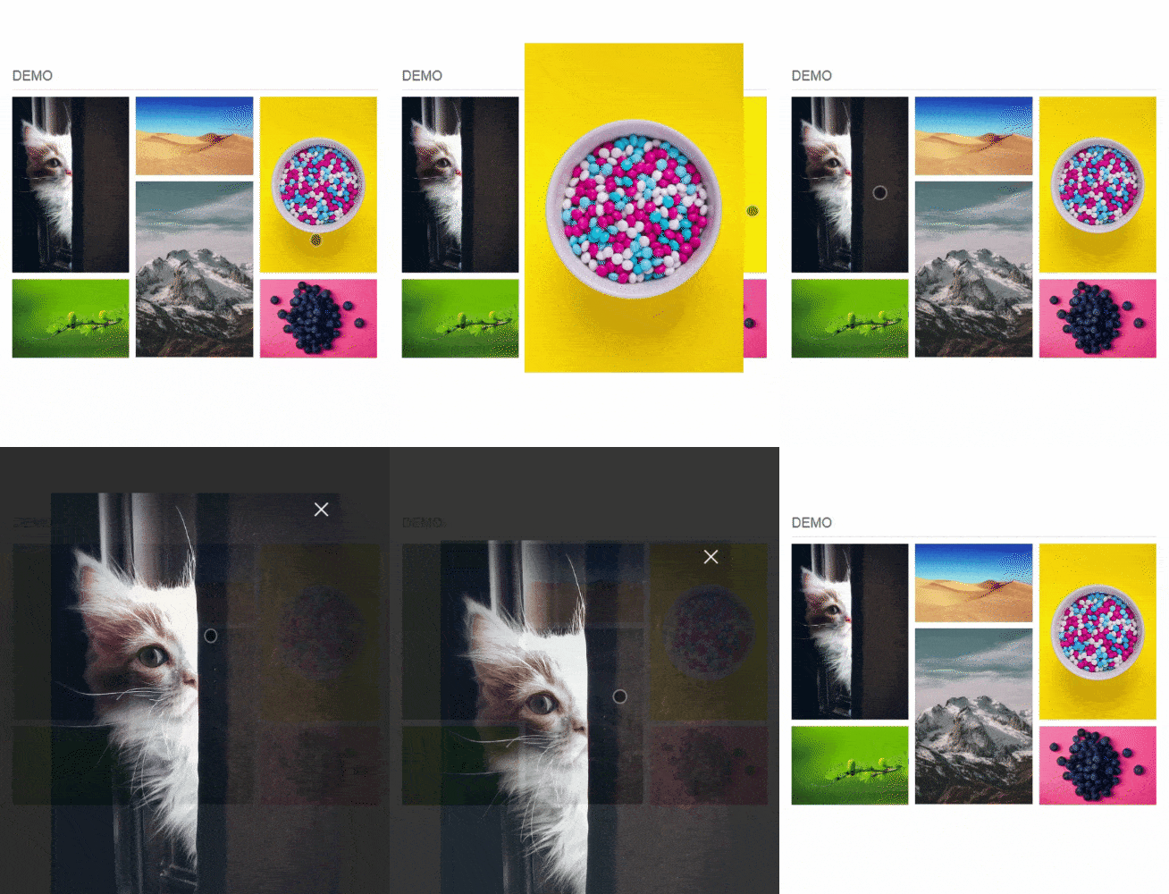
Floating Image Viewer
Mobile look and feel image viewer for Angular 6+
Website: https://qumhieh.github.io/ngx-floating-img/

Table of contents
Installation
Add ngx-floating-img to your Angular project
npm install --save ngx-floating-imgOnce installed import NgxFloatingImgModule.forRoot() in your app.module.ts
import { NgxFloatingImgModule } from "ngx-floating-img";

...
@NgModule({
   ...
   imports: [
    ...
    NgxFloatingImgModule.forRoot(),
    ...
   ],
   ...
})
export class AppModule {}
NgxFloatingImgModule.forChild() for lazy loaded modules
NgxFloatingImgModule.forChild()Add ngx-floating-img in your template file
<ngx-floating-img ... [options] ... >
    <img src="thumbImgSrc" />
</ngx-floating-img>
Options
| Option | Description | Type | Default |
|---|---|---|---|
| id | Component id, can be used as a return value in events handling | string | - |
| imgSrc | Full image src | string | - |
| imgWidth ( Required ) | Full image width in pixels, if full image not provided then thumb image width | number | - |
| imgHeight ( Required ) | Full image height in pixels, if full image not provided then thumb image height | number | - |
| imgAnimationType | Image animation type on show and hide | any valid css animation (linear, ease-in ...) | ease-out |
| imgAnimationSpeed | Image animation speed on show and hide | any number between 0 (for no animation) and 800 | 250 |
| vpPadding | Viewport padding in pixels when full image is visible | number | 20 |
| overlayColor | Image overlay background color | color | transparent |
| overlayAnimation | Enable / disable fade animation for image overlay | boolean | true |
| overlayDismiss | Enable / disable close image on overlay click | boolean | true |
| thumbBgColor | Thumb background color | color | #f0f0f0 |
| showLoading | Enable / disable loading bar | boolean | true |
| loadingColor | Change loading bar background color | color | transparent |
| showCloseButton | Show / hide close button | boolean | true |
| disableScroll | Enable / Disable page scrolling for desktop browsers only, as it's always disabled for mobile platform to meet the mobile experience | boolean | false |
Default options
Default options can be changed by adding a new object of type NGXFloatingImgOptions when importing NgxFloatingImgModule in your module
NgxFloatingImgModule.forRoot({ imgAnimationSpeed: 200, vpPadding: 30, imgAnimationType: 'linear' })NGXFloatingImgOptions default values
{
    showLoading: true
    loadingColor: transparent
    imgAnimationType: 'ease-out'
    imgAnimationSpeed: 250
    overlayColor: 'transparent'
    overlayAnimation: true
    overlayDismiss: true
    thumbBgColor: '#f0f0f0'
    vpPadding: 20
    showCloseButton: true
    disableScroll: false
}
Events
| Event | Description | Return |
|---|---|---|
| beforeShow | This event fires right after thumb click and before animation starts | component id |
| afterShow | This event fires after show animation is fully completed | component id |
| onFullImgLoad | This event fires after full image is fully loaded (if imgSrc attribute provided) | component id |
| beforeClose | This event fires right before close full image process starts | component id |
| afterClose | This event fires after closing animation completed | component id |
Examples
https://qumhieh.github.io/ngx-floating-img/examples
Compatibility
- Tested on desktop versions of Chrome, Firefox, Safari, IE10+, Edge.
- Tested on Android and iPhone modern browsers.
- Tested on Ionic 4.
Change log
1.1.0
- Added disableScroll option.
- Improved the user experience on mobile devices.
Bugs
You can report any bugs as Github issues
License
The project is licensed under the MIT license