
Package Exports
- ngx-full-carousel
- ngx-full-carousel/package.json
Readme
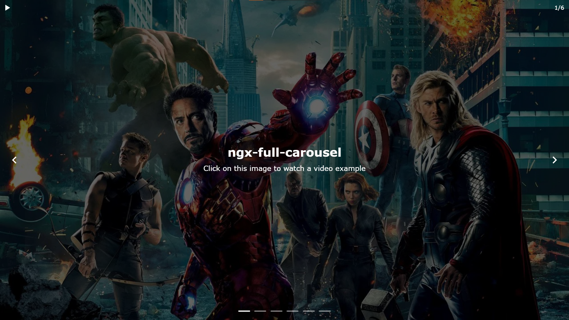
NgxFullCarousel - Angular Carousel
ngx-full-carousel is an standalone, reusable, responsive and customizable component for Angular 18, 19 and 20.
It is designed to work with signals and Angular zoneless, providing a lightweight, flexible, and accessible image slider.
Installation
If you want to install the latest version (currently 20):
npm install ngx-full-carouselAngular 19:
npm install ngx-full-carousel@angular19Angular 18:
npm install ngx-full-carousel@angular18Basic Usage
The only required input for ngx-full-carousel is [slides]. All other inputs are optional and can be used to customize the carousel´s behavior and appearance.
slides must be an array of objects with the type CarouselItem[]. You can import this type directly from the library:
import { CarouselItem } from 'ngx-full-carousel';MiniSliderItem Interface
Here is the exact declaration of the CarouselItem type:
export interface CarouselItem {
  image_url?: string;
  backgroundColor?: string;
  title?: string;
  subtitle?: string;
};| Property | Type | Required | Description |
|---|---|---|---|
image_url |
string |
No | Image URL for the slide |
backgroundColor |
string |
No | Background color for the slide if needed |
title |
string |
No | Responsive title for the slide (h2) |
subtitle |
string |
No | Responsive subtitle for the slide (h3) |
Basic Usage example
import { NgxFullCarousel, CarouselItem } from 'ngx-full-carousel';

@Component({
  imports: [NgxFullCarousel],
  template: `
    <ngx-full-carousel
      [slides]="items()"
    />
  `
})
class App {
  items = signal<CarouselItem[]>([
   { image_url: 'img1.jpg', title: 'First Slide', subtitle: '1st slide subtitle' },
   { image_url: 'img2.jpg', title: 'Second Slide', subtitle: '2nd slide subtitle' },
   ]);
}
Advanced Usage
Optional Attributes
In addition to the "slides" attribute, there are a number of optional attributes to fully customize the carousel.
<ngx-full-carousel
    [slides]="items()"

    [hasOverlay]="true"
    [transitionTime]="800"
    arrowsPlacement="auto"
    [hasCounter]="true"
    indicators="bars"

    [hasAutoplay]="true"
    [autoplayTime]="4000"
    [autoplayResumeTime]="15000"

    (selected)="selectedItem.set($event)"

    lang="en"
    accessibilityOptions="accOps()"
>
Below you will find a description of these optional attributes, determined by functionality.
Style Attributes
| Attribute | Description | Type | Default |
|---|---|---|---|
[hasOverlay] |
Add an overlay on top of the background image. | boolean | true |
[transitionTime] |
Time in ms of the transition between slides | number | 800 |
arrowsPlacement |
Position of arrows (Auto: up for desktop, down for mobile) | 'up', 'down' or 'auto' |
'auto' |
[hasCounter] |
Add a counter (Ex: 1/5). | boolean | false |
indicators |
Select the type of indicator for the slides | 'bars', 'circles' or 'none' |
'bars' |
If you want to edit styles in more detail, see the styles section below.
Autoplay Attributes
| Attribute | Description | Type | Default |
|---|---|---|---|
[hasAutoplay] |
Select whether you want autoplay or not | boolean | true |
[autoplayTime] |
Time in ms in which the slide is automatically changed | number | 7000 |
[autoplayResumeTime] |
Time in ms to resume autoplay when it stops (e.g. clicking on a slide) | number | 15000 |
Current/selected slide output
You can use (selected) output to get the current slide on screen. For example, if you want to build your own counter.
Accessibility Attributes
This component includes five default languages. When you choose one using the "lang" attribute, all accessibility settings are configured in that language, so you don't have to do anything else.
| Attribute | Description | Type | Default |
|---|---|---|---|
lang |
Select the language for accessibility | 'en', 'es', 'fr', 'de', 'it' |
en |
accessibilityOptions |
Set up your own custom aria attributes (more info below) | AccessibilityOptions or null |
null |
*** We recommend that if you don't need any languages other than those we offer by default, you use the "lang" attribute. It's easy and respects Wai-aria standards. ***
If you want to set up your own custom aria attributes, you should use the AccessibilityOptions interface.
You can import it directly from the componente:
import { AccessibilityOptions } from 'ngx-full-carousel';Here is the exact declaration of the AccessibilityOptions type:
export interface AccessibilityOptions {
  hostAriaLabel?: string;
  autoplayPauseLabel?: string;
  autoplayPlayLabel?: string;
  prevBtnAriaLabel?: string;
  nextBtnAriaLabel?: string;
  slidesRegionAriaLabel?: string;
  slidesRegionRoleDescription?: string;
  slideAriaLabel?: (currentSlide: number, total: number) => string;
  slideRoleDescription?: string;
};
Here you can see a description of every field in AccessibilityOptions interface.
Every field is type string (except slideAriaLabel) and non-required
| Property | Description |
|---|---|
hostAriaLabel |
aria-label for the host componente. Usefull to indicate the user that has entered into a carousel |
autoplayPauseLabel |
aria-label for autoplay button when autoplay is playing (described action is to pause it) |
autoplayPlayLabel |
aria-label for autoplay button when autoplay is paused (described action is to resume it) |
prevBtnAriaLabel |
aria-label for the arrow button that goes to prev slide |
nextBtnAriaLabel |
aria-label for the arrow button that goes to next slide |
slidesRegionAriaLabel |
aria-label for the container of all slides |
slidesRegionRoleDescription |
aria-roledescription for the container of all slides (role is 'group') |
slideAriaLabel |
aria-label for each slide. Is a function that returns the text for each slide (see example below) |
slideRoleDescription |
aria-roledescription for individual slide (role is 'group') |
IMPORTANT:
- All fields are optional, so you can customize only the ones you want. Fields that have not been entered in "AccessibilityOptions" will retain their values based on the selected "lang" (remember, default lang is "en")
Here you have an example of use:
import { NgxFullCarousel, CarouselItem, AccessibilityOptions } from 'ngx-full-carousel';

@Component({
  imports: [NgxFullCarousel],
  template: `
    <ngx-full-carousel
      [slides]="items()"
      [accessibilityOptions]="accOpts()"
    />
  `
})
class App {
  items = signal<CarouselItem[]>([
   { image_url: 'img1.jpg', title: 'First Slide', subtitle: '1st slide subtitle' },
   { image_url: 'img2.jpg', title: 'Second Slide', subtitle: '2nd slide subtitle' },
   ]);

  accOpts = signal<AccessibilityOptions>({
    hostAriaLabel: 'Main carousel CHANGED',
    autoplayPauseLabel: 'Pause carousel autoplay CHANGED',
    autoplayPlayLabel: 'Resume carousel autoplay CHANGED',
    prevBtnAriaLabel: 'Go to previous slide CHANGED',
    nextBtnAriaLabel: 'Go to next slide CHANGED',
    slidesRegionAriaLabel: 'Wide carousel CHANGED',
    slidesRegionRoleDescription: 'Carousel CHANGED',
    slideAriaLabel: (currentSlide: number, total: number) =>
        `CHANGED - Slide ${currentSlide} of ${total}`,
    slideRoleDescription: 'CHANGED - slide',
  });
}
Adding custom content: slide for
You can add the custom content you want into any slide you decide.
For doing that you must use ng-template and the SlideForDirective.
Here you have a simple example to add a button in the first slide:
import { NgxFullCarousel, CarouselItem, SlideForDirective } from 'ngx-full-carousel';

@Component({
  imports: [NgxFullCarousel, SlideForDirective],
  template: `
    <ngx-full-carousel
      [slides]="items()"
    >
      <ng-template [slideFor]="0">
        <button>
            Button in first slide
        </button>
      </ng-template>

    </ngx-full-carousel>
  `
})
class App {
  items = signal<CarouselItem[]>([
   { image_url: 'img1.jpg', title: 'First Slide', subtitle: '1st slide subtitle' },
   { image_url: 'img2.jpg', title: 'Second Slide', subtitle: '2nd slide subtitle' },
   ]);

}
As you can see in the example above, to add content to a slide you just need to use ng-template and the [slideFor] directive, which recieves the number of slide you want to add custom content.
Adding custom content: outerContent
You also can add content inside the whole carousel. It will be visible even if you navigate through slides. Example of use: imagine that the slider is opened into a modal window. You can easily add a "close button" this way.
import { NgxFullCarousel, CarouselItem } from 'ngx-full-carousel';

@Component({
  imports: [NgxFullCarousel],
  template: `
    <ngx-full-carousel
      [slides]="items()"
    >
      <ng-template #outerContent>
        <button style="position: absolute; top: 1rem; right: 1.5rem;">
            X
        </button>
      </ng-template>

    </ngx-full-carousel>
  `
})
class App {
  items = signal<CarouselItem[]>([
   { image_url: 'img1.jpg', title: 'First Slide', subtitle: '1st slide subtitle' },
   { image_url: 'img2.jpg', title: 'Second Slide', subtitle: '2nd slide subtitle' },
   ]);

}
As you can see in the example above, you just have to add <ng-template #outerContent> and use the template reference #outerContent.
IMPORTANT: You must set the content inside <ng-template #outerContent> as position: absolute and place it where you want.
Style variables
You can customize styles by using different variables in CSS.
| CSS Variable | Description | Default |
|---|---|---|
--carousel-bg |
General Background. Useful if you want no image or background per slide | black |
--carousel-width |
Component width. | 100% |
--carousel-height |
Component height. | 100dvh |
--carousel-overlay-color |
Custom color for the overlay if set in attributes | black |
--carousel-overlay-opacity |
Custom opacity for the overlay if set in attributes | .5 |
--carousel-title-size |
Custom size for titles in slides when set in [slides] object | 1.8rem |
--carousel-subtitle-size |
Custom size for subtitles in slides when set in [slides] object | 1.2rem |
--carousel-text-color |
Custom color for titles and subtitles when set in [slides] object | white |
--carousel-accent-color |
Custom color for arrows, indicators and autoplay toggle button | white |
--carousel-autoplay-color |
Custom color just for autoplay toggle button... | --carousel-accent-color |
--carousel-arrow-color |
Custom color just for arrow buttons | --carousel-accent-color |
--carousel-indicator-color |
Custom color just for indicators | --carousel-accent-color |
--carousel-autoplay-top |
Custom top position for autplay toggle button | 0rem |
--carousel-autoplay-left |
Custom left position for autplay toggle button | 0rem |
--carousel-counter-top |
Custom top position for counter if enabled in attributes | 0rem |
--carousel-counter-right |
Custom right position for counter if enabled in attributes | 0rem |
Examples of use:
ngx-full-carousel{
  --carousel-bg: red;
  --carousel-overlay-opacity: 0.8;
  --carousel-accent-color: red;
}
📌 Report or suggest something
Choose the form that best fits your case:
👉 Or go to the form selector.
License
MIT