
Package Exports
- ngx-gradient-picker
- ngx-gradient-picker/package.json
Readme
ngx-gradient-picker
A modern Angular gradient picker component with draggable color stops, circular angle picker, and full two-way binding support.


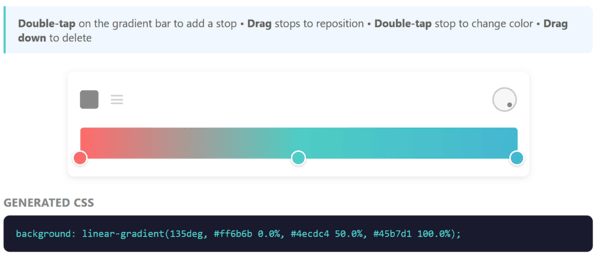
Desktop popover mode
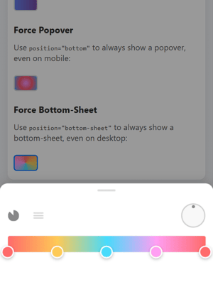
Mobile bottom-sheet mode (auto-detected)
✨ Features
- Draggable color stops with smooth animations
- Click to add new stops on the gradient bar
- Drag down to delete stops
- Double-click to open native color picker
- Single stop = solid color - one stop automatically becomes a solid color
- Circular angle picker for linear gradients
- 6 gradient types: Linear, Radial, Conic, Repeating-Linear, Repeating-Radial, Repeating-Conic
- CSS parsing - auto-detect gradient type, angle, and stops from CSS
- Mobile-friendly - bottom-sheet mode for popover, touch-optimized
- Angular Signals for optimal performance
- Standalone components - no module needed
- Two-way binding with
[(palette)],[(angle)],[(type)] - Works with Reactive Forms
- Fully customizable dimensions and CSS
- 🚫 Zero external dependencies - only Angular core
Installation
npm install ngx-gradient-pickeror with yarn:
yarn add ngx-gradient-pickeror with pnpm:
pnpm add ngx-gradient-pickerQuick Start
Basic Usage
import { Component, signal } from '@angular/core';
import { GradientPickerComponent, ColorStop, createColorStop } from 'ngx-gradient-picker';

@Component({
  selector: 'app-example',
  standalone: true,
  imports: [GradientPickerComponent],
  template: `
    <ngx-gradient-picker
      [(palette)]="palette"
      [(angle)]="angle"
      [(type)]="type"
      [width]="350"
      [paletteHeight]="32"/>
  `
})
export class ExampleComponent {
  palette = signal<ColorStop[]>([
    createColorStop(0, '#ff6b6b'),
    createColorStop(0.5, '#4ecdc4'),
    createColorStop(1, '#45b7d1')
  ]);
  angle = signal(90);
  type = signal<GradientType>('linear');
}
GradientType
type GradientType =
  | 'linear'
  | 'radial'
  | 'conic'
  | 'repeating-linear'
  | 'repeating-radial'
  | 'repeating-conic';
Popover Mode
Perfect for forms and compact UIs. By default, the picker automatically adapts to the device:
import { GradientPickerPopoverComponent } from 'ngx-gradient-picker';

@Component({
  imports: [GradientPickerPopoverComponent],
  template: `
    <!-- Auto mode (default): mobile = bottom-sheet, desktop = popover -->
    <ngx-gradient-picker-popover
      [(palette)]="palette"
      [(angle)]="angle"/>
  `
})
Position Options
| Position | Behavior |
|---|---|
'auto' (default) |
Auto-detects device: mobile/touch → bottom-sheet, desktop → popover |
'bottom' / 'top' / 'left' / 'right' |
Force popover at specified position |
'bottom-sheet' |
Force bottom-sheet mode (full-width modal) |
<!-- Force popover mode even on mobile -->
<ngx-gradient-picker-popover [position]="'bottom'"/>

<!-- Force bottom-sheet even on desktop -->
<ngx-gradient-picker-popover [position]="'bottom-sheet'"/>
CSS Auto-Detection
Parse any CSS gradient string and extract its type, angle, and color stops:
import { parseGradientCSS } from 'ngx-gradient-picker';

const css = 'linear-gradient(135deg, #667eea 0%, #764ba2 100%)';
const config = parseGradientCSS(css);
// config = { type: 'linear', angle: 135, stops: [...] }

// Then apply to your picker:
palette.set(config.stops);
angle.set(config.angle);
type.set(config.type);
Get CSS Output
import { Component, viewChild } from '@angular/core';
import { GradientPickerComponent, paletteToCSS } from 'ngx-gradient-picker';

@Component({
  template: `
    <ngx-gradient-picker #picker [(palette)]="palette" [(angle)]="angle"/>
    <div [style.background]="gradientCSS">Preview</div>
  `
})
export class ExampleComponent {
  picker = viewChild<GradientPickerComponent>('picker');

  // Option 1: Use the component method
  get gradientCSS() {
    return this.picker()?.getGradientCSS() ?? '';
  }

  // Option 2: Use the utility function
  get gradientCSS2() {
    return paletteToCSS(this.palette(), this.angle(), 'linear');
  }
}
With Reactive Forms
The component implements ControlValueAccessor, so it works directly with Angular forms:
import { Component, signal, inject } from '@angular/core';
import { FormBuilder, ReactiveFormsModule } from '@angular/forms';
import { GradientPickerComponent, ColorStop, createColorStop } from 'ngx-gradient-picker';

@Component({
  standalone: true,
  imports: [ReactiveFormsModule, GradientPickerComponent],
  template: `
    <form [formGroup]="form">
      <!-- formControlName binds the CSS output directly -->
      <ngx-gradient-picker
        formControlName="gradient"
        [(palette)]="palette"
        [(angle)]="angle"/>

      <div [style.background]="form.get('gradient')?.value">
        Preview
      </div>
    </form>
  `
})
export class FormComponent {
  private fb = inject(FormBuilder);

  palette = signal<ColorStop[]>([
    createColorStop(0, '#667eea'),
    createColorStop(1, '#764ba2')
  ]);
  angle = signal(90);

  // The CSS string is automatically synced to the form control
  form = this.fb.group({
    gradient: ['']
  });
}
API Reference
GradientPickerComponent
The component implements ControlValueAccessor - the form value is the CSS gradient string.
| Input/Output | Type | Default | Description |
|---|---|---|---|
[(palette)] |
ColorStop[] |
[] |
Two-way binding for color stops |
[(angle)] |
number |
90 |
Gradient angle (0-360 deg) |
[(type)] |
GradientType |
'linear' |
Gradient type (see types above) |
[width] |
number |
300 |
Picker width in pixels |
[paletteHeight] |
number |
24 |
Gradient bar height |
[minStops] |
number |
1 |
Minimum color stops (1 allows solid colors) |
[maxStops] |
number |
50 |
Maximum color stops |
(stopSelect) |
EventEmitter<ColorStop> |
- | Emitted when a stop is selected |
formControlName |
string |
- | Binds CSS output to form control |
GradientPickerPopoverComponent
| Input/Output | Type | Default | Description |
|---|---|---|---|
[(palette)] |
ColorStop[] |
[] |
Two-way binding for color stops |
[(angle)] |
number |
90 |
Gradient angle |
[width] |
number |
300 |
Picker width |
[position] |
PopoverPosition |
'auto' |
Position mode (see table above) |
type PopoverPosition = 'top' | 'bottom' | 'left' | 'right' | 'bottom-sheet' | 'auto';ColorStop Interface
interface ColorStop {
  id: string;       // Unique identifier
  offset: number;   // Position (0 to 1)
  color: string;    // Hex color value (#rrggbb)
  opacity?: number; // Optional opacity (0 to 1)
}
Helper Functions
import {
  createColorStop,
  paletteToCSS,
  parseGradientCSS,
  generateStopId,
  sortStopsByOffset,
  generateGradientCSS
} from 'ngx-gradient-picker';

// Create a new color stop
const stop = createColorStop(0.5, '#ff0000');
// { id: 'stop-xxx', offset: 0.5, color: '#ff0000', opacity: 1 }

// Generate CSS from palette
const css = paletteToCSS(palette, 90, 'linear');
// 'linear-gradient(90deg, #ff0000 0%, #00ff00 100%)'

// Parse CSS to get gradient config (auto-detection)
const config = parseGradientCSS('linear-gradient(45deg, #ff6b6b 0%, #4ecdc4 100%)');
// { type: 'linear', angle: 45, stops: [...] }
🎨 Solid Color Support
When only one color stop is present, the picker automatically outputs a solid color instead of a gradient:
// Single stop = solid color output
const palette = [createColorStop(0, '#ff6b6b')];
const css = paletteToCSS(palette, 90, 'linear');
// Returns: '#ff6b6b' (not 'linear-gradient(...)')
This is enabled by default (minStops="1"). To enforce at least 2 stops (gradient only), set minStops to 2:
<ngx-gradient-picker
  [(palette)]="palette"
  [minStops]="2" />
User Interactions
| Action | Effect |
|---|---|
| Click on gradient bar | Add new color stop |
| Drag a stop horizontally | Reposition the stop |
| Drag a stop down | Delete the stop (if > minStops) |
| Double-click a stop | Open native color picker |
| Drag angle picker | Change gradient angle |
| Click type button | Cycle between linear/radial/conic |
| Click repeat button | Toggle repeating mode |
🎨 CSS Customization
Override these CSS classes to customize the appearance:
| Class | Description |
|---|---|
.gradient-picker-container |
Main wrapper with background, padding, border-radius |
.gradient-picker-header |
Header containing type picker and angle picker |
.gradient-picker-body |
Body containing palette and color stops |
.color-stop-marker |
The circular color stop marker |
.palette-svg |
The gradient preview bar |
.angle-picker-container |
Container for the angle dial |
.dial |
The circular dial element |
.type-picker-container |
Container for type toggle buttons |
.type-toggle |
Type toggle button (linear/radial/conic) |
.repeat-toggle |
Repeat mode toggle button |
.popover-trigger |
The button that opens the popover |
.popover-content |
The popover container |
.popover-backdrop |
Backdrop overlay (bottom-sheet mode) |
Example customization:
::ng-deep .gradient-picker-container {
  background: #1a1a2e;
  border-radius: 16px;
  box-shadow: 0 8px 32px rgba(0, 0, 0, 0.3);
}

::ng-deep .color-stop-marker {
  width: 20px;
  height: 20px;
  border-width: 3px;
}
Angular Compatibility
| ngx-gradient-picker | Angular |
|---|---|
| 1.x | 17.x, 18.x, 19.x, 20.x |
📦 Bundle Size
| Metric | Size |
|---|---|
| FESM Bundle (unminified) | ~99 KB |
| Gzipped (estimated) | ~16 KB |
Note on npm publishing best practices: Angular libraries are published unminified to npm. This is intentional because:
- The consuming application's bundler (webpack, esbuild, vite) handles tree-shaking to remove unused code
- The bundler's minifier optimizes all code together for better compression
- Source maps remain accurate for debugging
- Consumer build tools can apply their own optimizations
The final impact on your app will depend on which components you import and your bundler's optimization settings.
Demo
Contributing
Contributions are welcome! Please read our Contributing Guide for details on:
- How to submit bug reports and feature requests
- How to set up the development environment
- Code style guidelines
- Pull request process
License
MIT © Mikhaël GERBET