
Package Exports
- phonix-input
- phonix-input/dist/index.js
This package does not declare an exports field, so the exports above have been automatically detected and optimized by JSPM instead. If any package subpath is missing, it is recommended to post an issue to the original package (phonix-input) to support the "exports" field. If that is not possible, create a JSPM override to customize the exports field for this package.
Readme
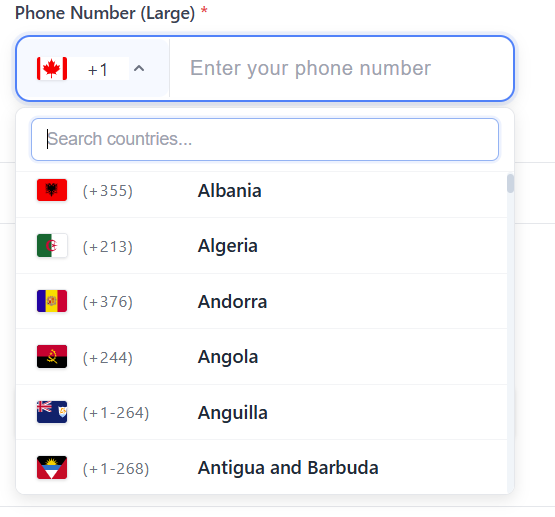
React Phone Input with Country Selection
A modern, customizable React component for phone number input with country code selection. Features a clean design, country flags, validation, and responsive layout that works seamlessly across all devices.
✨ Features
- 🎨 Modern Design: Clean, professional interface with premium styling
- 🏳️ Country Flags: Visual country selection with flag icons
- 📱 Responsive: Mobile-first design that adapts to all screen sizes
- ✅ Validation: Built-in phone number validation with custom error messages
- 🎛️ Customizable: Extensive styling options and configuration props
- 🔧 TypeScript: Full TypeScript support with comprehensive type definitions
- ⚡ Lightweight: Minimal dependencies and optimized bundle size
- 🔄 Easy Integration: Simple API that fits into any React application
📦 Installation
npm install phonix-inputPeer Dependencies
This package requires the following peer dependencies:
npm install react react-domSupported versions:
- React: ^17.0.0 || ^18.0.0 || ^19.0.0
- React DOM: ^17.0.0 || ^18.0.0 || ^19.0.0
🎨 CSS Import
The component includes built-in styles that are automatically imported. However, if you're experiencing styling issues, you can manually import the CSS:
Option 1: Automatic Import (Recommended)
The styles are automatically imported when you import the component.
Option 2: Manual CSS Import
# Import CSS in your main CSS file
@import 'phonix-input/dist/index.css';
Option 3: JavaScript Import
import { importStyles } from 'phonix-input';
importStyles(); // Call this in your app initialization
Option 4: CDN Import
<link rel="stylesheet" href="https://unpkg.com/phonix-input@1.0.10/dist/index.css">🚀 Quick Start
Note: The component defaults to India (+91) as the selected country. You can change this by providing a different initial value.
import React, { useState } from 'react';
import { PhoneInputWithCountrySelectList } from 'phonix-input';

function App() {
  const [phoneData, setPhoneData] = useState({
    countryCode: '+91',
    phone: ''
  });

  const handlePhoneChange = (value: { countryCode: string; phone: string }) => {
    setPhoneData(value);
  };

  return (
    <PhoneInputWithCountrySelectList
      countryFieldId="country"
      phoneFieldId="phone"
      label="Phone Number"
      placeholder="Enter your phone number"
      countryPlaceholder="Select country"
      required={true}
      value={phoneData}
      onChange={handlePhoneChange}
      validationMessages={{
        phoneRequired: "Please enter your phone number",
        phoneInvalid: "Invalid phone number format",
        countryRequired: "Please select a country"
      }}
    />
  );
}
📖 Documentation
Props
| Prop | Type | Default | Description |
|---|---|---|---|
countryFieldId |
string |
- | Required. Unique ID for the country select input |
phoneFieldId |
string |
- | Required. Unique ID for the phone input |
label |
string |
"Phone Number" |
Label text displayed above the inputs |
placeholder |
string |
"Enter phone number" |
Placeholder text for the phone input |
countryPlaceholder |
string |
"Select country" |
Placeholder text for the country dropdown |
required |
boolean |
false |
Shows a red asterisk (*) next to the label when true |
disabled |
boolean |
false |
Disables both inputs |
value |
object |
{ countryCode: "", phone: "" } |
Current value of the inputs |
onChange |
function |
- | Callback fired when the value changes |
validationMessages |
object |
- | Custom validation error messages |
Styling Props
Customize the appearance with these optional styling props:
| Prop | Type | Default | Description |
|---|---|---|---|
inputHeight |
string |
"48px" |
Height of both input fields |
inputPadding |
string |
"12px 16px" |
Internal padding of input fields |
countryWidth |
string |
"180px" |
Width of the country dropdown |
phoneWidth |
string |
"auto" |
Width of the phone input field |
dropdownHeight |
string |
"280px" |
Maximum height of the dropdown menu |
dropdownWidth |
string |
"200px" |
Minimum width of the dropdown menu |
inputHeightMobile |
string |
"52px" |
Height of inputs on mobile devices |
Value Object
interface PhoneValue {
  countryCode: string; // e.g., "+91", "+1", "+44"
  phone: string;       // The phone number without country code
}
Validation Messages
interface ValidationMessages {
  phoneRequired?: string;      // When phone number is required but empty
  phoneInvalid?: string;       // When phone number format is invalid
  phoneLengthInvalid?: string; // When phone number length is incorrect
  countryRequired?: string;    // When country selection is required but empty
}
🎨 Styling & Customization
Basic Styling
The component comes with a modern, clean design out of the box. You can customize the appearance using the styling props:
<PhoneInputWithCountrySelectList
  // ... other props
  inputHeight="56px"
  inputPadding="16px 20px"
  countryWidth="200px"
  phoneWidth="300px"
  dropdownHeight="320px"
/>
Custom CSS Classes
The component uses CSS classes that you can override:
/* Main container */
.phone-input-container {
  /* Your custom styles */
}

/* Country dropdown */
.country-select {
  /* Your custom styles */
}

/* Phone input field */
.phone-input {
  /* Your custom styles */
}

/* Required asterisk styling */
.required::after {
  content: "*";
  color: #dc3545;
  padding-left: 0.25rem;
  font-weight: bold;
}
🌍 Supported Countries
The component includes support for 195+ countries with:
- Country names in English
- ISO country codes
- International dialing codes
- Flag icons
- Proper phone number formatting
📱 Mobile Responsiveness
The component is designed with mobile-first principles:
- Touch-friendly input sizes
- Responsive dropdown menus
- Optimized for small screens
- Separate mobile styling options
🔧 Advanced Usage
Form Integration
import { useForm, Controller } from 'react-hook-form';

function ContactForm() {
  const { control, handleSubmit } = useForm();

  return (
    <form onSubmit={handleSubmit(onSubmit)}>
      <Controller
        name="phone"
        control={control}
        rules={{ required: "Phone number is required" }}
        render={({ field, fieldState }) => (
          <PhoneInputWithCountrySelectList
            countryFieldId="country"
            phoneFieldId="phone"
            value={field.value}
            onChange={field.onChange}
            validationMessages={{
              phoneRequired: fieldState.error?.message
            }}
          />
        )}
      />
    </form>
  );
}
With Custom Validation
const validatePhoneNumber = (countryCode: string, phone: string) => {
  // Your custom validation logic
  return phone.length >= 7 && phone.length <= 15;
};

<PhoneInputWithCountrySelectList
  // ... other props
  onChange={(value) => {
    if (validatePhoneNumber(value.countryCode, value.phone)) {
      // Handle valid phone number
    }
    handlePhoneChange(value);
  }}
/>
🛠️ Development
Building the Library
npm run buildPublishing
The package includes a prepublishOnly script that automatically builds the library before publishing:
npm publish🤝 Contributing
Contributions are welcome! Please feel free to submit a Pull Request. For major changes, please open an issue first to discuss what you would like to change.
- Fork the repository
- Create your feature branch (
git checkout -b feature/amazing-feature) - Commit your changes (
git commit -m 'Add some amazing feature') - Push to the branch (
git push origin feature/amazing-feature) - Open a Pull Request
📄 License
This project is licensed under the MIT License - see the LICENSE file for details.
🔧 Troubleshooting
CSS Not Loading
If the component appears unstyled, try these solutions:
- Check CSS Import: Make sure the CSS is properly imported
- Clear Cache: Clear your browser cache and node_modules
- Manual Import: Use one of the CSS import options above
- Build Issues: Rebuild your project after installing the package
Common Issues
- Dropdown not showing: Check z-index conflicts
- Mobile responsiveness: Ensure viewport meta tag is set
- TypeScript errors: Make sure you have the latest version
💝 Support
If you find this package helpful, please consider:
- ⭐ Starring the repository
- 🐛 Reporting bugs
- 💡 Suggesting new features
- 📢 Sharing with others
Made with ❤️ by Irfan Haidar Mukhi