
Package Exports
- ratti
Readme
Ratti
React Star Rating - Zero dependency, a highly-configurable, accessible rating component for React applications with TypeScript support.
Features
- Flexible Rating System: Support stars with fractional ratings
- Multiple Variants: Default, Circle, and Square background styles
- Custom Colors: Built-in color schemes or custom color arrays
- Accessibility: Full keyboard navigation and ARIA support
- Responsive: Works seamlessly across all device sizes
- Precision Control: Configurable rating precision (0.1, 0.5, 1.0, etc.)
- Interactive States: Hover, focus, and active states with smooth transitions
- Customizable: Custom SVG icons, sizes, and styling
- Zero Dependencies: Pure React component with no external dependencies
Installation
npm install ratti
# or
yarn add ratti
# or
pnpm add ratti
Basic Usage
Simple Star Rating
import { RateStar } from 'ratti';

<RateStar maxRating={5} defaultValue={3} />
Controlled Component
import { RateStar } from 'ratti';
import { useState } from 'react';

function RatingComponent() {
  const [rating, setRating] = useState(2.5);

  return (
    <RateStar
      maxRating={5}
      value={rating}
      onChange={setRating}
      precision={0.5}
    />
  );
}
Fractional Ratings
<RateStar
maxRating={5}
defaultValue={3.5}
precision={0.5} // Allows half-star ratings
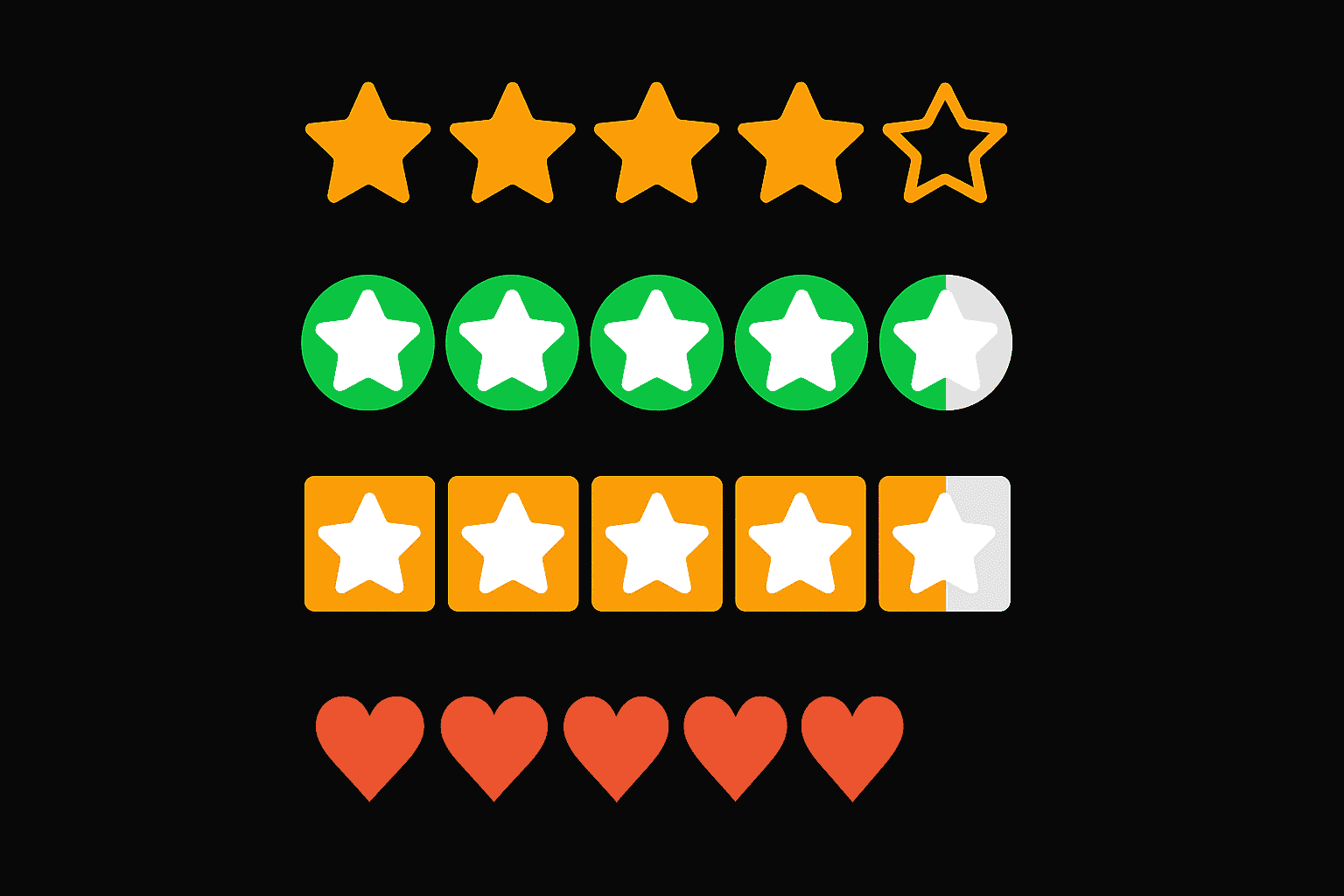
/>Variants
Default Variant
The classic star rating with direct color application.
<RateStar
  maxRating={5}
  defaultValue={4}
  variant="default"
  activeColorsEnabled
/>
Circle Variant
Stars displayed on circular backgrounds.
<RateStar
  maxRating={5}
  defaultValue={3}
  variant="circle"
  activeColorsEnabled
/>
Square Variant
Stars displayed on square backgrounds.
<RateStar
  maxRating={5}
  defaultValue={2}
  variant="square"
  activeColorsEnabled
/>
Color Customization
Built-in Color Schemes
<RateStar
  maxRating={5}
  defaultValue={4}
  activeColorsEnabled
  // Uses default color progression: red → orange → yellow → green
/>
Custom Colors
<RateStar
  maxRating={7}
  defaultValue={5}
  activeColorsEnabled
  customActiveColors={[
    "#d90429", // Red
    "#f77f00", // Orange
    "#fcbf49", // Yellow
    "#eae2b7", // Light yellow
    "#003049", // Dark blue
    "#d62828", // Dark red
    "#f77f00"  // Orange
  ]}
/>
Event Handlers
<RateStar
  maxRating={5}
  defaultValue={0}
  onChange={(rating) => console.log('Rating changed:', rating)}
  onHoverChange={(hoverRating) => console.log('Hover rating:', hoverRating)}
  onBlur={(event) => console.log('Component lost focus')}
/>
API Reference
Props
| Prop | Type | Default | Description |
|---|---|---|---|
maxRating |
number |
5 |
Maximum number of stars (1-15) |
defaultValue |
number |
0 |
Initial rating value |
value |
number |
- | Controlled rating value |
onChange |
(rating: number) => void |
- | Callback when rating changes |
onHoverChange |
(hoverRating: number) => void |
- | Callback when hover rating changes |
onBlur |
(event: React.FocusEvent) => void |
- | Callback when component loses focus |
disabled |
boolean |
false |
Whether the component is disabled |
readOnly |
boolean |
false |
Whether the component is read-only |
precision |
number |
1 |
Rating precision (0.1, 0.5, 1.0, etc.) |
activeColorsEnabled |
boolean |
false |
Enable color progression |
customActiveColors |
string[] |
- | Custom color array for rating levels |
variant |
'default' | 'circle' | 'square' |
'default' |
Visual variant |
svgPathD |
string |
- | Custom SVG path data |
className |
string |
- | Additional CSS class name |
size |
number | string |
- | Star size (px or CSS unit) |
Types
export type StarRatingVariant = "default" | "circle" | "square";

export interface StarRatingProps {
  maxRating?: number;
  defaultValue?: number;
  value?: number;
  onChange?: (rating: number) => void;
  onHoverChange?: (hoverRating: number) => void;
  onBlur?: (event: React.FocusEvent<HTMLDivElement>) => void;
  disabled?: boolean;
  readOnly?: boolean;
  precision?: number;
  activeColorsEnabled?: boolean;
  customActiveColors?: string[];
  variant?: StarRatingVariant;
  svgPathD?: string;
  className?: string;
  size?: number | string;
}
Accessibility
Ratti is built with accessibility in mind:
- ARIA Support: Proper
role,aria-valuemin,aria-valuemax,aria-valuenow, andaria-valuetextattributes - Keyboard Navigation: Full keyboard support with arrow keys, Home, End, Enter, and Space
- Focus Management: Visible focus indicators and proper focus handling
- Screen Reader Support: Descriptive labels and state announcements
Keyboard Controls
- Arrow Keys: Navigate between stars
- Home: Jump to first star (0 rating)
- End: Jump to last star (max rating)
- Enter/Space: Select current rating
- Tab: Navigate to/from component
Styling
CSS Custom Properties
The component uses CSS custom properties for easy theming:
.star-rating {
  --star-size: 24px;
  --star-gap: 4px;
  --star-color: #f59e0b;
  --star-hover-color: #fbbf24;
  --star-selected-color: #f59e0b;
  --star-disabled-color: #94a3b8;
  --star-transition: all 0.2s ease;
  --star-hover-scale: 1.1;
  --star-active-scale: 0.95;
}
Variant-Specific Properties
For circle and square variants, additional properties are available:
.star-rating {
  /* Circle variant */
  --star-circle-radius: 50%;

  /* Square variant */
  --star-square-radius: 4px;

  /* Background properties for circle/square variants */
  --star-bg-default: #dddddd;
  --star-bg-selected: var(--star-selected-color);
  --star-active-bg-color: var(--star-selected-color);
  --star-icon-on-bg: #ffffff;
}
Custom Styling
<RateStar
  maxRating={5}
  defaultValue={3}
  className="my-custom-rating"
/>
.my-custom-rating {
--star-color: #3b82f6;
--star-hover-color: #60a5fa;
--star-selected-color: #1d4ed8;
}
/* Custom circle variant */
.my-custom-rating.variant-circle {
--star-circle-radius: 25%;
--star-bg-default: #e5e7eb;
--star-bg-selected: #3b82f6;
}
/* Custom square variant */
.my-custom-rating.variant-square {
--star-square-radius: 8px;
--star-bg-default: #f3f4f6;
--star-bg-selected: #10b981;
}