
Package Exports
- react-bootstrap-date-picker
This package does not declare an exports field, so the exports above have been automatically detected and optimized by JSPM instead. If any package subpath is missing, it is recommended to post an issue to the original package (react-bootstrap-date-picker) to support the "exports" field. If that is not possible, create a JSPM override to customize the exports field for this package.
Readme
React-Bootstrap based date picker.


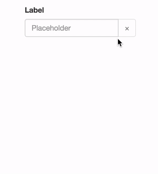
See the demo at pushtell.github.io/react-bootstrap-date-picker.
Please ★ on GitHub!
Using this module in production? We'd love to hear about it.
Table of Contents
Installation
react-bootstrap-date-picker is compatible with React 0.14.x and 0.15.x.
npm install react-bootstrap-date-pickerUsage
var DatePicker = require("react-bootstrap-date-picker");

var App = React.createClass({
  getInitialState: function(){
    var value = new Date().toISOString();
    return {
      value: value
    }
  },
  handleChange: function(value, formattedValue) {
    this.setState({
      value: value, // ISO String, ex: "2016-11-19T12:00:00.000Z"
      formattedValue: formattedValue // Formatted String, ex: "11/19/2016"
    });
  },
  componentDidUpdate: function(){
    // Access ISO String and formatted values from the DOM.
    var hiddenInputElement = document.getElementById("example-datepicker");
    console.log(hiddenInputElement.value); // ISO String, ex: "2016-11-19T12:00:00.000Z"
    console.log(hiddenInputElement.getAttribute('data-formattedvalue')) // Formatted String, ex: "11/19/2016"
  },
  render: function(){
    return <FormGroup>
      <ControlLabel>Label</ControlLabel>
      <DatePicker id="example-datepicker" value={this.state.value} onChange={this.handleChange} />
      <HelpBlock>Help</HelpBlock>
    </FormGroup>;
  }
});
API Reference
<DatePicker />
DatePicker component. Renders as a React-Bootstrap InputGroup.
InputGroup properties are passed through to the input group.
Properties:
value- ISO date string representing the current value.- Optional
- Type:
string - Example:
"2016-05-19T12:00:00.000Z"
defaultValue- ISO date string representing the default value. Cannot be set with 'value'.- Optional
- Type:
string - Example:
"2016-05-19T12:00:00.000Z"
minDate- ISO date string to set the lowest allowable date value.- Optional
- Type:
string - Example:
"2016-05-19T12:00:00.000Z"
maxDate- ISO date string to set the highest allowable date value.- Optional
- Type:
string - Example:
"2016-05-19T12:00:00.000Z"
style- Style object passed to theFormControlinput element.- Optional
- Type:
object - Example:
{width: "100%"}
className- Class name passed to theFormControlinput element.- Optional
- Type:
string - Example:
example-class
autoComplete- autoComplete attribute passed to theFormControlinput element.- Optional
- Type:
string - Example:
off
autoFocus- Whether or not component starts with focus.- Optional
- Type:
bool - Example:
false
disabled- Whether or not component is disabled.- Optional
- Type:
bool - Example:
false
onChange- Focus callback function.- Optional
- Type:
function - Callback Arguments:
value- ISO date string representing the selected value.- Type:
String - Example:
"2016-05-19T12:00:00.000Z"
- Type:
formattedValue- String representing the formatted value as defined by thedateFormatproperty.- Type:
String - Example:
"05/19/2016"
- Type:
onFocus- Focus callback function.- Optional
- Type:
function - Callback Arguments:
event- Focus event.- Type:
Event
- Type:
onBlur- Blur callback function.- Optional
- Type:
function - Callback Arguments:
event- Blur event.- Type:
Event
- Type:
dateFormat- Date format. Any combination of DD, MM, YYYY and separator.- Optional
- Type:
string - Examples:
"MM/DD/YYYY","YYYY/MM/DD","MM-DD-YYYY", or"DD MM YYYY"
clearButtonElement- Character or component to use for the clear button.- Optional
- Type:
stringorReactClass - Example:
"×"
showClearButton- Toggles the visibility of the clearButton- Optional
- Type:
bool - Example:
false
onClear- Defines what happens when clear button is clicked.- Optional
- Type:
function
previousButtonElement- Character or component to use for the calendar's previous button.- Optional
- Type:
stringorReactClass - Example:
"<"
nextButtonElement- Character or component to use for the calendar's next button.- Optional
- Type:
stringorReactClass - Example:
">"
cellPadding- CSS padding value for calendar date cells.- Optional
- Type:
string - Example:
"2px"
dayLabels- Array of day names to use in the calendar. Starting on Sunday.- Optional
- Type:
array - Example:
['Sun', 'Mon', 'Tue', 'Wed', 'Thu', 'Fri', 'Sat']
monthLabels- Array of month names to use in the calendar.- Optional
- Type:
array - Example:
['January', 'February', 'March', 'April', 'May', 'June', 'July', 'August', 'September', 'October', 'November', 'December']
calendarPlacement- Overlay placement for the popover calendar.- Optional
- Type:
stringorfunction - Example:
"top"
calendarContainer- Overlay container for the popover calendar. When placing the date-picker in a scrolling container, set this prop to some ancestor of the scrolling container.- Optional
- Type: A DOM element or a component
- Example:
document.body
weekStartsOnMonday- OBSOLETE useweekStartsOnweekStartsOn- Makes the calendar's week to start on a specified day. 0 = Sunday, 1 = Monday, etc.- Optional
- Type:
number - Example:
4
showTodayButton- Toggles the visibility of the today-button.- Optional
- Type:
boolean - Example:
false
todayButtonLabel- Label for the today-button- Optional
- Type:
string - Example:
"Today"
customControl- Overwrite the defaultFormControlcomponent with your own component.- Optional
- Type:
React.Component - Example:
<CustomControl />
Methods:
Tests
Browser Coverage
Karma tests are performed on Browserstack in the following browsers:
- IE 9, Windows 7
- IE 10, Windows 7
- IE 11, Windows 7
- Opera (latest version), Windows 7
- Firefox (latest version), Windows 7
- Chrome (latest version), Windows 7
- Safari (latest version), OSX Yosemite
- Mobile Safari (latest version), iPhone 6, iOS 8.3
Please let us know if a different configuration should be included here.
Running Tests
Locally:
npm test
On Browserstack:
BROWSERSTACK_USERNAME=YOUR_USERNAME BROWSERSTACK_ACCESS_KEY=YOUR_ACCESS_KEY npm test