
Package Exports
- react-bootstrap-monthrangepicker
This package does not declare an exports field, so the exports above have been automatically detected and optimized by JSPM instead. If any package subpath is missing, it is recommended to post an issue to the original package (react-bootstrap-monthrangepicker) to support the "exports" field. If that is not possible, create a JSPM override to customize the exports field for this package.
Readme
React Month & Quater & Year Range Picker for Bootstrap
Edit from react-bootstrap-daterangepicker;
Add one parameter :
- monthOrQuarter:[number]0 for monthRangePicker(default) ,1 for quarterRangePicker , 2 for yearRangePicker
Delete showWeekNumbers,date and time picker , if you want to use daterangepicker, you can see the package react-bootstrap-daterangepicker;
If your project is not React , you can see the package bootstrap-monthrangepicker;
Screenshots
monthOrQuarter:2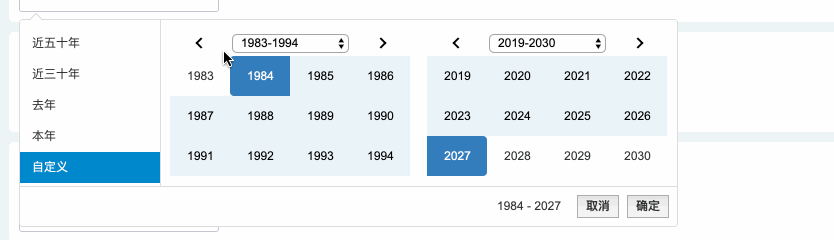
monthOrQuarter:1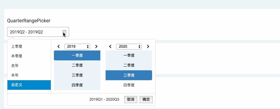
monthOrQuarter:0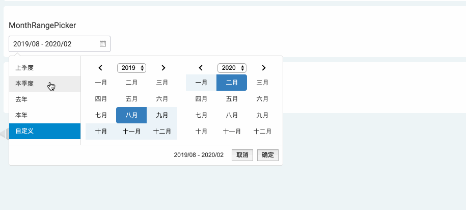
Description
A month/quarter picker for react (using bootstrap). This is a react wrapper around an existing jQuery/bootstrap library (it is not a pure react port):
Getting Started
Install the needed peer dependencies:
npm install --save bootstrap-monthrangepicker react jquery moment prop-typesInstall the module with:
npm install --save react-bootstrap-monthrangepickerInclude the bootstrap@3 css and fonts in your project. (aka
import 'bootstrap/dist/css/bootstrap.css';)Include the bootstrap-monthrangepicker css in your project. (aka
import 'bootstrap-monthrangepicker/daterangepicker.css';)This is a commonjs library. You will need a tool like browserify/webpack/etc to build your code.
import React, { Component } from 'react';
import Monthrangepicker from 'react-bootstrap-monthrangepicker';
// you will need the css that comes with bootstrap@3. if you are using
// a tool like webpack, you can do the following:
import 'bootstrap/dist/css/bootstrap.css';
// you will also need the css that comes with bootstrap-daterangepicker
import 'bootstrap-monthrangepicker/daterangepicker.css';

//monthOrQuarter:0 monthRangePicker(default);1 quarterRangePicker
class MyComponent {
  render() {
      var Locale ={
        format: 'YYYY/MM',
        separator: ' - ',
        applyLabel: '确定',
        cancelLabel: '取消',
        fromLabel: '从',
        toLabel: '至',
        customRangeLabel: '自定义',
        monthNames: ['一月', '二月', '三月', '四月', '五月', '六月', '七月', '八月', '九月', '十月', '十一月', '十二月'],
        quarterNames: ['一季度', '二季度', '三季度', '四季度'],
        firstDay: 1
    };
    return (
      <Monthrangepicker locale={Locale} startDate="1/1/2014" endDate="3/1/2014" monthOrQuarter={1}>
        <button>Click Me To Open Picker!</button>
      </Monthrangepicker>
    );
  }
}
Documentation
For in depth documentation, see the original bootstrap-monthrangepicker project page. bootstrap-daterangepicker project page.
You can pass all the same props as the original plugin:
- <input>, alwaysShowCalendars, applyClass, autoApply, autoUpdateInput, buttonClasses, cancelClass, dateLimit, drops, endDate, isCustomDate, isInvalidDate, linkedCalendars, locale, maxDate, minDate, opens, parentEl, ranges, showCustomRangeLabel, showDropdowns, showISOWeekNumbers, singleDatePicker, startDate, template,monthOrQuarter
You can listen to the following 7 events:
- onShow: thrown when the widget is shown
- onHide: thrown when the widget is hidden
- onShowCalendar: thrown when the calendar is shown
- onHideCalendar: thrown when the calendar is hidden
- onApply: thrown when the apply button is clicked
- onCancel: thrown when the cancel button is clicked
- onEvent: thrown when any of the 4 events above are triggered
All 7 of the events above should take a handler that is passed 2 arguments: event and picker
Example event handler:
class SomeReactComponent extends React.Component {
  handleEvent(event, picker) {
    console.log(picker.startDate);
  }
  render() {
    return <Monthrangepicker onEvent={this.handleEvent} />;
  }
}
There are 2 additional props you can pass, that are not part of the wrapped
bootstrap-daterangepicker project.
Every <Monthrangepicker /> element emits a div element for the wrapper project to initialize itself against.
The emitted div looks like this by default:
<div class="react-bootstrap-daterangepicker-container" style="display:inline-block"></div>The 2 props you can pass to modify this behavior are:
- containerStyles [object]: the styles of the container
<div />(default:{ display: 'inline-block' }) - containerClass [string]: the class of the container
<div />(default:'react-bootstrap-daterangepicker-container')
Links
- github : Original bootstrap-monthrangepicker Plugin
- github : Original react-bootstrap-daterangepicker Plugin
- github : Original bootstrap-daterangepicker Plugin
License
Copyright (c) 2019 gntyu
Uses the original bootstrap-daterangepicker license.