
Package Exports
- react-custom-rating-component
- react-custom-rating-component/dist/cjs/index.js
- react-custom-rating-component/dist/esm/index.js
This package does not declare an exports field, so the exports above have been automatically detected and optimized by JSPM instead. If any package subpath is missing, it is recommended to post an issue to the original package (react-custom-rating-component) to support the "exports" field. If that is not possible, create a JSPM override to customize the exports field for this package.
Readme
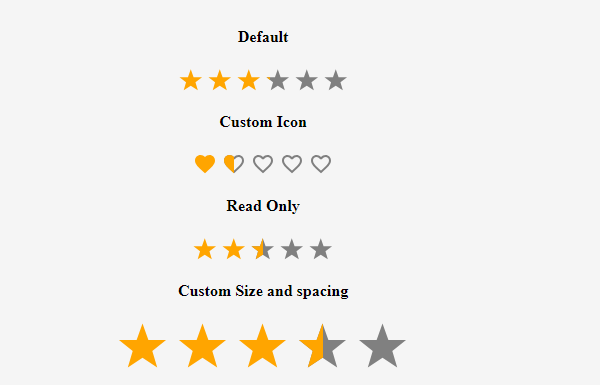
React Custom Rating Component
A fully customizable React rating component supporting stars, hearts, and custom icons with various precisions.
Installation
Install using npm or yarn:
npm install react-custom-rating-componentOr
yarn add react-custom-rating-componentMotivation
This package was created to offer a highly customizable and declarative rating component with support for different shapes, precise ratings, and custom icons.
Demo
Check out the interactive playground showcasing different use cases:
Live Example
Demo Image
Usage
import { Rating } from 'react-custom-rating-component'

const App = () => {
  return (
    <div style={{ display: 'flex', justifyContent: 'center', alignItems: 'center', margin: '40px 20px' }}>
      <Rating
        defaultValue={2.5}
        size='30px'
        spacing='10px'
        activeColor='red'
        onChange={(newRating) => console.log('New Rating:', newRating)}
        onHover={(hoveredRating) => console.log('Hovered Rating:', hoveredRating)}
      />
    </div>
  )
}
Features
- Customizable icons (stars, hearts, or custom SVGs)
- Supports precise ratings (0.1 - 1 increments)
- Read-only mode
- Custom colors and sizes
- Hover effects with tooltips
Props
| Prop | Type | Default | Description |
|---|---|---|---|
defaultValue |
number | 0 | The default rating value. |
precision |
0.1 - 1 | 1 | The increment step for rating selection. |
count |
number | 5 | The number of rating icons displayed. |
shape |
'star' | 'heart' | 'custom' | 'star' | Defines the shape of rating icons. |
onChange |
function | - | Callback when rating value changes. |
onHover |
function | - | Callback when rating is hovered. |
readOnly |
boolean | false | Disables user interaction. |
size |
string | '24px' | Defines the size of rating icons. |
spacing |
string | '5px' | Defines the space between rating icons. |
activeColor |
string | 'orange' | Color for active rating icons. |
defaultColor |
string | 'gray' | Color for inactive rating icons. |
titleArray |
string[] | - | Custom tooltips for each rating level. |
showTitle |
boolean | false | Enables tooltips on hover. |
emptyIcon |
function | - | Returns custom SVG component for empty icon. |
fillIcon |
function | - | Returns custom SVG component for filled icon. |
Examples
Custom Icon Rating
import { Rating, IconStylesProps } from 'react-custom-rating-component'

const CircleIcon = ({ iconStyles, defaultColor, isFilled }: IconStylesProps & { isFilled?: boolean }) => (
  <svg viewBox='0 0 24 24' style={iconStyles} fill={isFilled ? 'currentColor' : defaultColor}>
    <circle cx='12' cy='12' r='10' />
  </svg>
)

const App = () => (
  <Rating
    count={5}
    defaultValue={3.5}
    precision={0.5}
    shape='custom'
    emptyIcon={(props) => <CircleIcon {...props} isFilled={false} />}
    fillIcon={(props) => <CircleIcon {...props} isFilled />}
  />
)
Read-Only Mode
<Rating defaultValue={4} readOnly />Custom Colors
<Rating defaultValue={4} activeColor='red' defaultColor='purple' />Tooltips
<Rating defaultValue={3} showTitle titleArray={['Poor', 'Fair', 'Good', 'Better', 'Excellent']} />Issues & Contributions
If you encounter any issues or have feature requests, raise them on GitHub:
Thank You!
Thank you for using React Custom Rating Component!