
Package Exports
- react-custom-sidebar
- react-custom-sidebar/dist/index.js
This package does not declare an exports field, so the exports above have been automatically detected and optimized by JSPM instead. If any package subpath is missing, it is recommended to post an issue to the original package (react-custom-sidebar) to support the "exports" field. If that is not possible, create a JSPM override to customize the exports field for this package.
Readme
React Custom Sidebar
React Custom Sidebar is a fully customizable sidebar component for React.
- Can be used a docked or over content.
- Docked version has open and close state.
- Fully customizabe light and dark theme option.
- User profile section.
- Dedicated logout button
- Auto adjusted on mobile devices to 'Over content' mode
- Custom styles supported
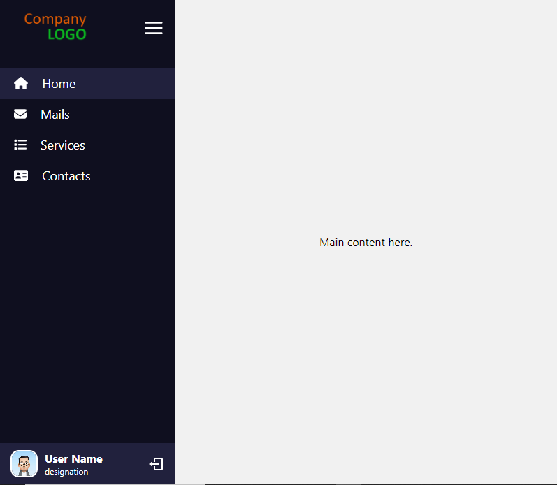
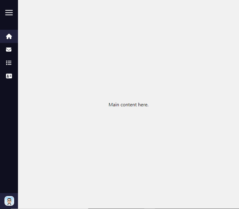
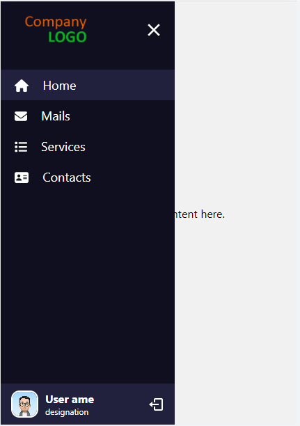
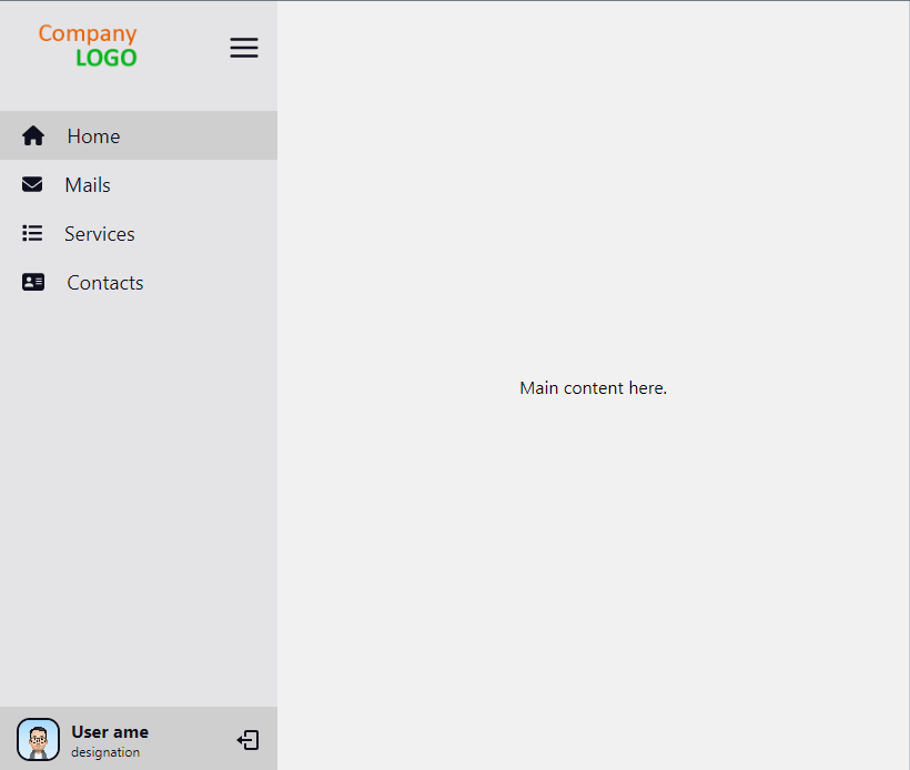
Screenshots
desktop view
desktop view menu closed
mobile view menu opened
light theme
Installation
npm install react-custom-sidebar
Getting started
import { Sidebar } from "react-custom-sidebar";

const themeColors = {
  light: {
    bgColor: "#e4e4e6",
    textColor: "#0f0f1f",
    highlights: "#cfcfcf",
  },
  dark: {
    bgColor: "#0f0f1f",
    textColor: "#ffffff",
    highlights: "#21213d",
  },
};

function App() {
  // sidebar toggle status
  const [isMenuOpen, setIsMenuOpened] = useState(false);

  // menu list
  const menuItems = [
    {
      title: "Home",
      link: "/",
      icon: <FontAwesomeIcon icon={faHome} />,
    },
    {
      title: "Mails",
      link: "/mails",
      icon: <FontAwesomeIcon icon={faEnvelope} />,
    },
    {
      title: "Services",
      link: "/services",
      icon: <FontAwesomeIcon icon={faList} />,
    },
    {
      title: "Contacts",
      link: "/contacts",
      icon: <FontAwesomeIcon icon={faContactCard} />,
    },
  ];

  // logout click handler
  const handleLogout = () => {
    console.log("logout clicked");
  };

  return (
    <div className="App">
      <BrowserRouter>
        <Sidebar
          menuItems={menuItems}
          theme="light"
          logoUrl="add logo url here"
          logoSmallUrl="add small logo url here which will be visible in closed state"
          themeColors={defaultThemeColors}
          showLogout={true}
          handleLogout={handleLogout}
          userDetails={{
            name: "User name",
            description: "designation",
            avatar: "add user avatart url here",
          }}
          closeOnLinkClick={false}
          closeOnOutsideClick={false}
          isSidebarOpened={isMenuOpen}
          handleSidebarToggle={setIsMenuOpened}
          showToggleButton={true}
        >
          // main content here
          <Routes>
            <Route path="/" element={<Home />} />
            <Route path="mails" element={<Mails />} />
            <Route path="contacts" element={<Contacts />} />
            <Route path="services" element={<Services />} />
          </Routes>
        </Sidebar>
      </BrowserRouter>
    </div>
  );
}

export default App;
Supported props
| Property name | Type | Default | Description |
|---|---|---|---|
| docked | boolean | true for desktop/tablet and false for mobiles | If the sidebar is docked with main content or float over it |
| menuItems | array of objects | Empty array | The list of menu items to be rendered |
| logoUrl | string | NULL | Logo url |
| logoSmallUrl | string | NULL | Small Logo for closed state, only visible if showToggleButton is false url |
| theme | string | dark | light/dark |
| themeColors | object | default colors | Theme colors |
| showLogout | boolean | false | To show/hide logout button |
| handleLogout | function | NULL | Logout button click listener |
| userDetails | object | NULL | User details to be shown in sidebar. |
| closeOnLinkClick | boolean | false | To close the sidebar on menu item click |
| closeOnOutsideClick | boolean | false | To close the sidebar on outside click on docked state or mobile view |
| isSidebarOpened | boolean | true | If the sidebar should be open |
| showToggleButton | boolean | true | If hamburger menu icon visible |
| handleSidebarToggle | function | n/a | Callback called when the sidebar status changed from hamburger menu icon |
| showTooltipOnClose | boolean | true | If tooltip visible in closed state. |
| styles | object | empty object | Custom styles. |
Default theme colors
{
  light: {
    bgColor: "#e4e4e6", // sidebar background color
    textColor: "#0f0f1f", // text color
    highlights: "#cfcfcf", // bg color of active/hover link item
  },
  dark: {
    bgColor: "#0f0f1f",
    textColor: "#ffffff",
    highlights: "#21213d",
  },
}
Menu items
[
    {
        title: "Home",
        link: "/home",
        icon: "" //  component or img,
    },
    ...
]
userDetails
{
    name: "",
    description: "",
    avatar: ""
}
Styles
Custom styles can be passed as an object with these keys:
{
    sidebar : { /* for main container */},
    logoContainer: {/* for logo container */},
    logo: { /* for logo icon */},
    logoSmall: { /* for small logo icon */},
    toggleIcon: { /* for hamburger menu icon */},
    menuItem: { /* for menu logo and text container */},
    menuItemIcon: { /* for menu item logo */},
    menuItemText: { /* for menu item text */},
    userContainer: { /* for  user details container */},
    username: { /* for username text */},
    avatar: { /* for user avatar */},
    userDescription: { /* for user description text */},
    logout: { /* for logout icon */},
    mainContentContainer: { /* for main content outside the sidebar */}
}