
Package Exports
- react-deck-swiper
This package does not declare an exports field, so the exports above have been automatically detected and optimized by JSPM instead. If any package subpath is missing, it is recommended to post an issue to the original package (react-deck-swiper) to support the "exports" field. If that is not possible, create a JSPM override to customize the exports field for this package.
Readme
React Deck Swiper

This is a simple React module that introduces a tinder-like swipeable component.
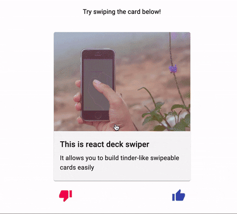
Preview
Online example here.
Install
You can use yarn or npm.
Yarn
yarn add react-deck-swipernpm
npm install --save react-deck-swiperUsage
import * as React from 'react';

import { Swipeable, direction } from 'react-deck-swiper';

const Component = () => {
  const handleOnSwipe = (swipeDirection) => {
    if (swipeDirection === direction.RIGHT) {
      // handle right swipe
      return;
    }

    if (swipeDirection === direction.LEFT) {
      // handle left swipe
      return;
    }
  }

  return (
    <Swipeable onSwipe={handleOnSwipe}>
      <div className="card">
        Your card content here
      </div>
    </Swipeable>
  );
};

export default Component;
Props
| Name | Type | Required | Default value | Description |
|---|---|---|---|---|
children |
React.ReactChild |
required | - | component that will be swipeable |
onBeforeSwipe |
(forceSwipe, cancelSwipe, direction) => void |
optional | undefined |
callback executed on swipe start |
onSwipe |
(direction) => void |
optional | undefined |
callback executed on swipe end |
onAfterSwipe |
() => void |
optional | undefined |
callback executed right after onSwipe end |
onOpacityChange |
(opacity) => void |
optional | undefined |
callback executed when the card opacity changes on swipe |
wrapperHeight |
string |
optional | 100% |
height prop for swipeable wrapper |
wrapperWidth |
string |
optional | 100% |
width prop for swipeable wrapper |
swipeThreshold |
number |
optional | 120 |
offset in px swiped to consider as swipe |
fadeThreshold |
number |
optional | 40 |
offset when opacity fade should start |
renderButtons |
({right, left}) => React.Component |
optional | undefined |
function to render buttons to force swipes |
Contributing
Pull requests are welcome! If you have any feedback, issue or suggestion, feel free to open a new issue so we can talk about it 💬.
License
MIT
Special Thanks
Thanks to goncy for the first version of this lib.
Made with ❤️ by Pedro Bini @ Jungsoft.