
Package Exports
- react-form-stepper
- react-form-stepper/dist/index.js
- react-form-stepper/dist/react-form-stepper.esm.js
This package does not declare an exports field, so the exports above have been automatically detected and optimized by JSPM instead. If any package subpath is missing, it is recommended to post an issue to the original package (react-form-stepper) to support the "exports" field. If that is not possible, create a JSPM override to customize the exports field for this package.
Readme
react-form-stepper


A simple react stepper component for multi-step forms inspired by the Stepper component from Material-UI.
Examples
For examples of react-form-stepper go to: https://m0ky.github.io/react-form-stepper/.
Getting started
Install the library by running:
npm install react-form-stepper --saveor
yarn add react-form-stepperUsage
import { Stepper } from 'react-form-stepper';There are 2 possible ways of defining the steps in the Stepper component:
- Using the
stepsprop - Using the
Stepperas a HOC withStepas children
Using the steps prop
<Stepper
steps={[{ label: 'Step 1' }, { label: 'Step 2' }, { label: 'Step 3' }]}
activeStep={2}
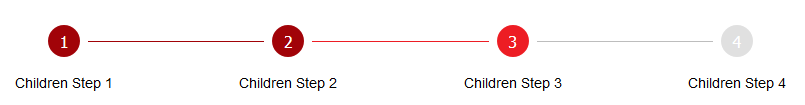
/>Using the Stepper as a HOC with Step as children
<Stepper activeStep={1}>
  <Step label="Children Step 1" />
  <Step label="Children Step 2" />
  <Step label="Children Step 3" />
</Stepper>
Using with SSR
When developing an SSR application with a framework like Next.js you might face your console being polluted with the following message
Warning: [JSS] Rule is not linked. Missing sheet option "link: true". caused by the underlying dependency react-jss.
A workaround is to use the dynamic import module like in the example below.
// CustomStepper.js
const CustomStepper = () => {
  return <Stepper steps={[{ label: 'Step 1' }, { label: 'Step 2' }]} activeStep={1} />;
};

export default CustomStepper;
// MultiStepForm.js
import dynamic from 'next/dynamic';
const StepperComponent = dynamic(() => import('./CustomStepper'), {
ssr: false,
});Stepper props
| Props | Options | Default | Description |
|---|---|---|---|
| steps | [StepsDTO] | none | Array of objecst defining the steps |
| activeStep | number | 0 | Value defining the active step |
| connectorStateColors | boolean | false | Use different colors for connector lines based on adjacent steps state |
| className | string | none | Add css classes to the Stepper component |
| stepClassName | string | none | Add css classes to Step components |
| hideConnectors | boolean |'inactive' | false | Value defining connectors visibility |
| nonLinear | boolean | false | Allow users to enter the flow at any point |
| styleConfig | StepStyleDTO | --- | Object containing Step style defaults |
| connectorStyleConfig | ConnectorStyleProps | --- | Object containing Connector style defaults |
ConnectorStyleProps
| Props | Options | Default | Description |
|---|---|---|---|
| disabledColor | string | '#bdbdbd' | Define the disabled connector line color |
| activeColor | string | '#ed1d24' | Define the active connector line color |
| completedColor | string | '#a10308' | Define the completed connector line color |
| size | React.ReactText | 1 | Define the thickness of the connector line |
| stepSize | React.ReactText | '2em' | Value defaulting to the step size, used to calculate the padded space between the step and connector line start |
| style | string | 'solid' | Define the style of the connector line |
StepsDTO
| Props | Options | Default | Description |
|---|---|---|---|
| label | string | '' | Value to be displayed under each step |
| active | boolean | false | Value to indicate should the step be displayed as active |
| completed | boolean | false | Value to indicate should the step be displayed as completed |
StepStyleDTO
| Props | Options | Default | Description |
|---|---|---|---|
| activeBgColor | string | '#ed1d24' | Define the background color for active steps |
| activeTextColor | string | '#ffffff' | Define the text color for active steps |
| completedBgColor | string | '#a10308' | Define the background color for completed steps |
| completedTextColor | string | '#ffffff' | Define the background color for completed steps |
| inactiveBgColor | string | '#e0e0e0' | Define the background color for inactive steps |
| inactiveTextColor | string | '#ffffff' | Define the background color for inactive steps |
| size | string or number | '2em' | Value representing the width and height of the step |
| circleFontSize | string or number | '1rem' | Font size of the step content |
| labelFontSize | string or number | '0.875rem' | Font size of step labels |
| borderRadius | string or number | '50%' | Step border radius |
| fontWeight | string or number | 500 | Step label font weight |
Step props
| Props | Options | Default | Description |
|---|---|---|---|
| label | string | '' | Value to be displayed under each step |
| active | boolean | false | Value to indicate should the step be displayed as active |
| completed | boolean | false | Value to indicate should the step be displayed as completed |
| index | number | 0 | Index value of the step |
| className | string | none | Add css classes to the Step component |
| children | React.ReactNode | Step index | Value inside the step |