
Package Exports
- react-input-color-v2
- react-input-color-v2/dist/index.cjs.js
- react-input-color-v2/dist/index.esm.js
This package does not declare an exports field, so the exports above have been automatically detected and optimized by JSPM instead. If any package subpath is missing, it is recommended to post an issue to the original package (react-input-color-v2) to support the "exports" field. If that is not possible, create a JSPM override to customize the exports field for this package.
Readme
react-input-color-v2
This is a library based on https://www.npmjs.com/package/react-input-color, but add a new feature to be used as a Popover instead of have a default input picker


React input color component with hsv color picker
The color picker is inspired by the sketch color picker
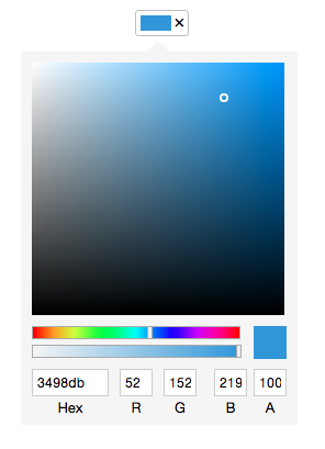
Starting from v2, this component is rewritten with emotion and it doesnot require any external css file.
Installation
npm install react-input-color --save
yarn add react-input-color
Usage
The initialValue property supports 6 (#RRGGBB) and 8 (#RRGGBBAA) digits hex value.
import React from 'react';
import PopoverInputColor from 'react-input-color';

function App() {
  const [color, setColor] = React.useState({});

  return (
    <div>
      <PopoverInputColor
        initialValue="#5e72e4"
        onChange={setColor}
        placement="right"
      />
      <span>Select Color</span>
      </PopoverInputColor>
    </div>
  );
}- This component is built with react-input-slider and react-input-number.
License
MIT