
Package Exports
- react-js-cron
- react-js-cron/dist/cjs/index.js
- react-js-cron/dist/esm/index.js
- react-js-cron/dist/styles.css
This package does not declare an exports field, so the exports above have been automatically detected and optimized by JSPM instead. If any package subpath is missing, it is recommended to post an issue to the original package (react-js-cron) to support the "exports" field. If that is not possible, create a JSPM override to customize the exports field for this package.
Readme
ReactJS Cron
A React cron editor built with antd

Live demo and usage at https://xrutayisire.github.io/react-js-cron/
Features
- Zero dependencies except React and antd
- Supports all standard cron expressions
- Supports cron names for months and week days
- Supports cron shortcuts
- Supports "7" for Sunday
- Supports two-way sync binding with input
- Supports locale customization
- Supports multiple selection by double-clicking on an option
- And many more (disabled, read-only, 12-hour clock...)
Inspired by
TypeScript
react-js-cron is written in TypeScript with complete definitions
Installation
Be sure that you have these dependencies on your project:
- react (>=17.0.0)
- antd (>=5.8.0)
# NPM
npm install react-js-cron

# Yarn
yarn add react-js-cron
Usage
import { Cron } from 'react-js-cron'
import 'react-js-cron/dist/styles.css'
export function App() {
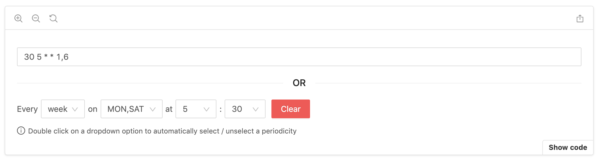
const [value, setValue] = useState('30 5 * * 1,6')
return <Cron value={value} setValue={setValue} />
}Don't forget to import styles manually:
import 'react-js-cron/dist/styles.css'Converter
If you want to use the converter that react-js-cron uses internally, you can import it into your project:
import { converter } from 'react-js-cron'

const cronString = converter.getCronStringFromValues(
  'day', // period: 'year' | 'month' | 'week' | 'day' | 'hour' | 'minute' | 'reboot'
  [], // months: number[] | undefined
  [], // monthDays: number[] | undefined
  [], // weekDays: number[] | undefined
  [2], // hours: number[] | undefined
  [1], // minutes: number[] | undefined
  false // humanizeValue?: boolean
)

console.log('cron string:', converted)
cron string: '1 2 * * *'The converter can also be helpful for parsing a string. Note that Sunday is represented as 0 in the output array but can be either 0 or 7 in the cron expression.
import { converter } from 'react-js-cron'

const [minutes, hours, daysOfMonth, months, daysOfWeek] =
  converter.parseCronString('0 2,14 * * 1-5')

console.log('parsed cron:', {
  minutes,
  hours,
  daysOfMonth,
  months,
  daysOfWeek,
})
parsed cron: {
minutes: [0],
hours: [2, 14],
daysOfMonth: [],
months: [],
daysOfWeek: [1, 2, 3, 4, 5]
}Examples
Learn more with dynamic settings.
- Two-way sync binding with input
- Default value
- Default period
- Disabled mode
- Read-Only mode
- Humanized labels
- Humanized value
- Leading zero for numbers
- Error management with text and style
- "Clear button" removal
- "Clear button" action
- Empty value management
- Cron shortcuts
- 12-hour clock
- 24-hour clock
- Locale customization
- Prefix and suffix removal
- Style customization
- And many more...
API
CronProps {
  /**
   * Cron value, the component is by design a controlled component.
   * The first value will be the default value.
   *
   * required
   */
  value: string

  /**
   * Set the cron value, similar to onChange.
   * The naming tells you that you have to set the value by yourself.
   *
   * required
   */
  setValue:
    | (value: string, extra: { selectedPeriod }) => void
    | Dispatch<SetStateAction<string>>

  /**
   * Set the container className and used as a prefix for other selectors.
   * Available selectors: https://xrutayisire.github.io/react-js-cron/?path=/story/reactjs-cron--custom-style
   */
  className?: string

  /**
   * Humanize the labels in the cron component, SUN-SAT and JAN-DEC.
   *
   * Default: true
   */
  humanizeLabels?: boolean

  /**
   * Humanize the value, SUN-SAT and JAN-DEC.
   *
   * Default: false
   */
  humanizeValue?: boolean

  /**
   * Add a "0" before numbers lower than 10.
   *
   * Default: false
   */
  leadingZero?: boolean | ['month-days', 'hours', 'minutes']

  /**
   * Define the default period when the default value is empty.
   *
   * Default: 'day'
   */
  defaultPeriod?: 'year' | 'month' | 'week' | 'day' | 'hour' | 'minute' | 'reboot'

  /**
   * Disable the cron component.
   *
   * Default: false
   */
  disabled?: boolean

  /**
   * Make the cron component read-only.
   *
   * Default: false
   */
  readOnly?: boolean

  /**
   * Show clear button for each dropdown.
   *
   * Default: true
   */
  allowClear?: boolean

  /**
   * Define if empty should trigger an error.
   *
   * Default: 'for-default-value'
   */
  allowEmpty?: 'always' | 'never' | 'for-default-value'

  /**
   * Support cron shortcuts.
   *
   * Default: ['@yearly', '@annually', '@monthly', '@weekly', '@daily', '@midnight', '@hourly']
   */
  shortcuts?: boolean | ['@yearly', '@annually', '@monthly', '@weekly', '@daily', '@midnight', '@hourly', '@reboot']

  /**
   * Define the clock format.
   *
   * Default: undefined
   */
  clockFormat?: '12-hour-clock' | '24-hour-clock'

  /**
   * Display the clear button.
   *
   * Default: true
   */
  clearButton?: boolean

  /**
   * antd button props to customize the clear button.
   */
  clearButtonProps?: ButtonProps

  /**
   * Define the clear button action.
   *
   * Default: 'fill-with-every'
   */
  clearButtonAction?: 'empty' | 'fill-with-every'

  /**
   * Display error style (red border and background).
   *
   * Display: true
   */
  displayError?: boolean

  /**
   * Triggered when the cron component detects an error with the value.
   */
  onError?:
    | (error: {
      type: 'invalid_cron'
      description: string
    }) => void
    | Dispatch<SetStateAction<{
      type: 'invalid_cron'
      description: string
    }>>
    | undefined

  /**
   * Define if a double click on a dropdown option should automatically
   * select / unselect a periodicity.
   *
   * Default: true
   */
  periodicityOnDoubleClick?: boolean

  /**
   * Define if it's possible to select only one or multiple values for each dropdown.
   *
   * Even in single mode, if you want to disable the double click on a dropdown option that
   * automatically select / unselect a periodicity, set 'periodicityOnDoubleClick'
   * prop at false.
   *
   * When single mode is active and 'periodicityOnDoubleClick' is false,
   * each dropdown will automatically close after selecting a value
   *
   * Default: 'multiple'
   */
  mode?: 'multiple' | 'single'

  /**
   * Define which dropdowns need to be displayed.
   *
   * Default: ['period', 'months', 'month-days', 'week-days', 'hours', 'minutes']
   */
  allowedDropdowns?: [
    'period',
    'months',
    'month-days',
    'week-days',
    'hours',
    'minutes'
  ]

  /**
   * Define the list of periods available.
   *
   * Default: ['year', 'month', 'week', 'day', 'hour', 'minute', 'reboot']
   */
  allowedPeriods?: ['year', 'month', 'week', 'day', 'hour', 'minute', 'reboot']

  /**
   * Define a configuration that is used for each dropdown specifically.
   * Configuring a dropdown will override any global configuration for the same property.
   *
   * Configurations available:
   *
   * // See global configuration
   * // For 'months' and 'week-days'
   * humanizeLabels?: boolean
   *
   * // See global configuration
   * // For 'months' and 'week-days'
   * humanizeValue?: boolean
   *
   * // See global configuration
   * // For 'month-days', 'hours' and 'minutes'
   * leadingZero?: boolean
   *
   * // See global configuration
   * For 'period', 'months', 'month-days', 'week-days', 'hours' and 'minutes'
   * disabled?: boolean
   *
   * // See global configuration
   * For 'period', 'months', 'month-days', 'week-days', 'hours' and 'minutes'
   * readOnly?: boolean
   *
   * // See global configuration
   * // For 'period', 'months', 'month-days', 'week-days', 'hours' and 'minutes'
   * allowClear?: boolean
   *
   * // See global configuration
   * // For 'months', 'month-days', 'week-days', 'hours' and 'minutes'
   * periodicityOnDoubleClick?: boolean
   *
   * // See global configuration
   * // For 'months', 'month-days', 'week-days', 'hours' and 'minutes'
   * mode?: Mode
   *
   * // The function will receive one argument, an object with value and label.
   * // If the function returns true, the option will be included in the filtered set.
   * // Otherwise, it will be excluded.
   * // For 'months', 'month-days', 'week-days', 'hours' and 'minutes'
   * filterOption?: FilterOption
   *
   * Default: undefined
   */
  dropdownsConfig?: {
    'period'?: {
      disabled?: boolean
      readOnly?: boolean
      allowClear?: boolean
    }
    'months'?: {
      humanizeLabels?: boolean
      humanizeValue?: boolean
      disabled?: boolean
      readOnly?: boolean
      allowClear?: boolean
      periodicityOnDoubleClick?: boolean
      mode?: 'multiple' | 'single'
      filterOption?: ({
          value,
          label,
        }: {
          value: string
          label: string
        }) => boolean
    }
    'month-days'?: {
      leadingZero?: boolean
      disabled?: boolean
      readOnly?: boolean
      allowClear?: boolean
      periodicityOnDoubleClick?: boolean
      mode?: 'multiple' | 'single'
      filterOption?: ({
          value,
          label,
        }: {
          value: string
          label: string
        }) => boolean
    }
    'week-days'?: {
      humanizeLabels?: boolean
      humanizeValue?: boolean
      disabled?: boolean
      readOnly?: boolean
      allowClear?: boolean
      periodicityOnDoubleClick?: boolean
      mode?: 'multiple' | 'single'
      filterOption?: ({
          value,
          label,
        }: {
          value: string
          label: string
        }) => boolean
    }
    'hours'?: {
      leadingZero?: boolean
      disabled?: boolean
      readOnly?: boolean
      allowClear?: boolean
      periodicityOnDoubleClick?: boolean
      mode?: 'multiple' | 'single'
      filterOption?: ({
          value,
          label,
        }: {
          value: string
          label: string
        }) => boolean
    }
    'minutes'?: {
      leadingZero?: boolean
      disabled?: boolean
      readOnly?: boolean
      allowClear?: boolean
      periodicityOnDoubleClick?: boolean
      mode?: 'multiple' | 'single'
      filterOption?: ({
          value,
          label,
        }: {
          value: string
          label: string
        }) => boolean
    }
  }

  /**
   * Change the component language.
   * Can also be used to remove prefix and suffix.
   *
   * When setting 'humanizeLabels' you can change the language of the
   * alternative labels with 'altWeekDays' and 'altMonths'.
   *
   * The order of the 'locale' properties 'weekDays', 'months', 'altMonths'
   * and 'altWeekDays' is important! The index will be used as value.
   *
   * Default './src/locale.ts'
   */
  locale?: {
    everyText?: string
    emptyMonths?: string
    emptyMonthDays?: string
    emptyMonthDaysShort?: string
    emptyWeekDays?: string
    emptyWeekDaysShort?: string
    emptyHours?: string
    emptyMinutes?: string
    emptyMinutesForHourPeriod?: string
    yearOption?: string
    monthOption?: string
    weekOption?: string
    dayOption?: string
    hourOption?: string
    minuteOption?: string
    rebootOption?: string
    prefixPeriod?: string
    prefixMonths?: string
    prefixMonthDays?: string
    prefixWeekDays?: string
    prefixWeekDaysForMonthAndYearPeriod?: string
    prefixHours?: string
    prefixMinutes?: string
    prefixMinutesForHourPeriod?: string
    suffixMinutesForHourPeriod?: string
    errorInvalidCron?: string
    weekDays?: string[]
    months?: string[]
    altWeekDays?: string[]
    altMonths?: string[]
  }

  /**
   * Define the container for the dropdowns.
   * By default, the dropdowns will be rendered in the body.
   * This is useful when you want to render the dropdowns in a specific
   * container, for example, when using a modal or a specific layout.
   */
  getPopupContainer?: () => HTMLElement
}
License
MIT © xrutayisire