Package Exports
- react-loaderkit
- react-loaderkit/dist/index.esm.js
- react-loaderkit/dist/index.js
This package does not declare an exports field, so the exports above have been automatically detected and optimized by JSPM instead. If any package subpath is missing, it is recommended to post an issue to the original package (react-loaderkit) to support the "exports" field. If that is not possible, create a JSPM override to customize the exports field for this package.
Readme
React LoaderKit 🚀
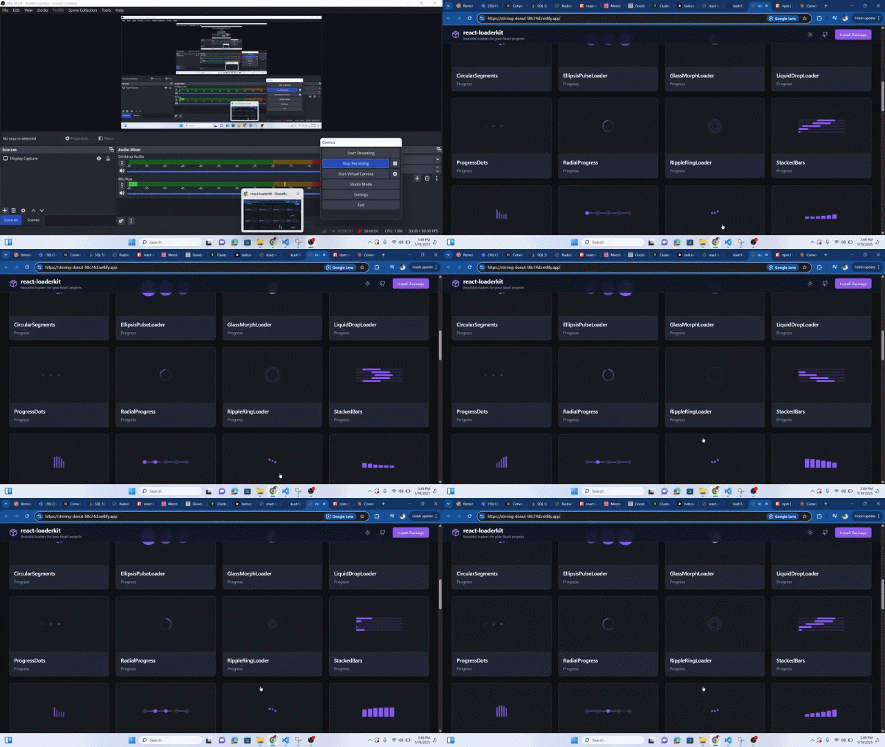
A lightweight, customizable React loader component library featuring spinners, progress bars, skeletons, text loaders, creative animations, and icon loaders — designed to make your loading states look awesome with minimal effort.
Features
- Multiple loader categories: spinner, progress, skeleton, text, creative, icon
- Easy props to control size, color, and animation speed
- Built with TypeScript, fully typed
- Tree-shakable and minimal dependencies

Documentation
Full documentation, examples, and demos are available on the website:
www.react-loaderkit.in
Installation
npm install react-loaderkit
# or
yarn add react-loaderkit
Usage Example
tsx
Copy
Edit
import React from 'react';
import { IconSpin, CircleLoader, PulseLoader } from 'react-loaderkit';

export default function App() {
  return (
    <div style={{ display: 'flex', gap: 20, alignItems: 'center', padding: 20 }}>
      <IconSpin size={50} color="#3b82f6" speed={2} />
      <CircleLoader size={40} color="#ef4444" />
      <PulseLoader size={60} speed={0.8} />
    </div>
  );
}
📦 Props (All Loaders)
| Prop | Type | Default | Description |
|---|---|---|---|
size |
number | 40 |
Width and height of the loader |
color |
string | Varies | Color of the loader (CSS-compatible string) |
speed |
number | 1 |
Animation speed multiplier (higher = faster) |
🔄 Available Loaders
🌀 Spinner
CircleLoaderDotLoaderRingLoader...
📊 Progress
BarLoaderCircularProgress...
💀 Skeleton
PulseLoaderCardSkeleton...
✍️ Text
DotTextTypeWriter...
🎨 Creative
BouncingBallsFoldingCube...
🎯 Icon
IconSpinIconPulse...
📚 Documentation
Full documentation, examples, and demos available at:
👉 www.react-loaderkit.in
👨💻 Author
🔍 Keywords
React · loaders · spinner · progress · skeleton · animation · typescript · UI components · loader animations
📄 License
MIT © Kushal Khandelwal
Happy coding! ⚡