
Package Exports
- react-mui-dropzone
- react-mui-dropzone/dist/index.es.js
- react-mui-dropzone/dist/index.js
This package does not declare an exports field, so the exports above have been automatically detected and optimized by JSPM instead. If any package subpath is missing, it is recommended to post an issue to the original package (react-mui-dropzone) to support the "exports" field. If that is not possible, create a JSPM override to customize the exports field for this package.
Readme
react-mui-dropzone Support @mui-5
(Unofficial published in order to support @mui/material 5) React-Mui-dropzone is a React component using Material-UI and is based on the excellent react-dropzone library.


This components provide either a file-upload dropzone or a file-upload dropzone inside of a dialog.
The file-upload dropzone features some snazzy "File Allowed/Not Allowed" effects, previews and alerts.
Installation
npm install --save react-mui-dropzoneor
yarn add react-mui-dropzoneSupport
material-ui-dropzone complies to the following support matrix.
| version | React | Material-UI |
|---|---|---|
4.x |
17+ |
5.x |
3.x |
16.8+ |
4.x |
2.x |
15.x or 16.x |
3.x or 4.x |
Screenshots
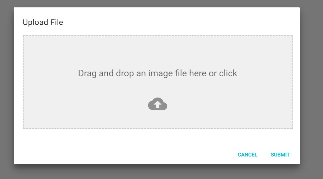
This is the Dialog component:
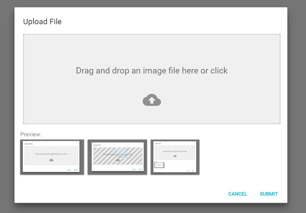
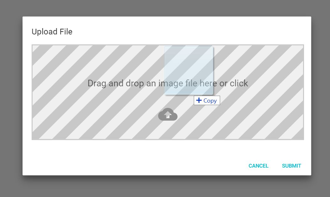
When you drag a file onto the dropzone, you get a neat effect:
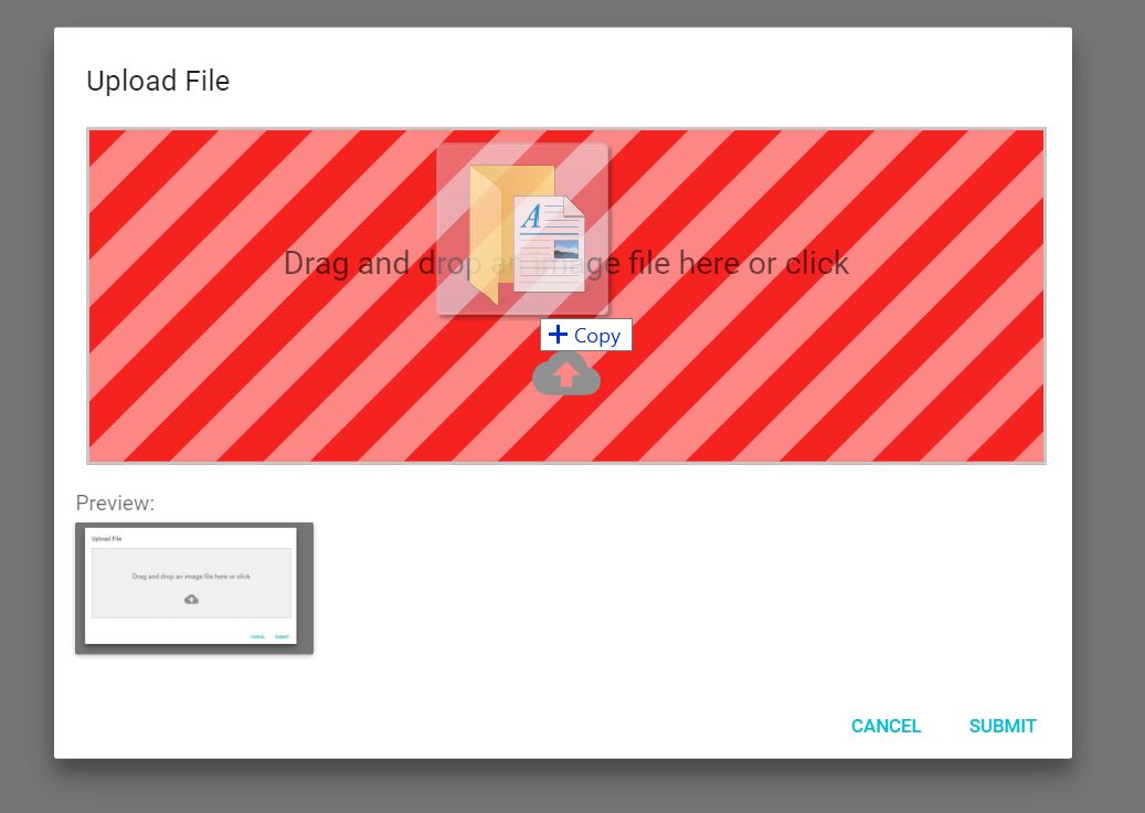
And if you drag in a wrong type of file, you'll get yelled at:
N.B. This has some limitations (see here for more details).
Documentation and Examples
See https://yuvaleros.github.io/material-ui-dropzone for Documentation and Examples.
Components
DropzoneArea
This components creates the dropzone, previews and snackbar notifications without a dialog
import React, {Component} from 'react'
import {DropzoneArea} from 'material-ui-dropzone'

class DropzoneAreaExample extends Component{
  constructor(props){
    super(props);
    this.state = {
      files: []
    };
  }
  handleChange(files){
    this.setState({
      files: files
    });
  }
  render(){
    return (
      <DropzoneArea
        onChange={this.handleChange.bind(this)}
        />
    )
  }
}

export default DropzoneAreaExample;
DropzoneDialog
This component provides the DropzoneArea inside of a MaterialUI Dialog.
import React, { Component } from 'react'
import {DropzoneDialog} from 'material-ui-dropzone'
import Button from '@material-ui/core/Button';

export default class DropzoneDialogExample extends Component {
    constructor(props) {
        super(props);
        this.state = {
            open: false,
            files: []
        };
    }

    handleClose() {
        this.setState({
            open: false
        });
    }

    handleSave(files) {
        //Saving files to state for further use and closing Modal.
        this.setState({
            files: files,
            open: false
        });
    }

    handleOpen() {
        this.setState({
            open: true,
        });
    }

    render() {
        return (
            <div>
                <Button onClick={this.handleOpen.bind(this)}>
                  Add Image
                </Button>
                <DropzoneDialog
                    open={this.state.open}
                    onSave={this.handleSave.bind(this)}
                    acceptedFiles={['image/jpeg', 'image/png', 'image/bmp']}
                    showPreviews={true}
                    maxFileSize={5000000}
                    onClose={this.handleClose.bind(this)}
                />
            </div>
        );
    }
}
License
MIT
Contributors
Thanks goes to these wonderful people (emoji key):
 Yuvaleros 🤔 💻 🎨 📖 💬 👀 🚧 |
 Mattia Panzeri 🤔 💻 🎨 📖 💡 🚇 🐛 💬 👀 🚧 |
 Max Carroll 🤔 💻 🎨 💡 👀 |
 Matthew Corner 🐛 🤔 💻 |
 Barry Loong 🤔 💻 |
 JF Blouin 🤔 💻 |
 Anthony Raymond 💻 💡 |
 isaacbuckman 🐛 💻 💡 |
 MatthijsMud 🐛 💻 |
This project follows the all-contributors specification. Contributions of any kind welcome!