
Package Exports
- react-native-action-bar
This package does not declare an exports field, so the exports above have been automatically detected and optimized by JSPM instead. If any package subpath is missing, it is recommended to post an issue to the original package (react-native-action-bar) to support the "exports" field. If that is not possible, create a JSPM override to customize the exports field for this package.
Readme
react-native-action-bar
An Android-like action bar for react-native
For react-native v0.39+
⚠️ Breaking change for versions < 2.*
The component has been redone so it hasn't much in common.
Check that README for versions lower than 2.*
Example
| iOS | Android |
|---|---|
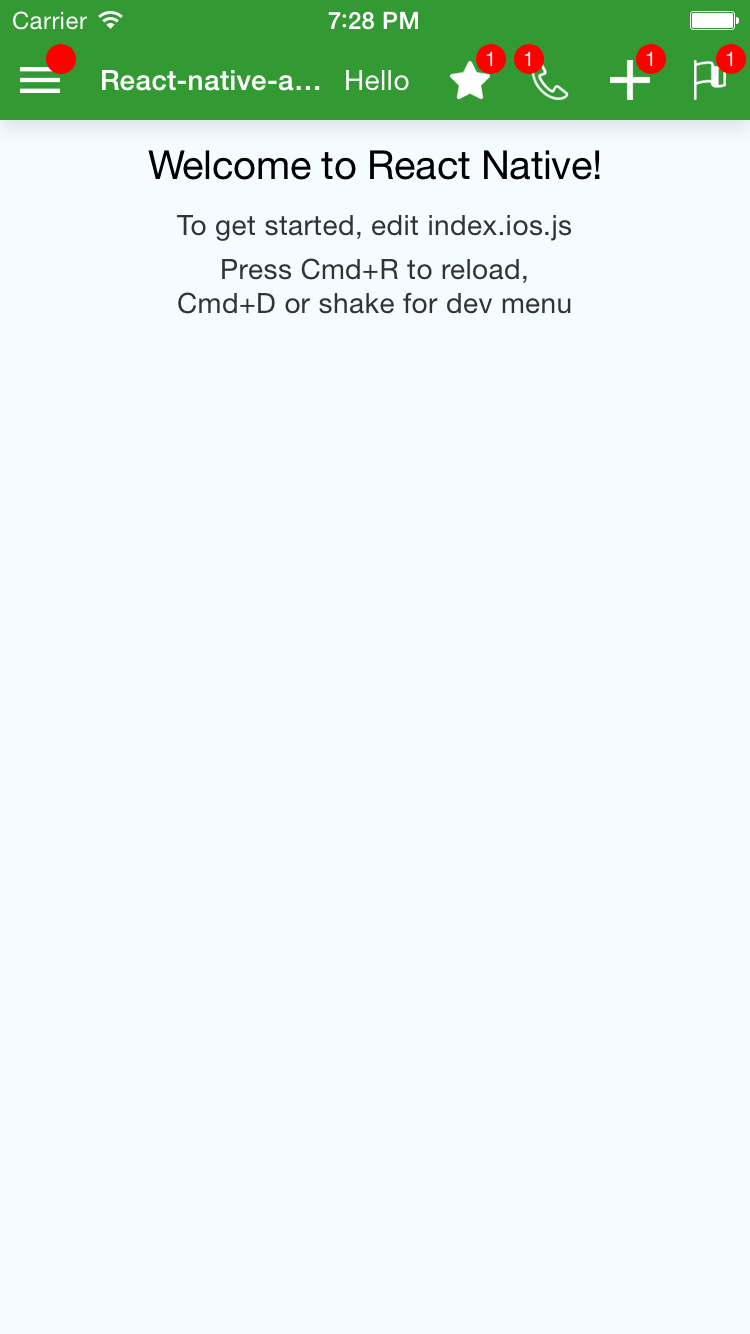 |
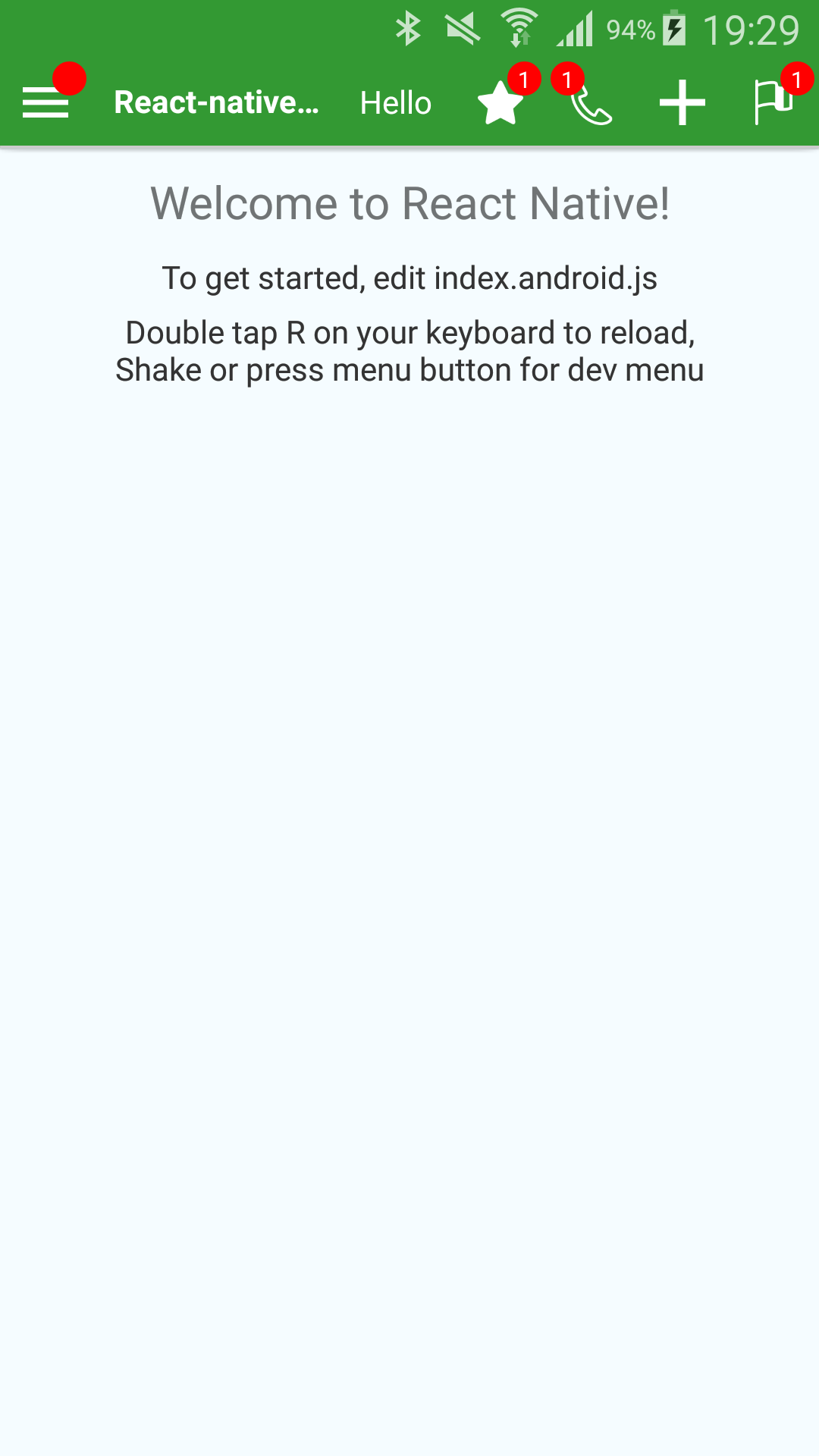 |
<ActionBar
    containerStyle={styles.bar}
    title={'React-native-action-bar Example'}
    rightText={'Hello'}
    leftIconName={'menu'}
    leftBadge={''}
    onLeftPress={() => console.log('Left!')}
    onTitlePress={() => console.log('Title!')}
    rightIcons={[
        {
            name: 'star',
            badge: '1',
            onPress: () => console.log('Right Star !'),
        },
        {
            name: 'phone',
            badge: '1',
            onPress: () => console.log('Right Phone !'),
            isBadgeLeft: true,
        },
        {
            name: 'plus',
            onPress: () => console.log('Right Plus !'),
        },
        {
            name: 'flag',
            badge: '1',
            onPress: () => console.log('Right Flag !'),
        },
        {
            image: require('my-custom-image.png'), // To use a custom image
            badge: '1',
            onPress: () => console.log('Right Custom image !'),
        },
    ]}
/>
Are you looking for React-native's ToolbarAndroid?
To allow more customization, I do not use ToolbarAndroid, however, this might be what you are looking for instead of my package.
react-native-action-bar is here to provide a similar top screen bar but that looks the same on Android and iOS.
Properties
| Property Name | Type | Comment |
|---|---|---|
| allowFontScaling | React.PropTypes.bool | If you want to allow font scaling on the title and the right text (false by default) |
| backgroundColor | React.PropTypes.string | The background color of the Bar |
| badgeColor | Badge.propTypes.backgroundColor | The color of all badges |
| badgeTextColor | Badge.propTypes.color | The color of the text of the badges |
| containerStyle | ViewPropTypes.style | Style of the container of the bar (has the backgroundColor) |
| disableShadows | React.PropTypes.bool | If you want the ActionBar to drop a shadow or not (The default is false) |
| disableStatusBarHandling | React.PropTypes.bool | If you want the ActionBar to set the color/style of the StatusBar (The default is false) |
| elevation | React.PropTypes.number | On Android, to 'control' the Shadow dropped by the bar (default is 2) |
| iconContainerStyle | ViewPropTypes.style | See the Icon component (applies to all Icons (left and right) |
| iconImageStyle | Image.propTypes.style | See the Icon component (applies to all Icons (left and right) |
| isLeftBadgeLeft | React.PropTypes.bool | Position of the badge on the left Icon |
| leftBadge | Badge.propTypes.content | Text of the badge on the left Icon ('' is a valid value, it will display an empty badge. undefined is needed to not have the badge displayed) |
| leftIconContainerStyle | Icon.propTypes.containerStyle | See the Icon component |
| leftIconImage | Icon.propTypes.source | An image to use as Icon (require()). Don't use remote images ({ uri: ... }) as it will have bad performance, but I guess you can |
| leftIconImageStyle | Icon.propTypes.imageStyle | See the Icon component |
| leftIconName | Icon.propTypes.name | The name of one of the predefined Icons (see List of predefined Icons) |
| leftTouchableChildStyle | ViewPropTypes.style | The style of the View inside the TouchableWithoutFeedback element for the left Icon |
| leftZoneContentContainerStyle | ViewPropTypes.style | The style of the View around the TouchableWithoutFeedback element for the left Icon |
| onLeftPress | React.PropTypes.func | The function to execute onPress for the left Icon |
| onRightTextPress | React.PropTypes.func | The function to execute onPress for the Text that you can display on the right of the Title |
| onTitlePress | React.PropTypes.func | The function to execute onPress for the Title |
| renderLeftSide | React.PropTypes.func | A function to override the rendering of the part left of the Title |
| renderRightSide | React.PropTypes.func | A function to override the rendering of the part right of the Title |
| rightIconContainerStyle | Icon.propTypes.containerStyle | See the Icon component |
| rightIconImageStyle | Icon.propTypes.imageStyle | See the Icon component |
| rightIcons | React.PropTypes.arrayOf( React.PropTypes.shape({ ...Icon.propTypes, badge: Badge.propTypes.content, onPress: React.PropTypes.func.isRequired, }), ) |
See below |
| rightText | React.PropTypes.string | The text to display on the right |
| rightTextStyle | Text.propTypes.style | Style of the text to display on the right |
| rightTouchableChildStyle | ViewPropTypes.style | The style of the View inside the TouchableWithoutFeedback element for all the Icons on the right |
| rightZoneContentContainerStyle | ViewPropTypes.style | The style of the View around all the Icons + Text on the right |
| throttleDelay | React.PropTypes.number | The delay to throttle the presses on the Icons (The default is 750ms) |
| title | React.PropTypes.string | The Text of the Title |
| titleContainerStyle | ViewPropTypes.style | The style of the View containing the Text element for the Title |
| titleStyle | Text.propTypes.style | The style of the Text element for the Title |
rightIcons elements example
{
    name: 'phone',
    badge: '1',
    onPress: () => console.log('Right Phone !'),
    isBadgeLeft: true,
}
Predefined Icons
Right now the following Icons are defined:
 back
back flag
flag loading
 location
 menu
menu phone
phone plus
plus star
star star-outline
Example
See an implementation example in the Example folder