
Package Exports
- react-native-awesome-alerts
- react-native-awesome-alerts/index.js
This package does not declare an exports field, so the exports above have been automatically detected and optimized by JSPM instead. If any package subpath is missing, it is recommended to post an issue to the original package (react-native-awesome-alerts) to support the "exports" field. If that is not possible, create a JSPM override to customize the exports field for this package.
Readme

React Native Awesome Alerts
Demo (Watch it on YouTube)
Getting Started
Installation
$ npm i react-native-awesome-alerts --saveBasic Usage
import React from 'react';
import { StyleSheet, View, Text, TouchableOpacity } from 'react-native';
import AwesomeAlert from 'react-native-awesome-alerts';
export default class App extends React.Component {
constructor(props) {
super(props);
this.state = { showAlert: false };
};
showAlert = () => {
this.setState({
showAlert: true
});
};
hideAlert = () => {
this.setState({
showAlert: false
});
};
render() {
const {showAlert} = this.state;
return (
<View style={styles.container}>
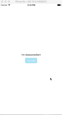
<Text>I'm AwesomeAlert</Text>
<TouchableOpacity onPress={() => {
this.showAlert();
}}>
<View style={styles.button}>
<Text style={styles.text}>Try me!</Text>
</View>
</TouchableOpacity>
<AwesomeAlert
show={showAlert}
showProgress={false}
title="AwesomeAlert"
message="I have a message for you!"
closeOnTouchOutside={true}
closeOnHardwareBackPress={false}
showCancelButton={true}
showConfirmButton={true}
cancelText="No, cancel"
confirmText="Yes, delete it"
confirmButtonColor="#DD6B55"
onCancelPressed={() => {
this.hideAlert();
}}
onConfirmPressed={() => {
this.hideAlert();
}}
/>
</View>
);
};
};
const styles = StyleSheet.create({
container: {
flex: 1,
alignItems: 'center',
justifyContent: 'center',
backgroundColor: '#fff',
},
button: {
margin: 10,
paddingHorizontal: 10,
paddingVertical: 7,
borderRadius: 5,
backgroundColor: "#AEDEF4",
},
text: {
color: '#fff',
fontSize: 15
}
});
Props
Basic
| Prop | Type | Description | Default |
|---|---|---|---|
| show | boolean |
Show / Hide awesome alert | false |
| animatedValue | number |
Animated value | 0.3 |
| useNativeDriver | boolean |
Use native driver for animations | false |
| showProgress | boolean |
Show / Hide progress bar | false |
| title | string |
Title text to display | hidden |
| message | string |
Message text to display | hidden |
| closeOnTouchOutside | bool |
Dismiss alert on clicking outside | true |
| closeOnHardwareBackPress | bool |
Dismiss alert on hardware back press (android) | true |
| showCancelButton | bool |
Show a cancel button | false |
| showConfirmButton | bool |
Show a confirmation button | false |
| cancelText | string |
Cancel button text | Cancel |
| confirmText | string |
Confirm button text | Confirm |
| onCancelPressed | func |
Action to perform when Cancel is pressed | - |
| onConfirmPressed | func |
Action to perform when Confirm is pressed | - |
| onDismiss | func |
Callback for when alert is dismissed | - |
| customView | object |
Custom view to render inside alert | null |
| modalProps | object |
Additional props to pass for Modal | - |
| confirmButtonTestID | string |
Confirm button testID | awesome-alert-confirm-btn |
| cancelButtonTestID | string |
Cancel button testID | awesome-alert-cancel-btn |
Styling
| Prop | Type | Description | Default |
|---|---|---|---|
| alertContainerStyle | object |
Alert parent container style | - |
| overlayStyle | object |
Overlay style | - |
| progressSize | string |
Size of activity indicator | - |
| progressColor | string |
Color of activity indicator | - |
| contentContainerStyle | object |
Alert popup style | - |
| contentStyle | object |
Alert popup content style | - |
| titleStyle | object |
Title style | - |
| messageStyle | object |
Message style | - |
| actionContainerStyle | object |
Action container style | - |
| cancelButtonColor | string |
Background color | #D0D0D0 |
| confirmButtonColor | string |
Background color | #AEDEF4 |
| cancelButtonStyle | object |
Cancel button style | - |
| cancelButtonTextStyle | object |
Cancel button text style | - |
| confirmButtonStyle | object |
Confirm button style | - |
| confirmButtonTextStyle | object |
Confirm button text style | - |
Tests
For automated tests, buttons default to data-testid='awesome-alert-cancel-btn' and data-testID='awesome-alert-confirm-btn' properties for the cancel and confirm buttons, respectively. However, feel free to pass in your own via the props.
Inspiration
Pedant: sweet-alert-dialog (Github)
Questions
Feel free to Contact me or Create an issue
License
Released under the Mit License