
Package Exports
- react-native-checkbox-group
This package does not declare an exports field, so the exports above have been automatically detected and optimized by JSPM instead. If any package subpath is missing, it is recommended to post an issue to the original package (react-native-checkbox-group) to support the "exports" field. If that is not possible, create a JSPM override to customize the exports field for this package.
Readme
react-native-checkbox-group
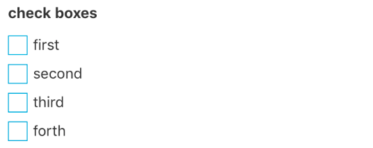
React native checkbox group component
Install :
npm install --save react-native-checkbox-groupExample usage :
import CheckboxGroup from 'react-native-checkbox-group'

<CheckboxGroup
              callback={(selected) => { console.log(selected) }}
              iconColor={"#00a2dd"}
              iconSize={30}
              checkedIcon="ios-checkbox-outline"
              uncheckedIcon="ios-square-outline"
              checkboxes={[
                {
                  label: "first", // label for checkbox item
                  value: 1, // selected value for item, if selected, what value should be sent?
                  selected: true // if the item is selected by default or not.
                },
                {
                  label: "second",
                  value: 2
                },
              ]}
              labelStyle={{
                color: '#333'
              }}
              rowStyle={{
                flexDirection: 'row'
              }}
              rowDirection={"column"}
            />
Props:
| Prop | Type | Description |
|---|---|---|
| callback | Function | whenever user selects or changes selections it will be called. |
| iconColor | String | icon color for checked/unchecked icons and search icon also border color of search bar |
| iconSize | Integer | icon size for checked/unchecked icons |
| checkedIcon | String | selected/checked icon name (react-native-vector-icons/Ionicon) |
| uncheckedIcon | String | unselected/unchecked icon name (react-native-vector-icons/Ionicon) |
| checkboxes | Object | checkboxes. see the example. |
| labelStyle | Object | styles for checkbox label |
| rowStyle | Object | styles for each checkbox |
| rowDirection | String | column or row. how to list checkboxes |
Author:
Ata S.Mohammadi. ataomega@gmail.com