
Package Exports
- react-native-custom-select
- react-native-custom-select/dist/main.js
This package does not declare an exports field, so the exports above have been automatically detected and optimized by JSPM instead. If any package subpath is missing, it is recommended to post an issue to the original package (react-native-custom-select) to support the "exports" field. If that is not possible, create a JSPM override to customize the exports field for this package.
Readme
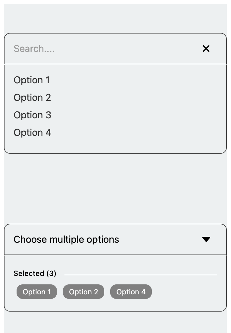
React native custom select
A customizable React Native dropdown/select component supporting single and multiple selection modes, with features like search, select all, and flexible styling options for seamless integration

Installation
npm i react-native-custom-selectyarn add react-native-custom-selectUsage
import { useState } from 'react';
import { Text, SafeAreaView, StyleSheet } from 'react-native';
import { SelectList, MultipleSelect } from 'react-native-custom-select';

export default function App() {
  const [selectedValue, setSelectedValue] = useState('');
  const [selectedValues, setSelectedValues] = useState([]);

  const data = [
    { key: '1', value: 'Option 1' },
    { key: '2', value: 'Option 2' },
    { key: '3', value: 'Option 3' },
    { key: '4', value: 'Option 4' },
  ];

  const handleChange = value => {
    setSelectedValue(value);
  };

  const handleMultipleChange = values => {
    setSelectedValues(values);
  };

  return (
    <SafeAreaView style={styles.container}>
      <Text style={styles.paragraph}>
        Change code in the editor and watch it change on your phone! Save to get
        a shareable url.
      </Text>

      <SelectList
        data={data}
        value={selectedValue}
        onChange={handleChange}
        placeholder="Select an option"
        borderColor="#444"
      />

      <MultipleSelect
        data={data}
        value={selectedValues}
        onChange={handleMultipleChange}
        placeholder="Choose multiple options"
        searchResult="No results found"
      />
    </SafeAreaView>
  );
}

const styles = StyleSheet.create({
  container: {
    flex: 1,
    justifyContent: 'center',
    backgroundColor: '#ecf0f1',
    padding: 8,
    margin: 10,
  },
  paragraph: {
    margin: 24,
    fontSize: 18,
    fontWeight: 'bold',
    textAlign: 'center',
  },
});
SelectList Properties
SelectList
| Property | Type | Default | Description |
|---|---|---|---|
data |
SelectItem[] |
[] |
The list of items for the select dropdown. |
value |
string |
undefined |
The selected value. |
placeholder |
string |
undefined |
Placeholder text when no item is selected. |
searchResult |
string |
undefined |
Displays the search results. |
fontSize |
number |
14 |
Font size of the text within the select component. |
backgroundColor |
string |
'transparent' |
Border color of the select component. |
borderColor |
string |
'#000' |
Border color of the select component. |
borderRadius |
number |
10 |
Border radius of the select component. |
defaultPadding |
number |
14 |
Default padding within the select component. |
containerStyle |
StyleProp<ViewStyle> |
{marginBottom: 15} |
Custom styles for the container view. |
indexValue |
string |
undefined |
The value of the item used for indexing in the dropdown. |
caretIcon |
ReactNode |
undefined |
Custom icon for the caret in the dropdown. |
closeIcon |
ReactNode |
undefined |
Custom icon for the close button in the dropdown. |
onChange |
(value: string) => void |
required |
Callback function triggered when a selection is made. |
MultipleSelect
| Property | Type | Default | Description |
|---|---|---|---|
data |
SelectItem[] |
[] |
The list of items for the select dropdown. |
value |
string[] |
undefined |
The array of selected values. |
placeholder |
string |
undefined |
Placeholder text when no item is selected. |
searchResult |
string |
undefined |
Displays the search results. |
fontSize |
number |
14 |
Font size of the text within the select component. |
backgroundColor |
string |
'transparent' |
Border color of the select component. |
borderColor |
string |
'#000' |
Border color of the select component. |
borderRadius |
number |
10 |
Border radius of the select component. |
defaultPadding |
number |
14 |
Default padding within the select component. |
containerStyle |
StyleProp<ViewStyle> |
{marginBottom: 15} |
Custom styles for the container view. |
indexValue |
string |
undefined |
The value of the item used for indexing in the dropdown. |
caretIcon |
ReactNode |
undefined |
Custom icon for the caret in the dropdown. |
closeIcon |
ReactNode |
undefined |
Custom icon for the close button in the dropdown. |
onChange |
(value: string) => void |
required |
Callback function triggered when multiple selections are made. |
Maintainers