
Package Exports
- react-native-custom-snackbar
This package does not declare an exports field, so the exports above have been automatically detected and optimized by JSPM instead. If any package subpath is missing, it is recommended to post an issue to the original package (react-native-custom-snackbar) to support the "exports" field. If that is not possible, create a JSPM override to customize the exports field for this package.
Readme
react-native-custom-snackbar is a custom animated snackbar for both Android and iOS devices.
###Installation
npm install react-native-custom-snackbar --save###Properties
snackBarBackColor = "rgba(0,0,0,0.8)" // Background color of Snackbar.
snackBarTextColor: 'white' // Snackbar Message color.
closeText: '' // Text for close button such as: UNDO, CLOSE etc. If provided blank the image is shown to close Snackbar.
closeTextColor: 'rgb(253,85,82)' // Text color for close button.
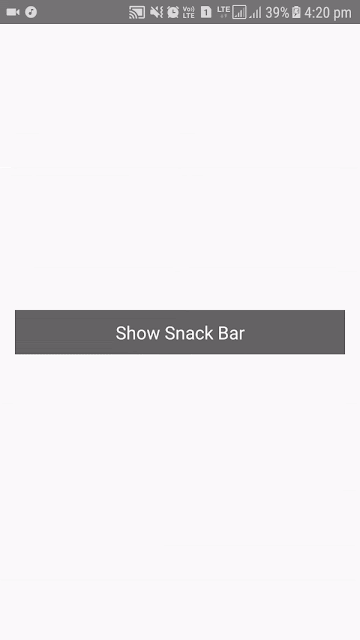
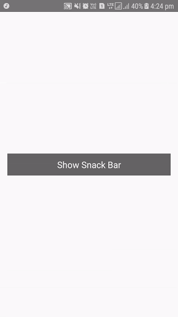
imageColor: 'rgb(253,85,82)' // Tint color of close image button.###Screenshots
###Usage Example
- First generate a new React native project:
react-native init CustomSnackbar
cd CustomSnackbar
npm install react-native-custom-snackbar --save- Then paste the following code into your
index.android.js / index.ios.jsfile:
import React, { Component } from 'react';
import { View, TouchableOpacity, Text, StyleSheet, Platform, AppRegistry } from 'react-native';

import SnackBar from 'react-native-custom-snackbar';

class CustomSnackbar extends Component
{
   constructor()
   {
      super();
   }

   showSnackBar = () =>
   {
      this.refs.mySnackBar.show("Custom SnackBar Text...");
   }

   render()
   {
      return(
         <View style = { styles.container }>
            <TouchableOpacity activeOpacity = { 0.8 } onPress = { this.showSnackBar } style = { styles.button }>
              <Text style = { styles.btnText }>Show Snack Bar</Text>
            </TouchableOpacity>

            <SnackBar
                ref = "mySnackBar"
                closeText = "close"/>
         </View>
      );
   }
}

const styles = StyleSheet.create(
{
    container:
    {
        flex: 1,
        justifyContent: 'center',
        alignItems: 'center',
        paddingHorizontal: 15,
        paddingTop: (Platform.OS) === 'ios' ? 20 : 0
    },

    button:
    {
        backgroundColor: 'rgba(0,0,0,0.6)',
        padding: 10,
        alignSelf: 'stretch'
    },

    btnText:
    {
        alignSelf: 'stretch',
        color: 'white',
        fontSize: 18,
        textAlign: 'center'
    }
});

AppRegistry.registerComponent('CustomSnackbar', () => CustomSnackbar);