
Package Exports
- react-native-flatlist-slider
This package does not declare an exports field, so the exports above have been automatically detected and optimized by JSPM instead. If any package subpath is missing, it is recommended to post an issue to the original package (react-native-flatlist-slider) to support the "exports" field. If that is not possible, create a JSPM override to customize the exports field for this package.
Readme
React-Native-FlatList-Slider
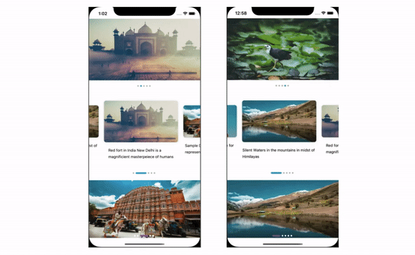
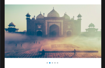
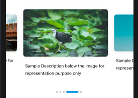
Custom Image Slider Component in React Native
Install
npm i react-native-flatlist-sliderImport
import {FlatListSlider} from 'react-native-flatlist-slider';Usage
Images from URI
  const images = [
   {
    image:'https://images.unsplash.com/photo-1567226475328-9d6baaf565cf?ixlib=rb-1.2.1&ixid=eyJhcHBfaWQiOjEyMDd9&auto=format&fit=crop&w=400&q=60',
    desc: 'Silent Waters in the mountains in midst of Himilayas',
   },
  {
    image:'https://images.unsplash.com/photo-1455620611406-966ca6889d80?ixlib=rb-1.2.1&ixid=eyJhcHBfaWQiOjEyMDd9&auto=format&fit=crop&w=1130&q=80',
    desc:
      'Red fort in India New Delhi is a magnificient masterpeiece of humans',
  },
  ]

  <FlatListSlider
    data={images}
  />
Images from Local
  const images = [
   {
    banner:'require('./images/banner1.png'),
    desc: 'Silent Waters in the mountains in midst of Himilayas',
   },
  {
    banner:'require('./images/banner2.png'),
    desc:
      'Red fort in India New Delhi is a magnificient masterpeiece of humans',
  },
  ]

  <FlatListSlider
    data={images}
    imageKey={'banner'}
    local
  />
  <FlatListSlider
    data={images}
    width={275}
    timer={5000}
    component={<Preview />}
    onPress={item => alert(JSON.stringify(item))}
    indicatorActiveWidth={40}
    contentContainerStyle={{paddingHorizontal: 16}}
  />
 <FlatListSlider
    data={images}
    height={240}
    timer={5000}
    onPress={item => alert(JSON.stringify(item))}
    contentContainerStyle={{paddingHorizontal: 16}}
    indicatorContainerStyle={{position:'absolute', bottom: 20}}
    indicatorActiveColor={'#8e44ad'}
    indicatorInActiveColor={'#ffffff'}
    indicatorActiveWidth={30}
    animation
  />
Props for Customization
| Prop | Type | Default | Description |
|---|---|---|---|
| data | Array | [] | Array of objects with images |
| imageKey | String | ‘image' | Key for image in object |
| local | Boolean | false | Image to be loaded from URI or local |
| width | Number | screenWidth | Width of Item in list |
| height | Number | 230 | Height of Item in list |
| loop | Boolean | true | Enable infinite scroll for list |
| separatorWidth | Number | 0 | Width of separator between list items |
| autoscroll | Boolean | true | Enable autoScroll for list |
| timer | Number | 3000 | Timer for scroll in milliseconds |
| onPress | Function | Function to call on Item press | |
| contentContainerStyle | Object | Styling slider container | |
| component | Component | Stateful/Stateless custom component for list item | |
| currentIndexCallback | Function | Callback for image change with index | |
| indicator | Boolean | true | Flag to render indicator |
| indicatorStyle | Object | Indicator Style | |
| indicatorContainerStyle | Object | Indicator Container Style | |
| indicatorActiveColor | String | '#3498db' | Active indicator color |
| indicatorInActiveColor | String | '#bdc3c7' | Inactive indicator color |
| indicatorActiveWidth | Number | 6 | Active Indicator Width |
| removeClippedSubviews | Boolean | true | Flatlist prop for performance |
| animation | Boolean | true | Animate indicator change |
Props passed to Custom Component
| Prop | Type | Description |
|---|---|---|
| style | Object | Container Style for Component |
| item | Object | Object from Array |
| imageKey | String | Key for image in object |
| onPress | Function | Function to call on Item press |
| index | Number | Index of item |
| active | Boolean | Flag if item is currently visible |
| local | Boolean | Image to be loaded from URI or local |
Sample Custom Component
import React from 'react';
import {
  View,
  Text,
  TouchableOpacity,
  Image,
  StyleSheet,
  Platform,
} from 'react-native';

export default (Preview = ({
  style,
  item,
  imageKey,
  onPress,
  index,
  active,
  local,
}) => {
  return (
    <TouchableOpacity
      style={[styles.videoContainer]}
      onPress={() => onPress(item)}>
      <View style={[styles.imageContainer, styles.shadow]}>
        <Image
          style={[styles.videoPreview, active ? {} : {height: 120}]}
          source={{uri: item[imageKey]}}
        />
      </View>
      <Text style={styles.desc}>{item.desc}</Text>
    </TouchableOpacity>
  );
});

const styles = StyleSheet.create({
  videoContainer: {
    width: 275,
    paddingVertical: 28,
    justifyContent: 'center',
    alignItems: 'center',
    marginRight: 20,
  },
  videoPreview: {
    width: 275,
    height: 155,
    borderRadius: 8,
    resizeMode: 'cover',
  },
  desc: {
    fontSize: 14,
    letterSpacing: 0,
    lineHeight: 24,
    marginTop: 18,
  },
  imageContainer: {
    justifyContent: 'center',
    alignItems: 'center',
  },
  shadow: {
    ...Platform.select({
      ios: {
        shadowColor: 'black',
        shadowOffset: {width: 0, height: 1},
        shadowOpacity: 0.1,
        shadowRadius: 5,
      },
      android: {
        elevation: 5,
      },
    }),
  },
});