
Package Exports
- react-native-lights-pipesort
This package does not declare an exports field, so the exports above have been automatically detected and optimized by JSPM instead. If any package subpath is missing, it is recommended to post an issue to the original package (react-native-lights-pipesort) to support the "exports" field. If that is not possible, create a JSPM override to customize the exports field for this package.
Readme
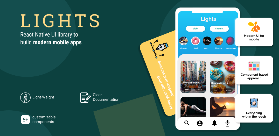
Lights
Light-Weight React Native UI library to build modern Mobile apps.
Contains
- 6+ completely customizable components built and tested to ease your efforts.
- Based on Modern UI and UX trends.
- Light-weight
- Simple and clear documentation with examples.
Quick start
Lights is a library that's tested and built for you to develop modern mobile apps using React Native.
We give you modern and highly customizable general use components that you use in & out in all your projects.
Installation
yarn add react-native-lights
OR
npm install --save react-native-lights
Usage:
BottomSheet
BottomSheet is the new modal window. BottomSheet component is a fully customizable component that shows notifiation and alert message in apps.
import BottomSheet from "react-native-lights";
const BottomSheet = () => {
    const data =
     {
       buttonText: 'click me',
       buttonStyles:{borderRadius:5,backgroundColor:"black", buttonTextColor:"white"},
       bottomSheetStyles:{backgroundColor:"#25e8e2" , textFontSize:15, textColor:"white"},
       bodyText: 'Show notification the modern way',
     }
  return (
    <View style={{flex:1}}
      <BottomSheet data={data} />
    </View>
  );
};
Example
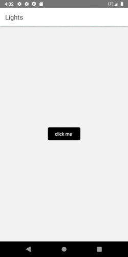
CardSlider
Pass in the array and have your card slider ready to use in your app.
import CardSlider from "react-native-lights";

const CardSlider = () => {

     const cardItems = [
        {git
          title: 'Card 1 ',
          description: 'Include images to your card',
          buttonTitle: 'Get Started',
          backgroundImage: {uri:'https://i.imgur.com/2nCt3Sbl.jpg'},
          buttonFunction: function(){
            Alert.alert("Thank You", "for choosing Lights!", [{text:"Welcome"}])
        }
        },
        {
            title: 'Card 2',
            description: 'You can choose to just have background color',
            buttonTitle: 'Get Started',
            backgroundColor: 'black',
        },
        {
          title: 'Card 3 ',
          description: 'onPress function is tagged to the image.',
          buttonTitle: 'Get Started',
          backgroundImage: {uri:'https://i.imgur.com/2nCt3Sbl.jpg'},
          buttonFunction: function(){
              Alert.alert("Thank You", "for choosing Lights!", [{text:"Welcome"}])
          }
        },
        {
            title: 'Card 2',
            description: 'Lorem ipsum dolor sit amet et nuncat mergitur',
            buttonTitle: 'Get Started',
            backgroundImage:{uri:'https://i.imgur.com/KZsmUi2l.jpg'},
        },
      ];


  return (
    <View style={{flex:1}}>
      <CardSlider data={cardItems} />
    </View>
  );
};
Example
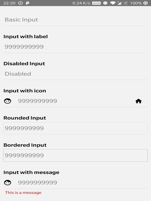
Input
Different types of input with/without Icons can now be included with ease in your projects.
import Input from "react-native-lights";

  return (
    <Input
      placeholder="9999999999"
      placeholderTextColor="#7d7d7d"
      autoFocus={true}
      maxLength={10}
      keyboardType={"numeric"}
      leftInputIcon={
        <Icon
          name="face"
          size={25}
          style={{ marginRight: 15 }}
        />
      }
      />
  );
};
Example
To view complete documentation you can check out Lights documentation page.
How can I support Lights
- Give us some 🌟 stars
- Follow us on Twitter
- Suggest new components, submit bugs and help us improve the library.
Licence
ISC licence
From Developers
Made with ❤️ by Pipesort developers.